Designing a Dashboard
While getting a drink at the water cooler, your discussion of weekend plans with a co-worker turns sour.
"I'm working all weekend," she complains. "I need to create a dashboard for Big Boss before the weekend is over." Thinking about the reports you've already created, you realize you may be able to help her!
"We should be able to do that in Reporting Services," you exclaim as you top off your water bottle. You turn to the Stairway to Reporting Services series to see what you can learn. This article walks through a sample dashboard to highlight sparklines, data bars, and indicators. With any luck, both you and your co-worker can be out of the office before the Friday traffic starts.
You can catch up on the basics of Reporting Services here: Stairway to SQL Server Reporting Services.
How do we start?
Report writers create two types of reports: analytical and operational. Operational reports help employees on a day to day basis. They typically include lists or visualizations. Some examples include a list of customers, a stage status for processes, and a third party application report. Analytical reports are a little different. They provide insight into your business to help you make business decisions. Examples of these reports include dashboards, scorecards, and drill-down reports.
Many analytical reports are best displayed using a dashboard. While there are different types of dashboards, at a high level, a dashboard displays summaries and trends to highlight different aspects of a business. Each item that is highlighted is known as a key performance indicator (KPI), and can be separated or grouped based on different business groups.
The final dashboard that we will create is shown in Figure 1.
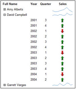
Figure 1. Final Dashboard
Dashboard Report Items
In Reporting Services, there are several report items that we use to create a dashboard: gauges, data bars, sparklines, and indicators. You can see those items in the Toolbox in the Business Intelligence Development Studio (BIDS) shown in Figure 2.
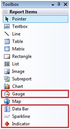
Figure 2. Toolbox Showing the Dashboard Report Items
Using these report items in a report is a little different than what we've seen up to this point, so let's walk through creating a dashboard now.
Dashboard Data
Begin by creating a data source and dataset that pulls the information you are interested in showing. For this example, use the AdventureWorksDW database that is provided with the SQL Server 2008 R2 database samples with the trend query provided in Figure 3.
select e.FirstName + ' ' + e.LastName as FullName
 ,fsq.CalendarYear
 ,fsq.CalendarQuarter
 ,fsq.SalesAmountQuota
 ,frs.SalesAmount
 ,CASE WHEN fsq.SalesAmountQuota > frs.SalesAmount
 THEN 1 ELSE CASE WHEN fsq.SalesAmountQuota = frs.SalesAmount
 THEN 0 ELSE -1 END
 END as Trend
from dbo.FactSalesQuota fsq
inner join dbo.DimEmployee e on fsq.EmployeeKey=e.EmployeeKey
left join (
 select
 EmployeeKey ,CalendarYear ,CalendarQuarter
 ,SUM(SalesAmount) as SalesAmount
 from dbo.FactResellerSales f
 inner join dbo.DimTime t on f.DueDateKey = t.TimeKey
 group by EmployeeKey,CalendarYear,CalendarQuarter) frs
 on fsq.EmployeeKey=frs.EmployeeKey
 and fsq.CalendarYear=frs.CalendarYear
 and fsq.CalendarQuarter=frs.CalendarQuarter
Figure 3. AdventureWorksDW trend query
Prepping the Dashboard
Now that our fields are available, let's prep the dashboard. Start by adding a table report item to the designer and add the following fields to the detail row of the tablix: CalendarYear and CalendarQuarter and a parent group using the column: FullName. The table up to this point can be seen in Figure 4.

Figure 4. Beginning Dashboard Creation
Dashboard Report Items
You'll need to decide which dashboard report items to use for your dashboard. Here is when you would use each type:
- A traffic light is the standard indicator that most people know. In the traffic light, red, yellow, and green lights describe the status of a process. Indicators in Reporting Services can use a variety of icons and are best used when there are a few distinct statuses or trends.
- Gauges also compare an actual value to a target value and allow you to show different statuses based on how close the actual value is to the target value.
- Tiny bar graphs included in a table are known as data bars. When you are interested in seeing the overall view of information over a range, you will want to use a data bar.
- Sparklines are mini-charts that can show an aggregated view of a series of data. Similar to data bars, it is possible to show how sales have changes over each of the year's quarters for each person.
By using any or all of these items, you can create a visual dashboard. Let's walk through setting up each of these report items in a table now.
Indicators
Begin setting up the indicator by adding a new column to the right of the existing table shown in Figure 4. Drag the Indicator report item from the Toolbox in BIDS into the new column's detail row. When the indicator is placed, the Select Indicator Type window opens. When choosing the indicator type, be sure to keep in mind the final display of the dashboard. If users will typically be printing the report, don't select an indicator that only differentiates based on color. For this example, select the colored arrows, as shown in Figure 5.
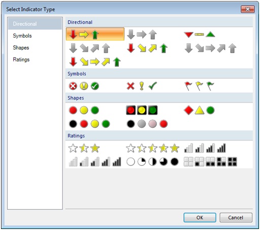
Figure 5. Select Indicator Type screen
After the indicator type is selected, you need to tell the indicator what value and ranges it should use. To accomplish this, single left-click on the indicator. In the Gauge Data window that opens, click the first icon, as shown in Figure 6, which will open up the Properties window.
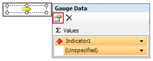
Figure 6. Select Indicator Properties
The Indicator properties window lets you set properties for the indicator. On the Value and States menu, set the Value to your desired column, which for us is Trend. Set the State Measurement Unit to Numeric and fill out the Indicator States as shown in Figure 7. If you use the Percentage measurement unit, be sure to use values between 0 and 100 for the state thresholds.
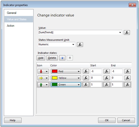
Figure 7. Value and States menu on the Indicator properties window
Note: There is a shortcut to set up the value of the indicator. Put the desired field in the text box first. Then place the indicator on top of the textbox and the value will already be set! Deleting the indicator will leave the original value in the text box as well.
Now that the indicator is set up, Reporting Services will use the value on each data row to evaluate which indicator should be shown. Gauges are very similar to indicators and can be used in the same fashion or as a standalone indicator!
Mini-Charts
To create a mini-chart, let's use the same query and table that we've already created. We'll want to show how the sales amount has changed over the quarters for each person. Begin by pulling a Sparkline item from our Toolbox onto the group header across from the FullName column and on top of the indicator we just created. The Select Sparkline Type wizard will immediately open to allow us to pick what type of sparkline we want to use. Let select the Line option as shown in Figure 8.
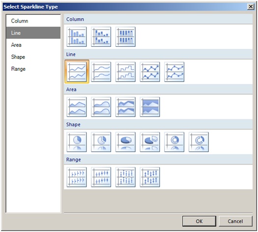
Figure 8. Select Sparkline Type Screen
Once we've selected our sparkline type, we need to populate the information needed to render the correct information. Clicking on the sparkline item will open the Chart Data window. Set the Values to SalesAmount and the Category Groups to CalendarYear and CalendarQuarter. The final view of the window can be seen in Figure 9.
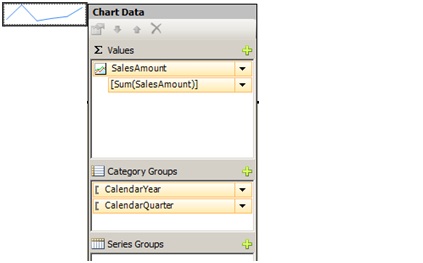
Figure 9. Chart Data window
And that is as simple as it gets! When we render the report, we will see the complete sales trend for that particular person. Alternatively, we could have used the data bar item. By setting up the same properties, we would have also seen a sales trend over time, but in a vertical bar-like fashion instead.
Dashboard Completed
You've successfully helped your co-worker create her dashboard, and you're ready to start a work-free weekend. You know how to add indicators and sparklines to create a full dashboard. Now that we have data displayed on our reports, we need to pretty it up a bit. It's time to talk to your manager and Big Boss and see what they need next. Then you can practice what you'll learn in Extras, Extras, the next article in SSRS Stairways series.
