Your manager’s humid breath oozes down the back of your neck. You shift in your chair uncomfortably as you show him your work up to this point.
“Yes… Very nice…” his voice hisses, and you imagine him twirling a handlebar mustache behind you. “Now it just needs a pie chart. Every report should have a pie chart!” With that, the warm presence behind you disappears. Probably with an evil swish of a black cape, you mumble under your breath. Pie charts!
While you know there are only a few scenarios where you would want to use a pie chart, you need to at least research charts and maps so that you can explain your reasoning to your manager. This article will explain different types of visualizations and when you would use each type.
Be sure to start with the earlier articles at: Stairway to SQL Server Reporting Services before continuing.
Visualizations
In addition to text-based items, a report can provide valuable information through different types of visualizations, including charts, maps, and dashboards. Not only can visualizations increase the esthetic and professional appearance of a report, they can also provide insights that would otherwise be difficult to discover. The visualizations in Reporting Services 2008 R2 and when you would want to use each one are listed here:
- Charts show trends, analysis, and groupings. If you want a user to understand a result as quickly as possible, a chart will provide that for you.
- To show geographical information, maps are king because they show data overlaying a meaningful area.
- There are also several dashboarding visualizations, including the gauge, data bar, sparkline, and indicator, which will be covered in a future article.
See the first two previously described items that we will use from the Toolbox in Figure 1.
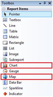
Figure 1. Toolbox with Visualization Items Selected
Charts
Charts have the distinction of being regularly used in our day to day activities. We are inundated with charts, between Excel spreadsheets, PowerPoint presentations, and even our monthly cell phone bills! While we know that different types of reports can highlight specific trends and data, how do we know what type of chart to use? See Table 1 for a list of charts in Reporting Services and their usages.
| Chart Type | Chart Use |
| Column | Trend |
| Line | Trend |
| Shape | Comparison |
| Bar | Trend |
| Area | Trend |
| Range | Trend |
| Scatter | Trend, Comparison |
| Polar | Comparison |
Table 1. Chart Types and Uses
Now that we know why we would each chart type, let’s create a report with a bar chart. Our finished product can be seen in Figure 2.
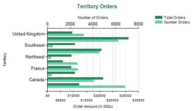
Figure 2. Completed Chart Report
To create our chart report, open Business Intelligence Development Studio (BIDS) and create a Reporting Services project and new report. Create a dataset against the AdventureWorks SQL Server database using the query in Figure 3.
select t.Name as TerritoryName
     , SUM(o.TotalDue) as TotalOrders
     , COUNT(*) as NumberOrders
from Sales.SalesOrderHeader o
inner join Sales.Customer c
     on o.CustomerID=c.CustomerID
inner join Sales.SalesTerritory t
     on c.TerritoryID=t.TerritoryID
group by t.Name
Figure 3. AmountSoldByTerritory Dataset
Next, we will add a bar chart to our report. From the Toolbox, drag the Chart item onto the Design pane. The Chart Wizard will open, as shown in Figure 4. To create a simple bar chart, select the first icon under the Bar section named Bar.
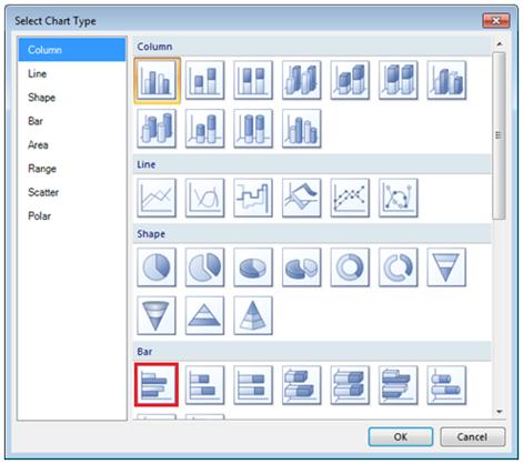
Figure 4. Chart Type Selector with Bar Chart Selected
Clicking on the chart will open up the Chart Data popup. Add the TotalOrders and NumberOrders field to the Values area and TerritoryName to the Category Groups area. The Series Group area would be used if you had a dynamic set of values that you wanted to show as different bars.
Now this chart seems like it may be what we need, but if we were to run it, we would see the ranges of values are so different that we cannot get a true view of the number of orders. Instead, we will need to create a secondary axis for the number of orders. On the properties for the NumberOrders value, go to the Axes and Chart Area menu. Set the Horizontal axis option to Secondary, as seen in Figure 5. 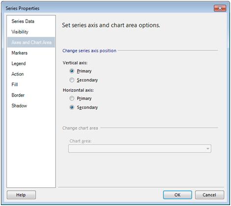
Figure 5. Series Properties Screen
Now when we run the report, we can see number of orders listed across the top, and the total amount of sales along the bottom. Finally, we can make changes to the chart through a series of properties panes, including color, text, and positioning. Our final product should be similar to the original chart we saw in Figure 2.
Maps
Much to the joy of executives everywhere, the map report item was introduced in the 2008 R2 release of Reporting Services. By utilizing the built in functionality, you can now create color-coded maps that show data in a variety of ways.
Reporting Services allows you to create maps from one of the following:
- Spatial data provided by an installed map gallery
- ESRI shapefiles
- Queries that return SQL Server spatial data
Once you have picked the geographical map you desire, you can tie analytical data to the areas to produce a clean and easy-to-read map. A completed map that shows how many customers an organization has throughout the United States is in Figure 6.
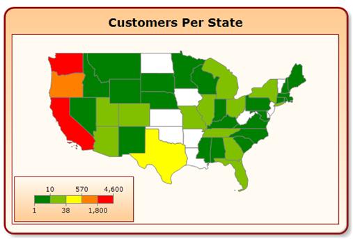
Figure 6. Completed Map Report
Let’s walk through the creation of the customer count map. Use the dataset shown in Figure 7 against the AdventureWorks SQL Server database.
select s.Name as StateName
     , COUNT(*) as PeopleCount
from Person.Address a
inner join Person.StateProvince s
on a.StateProvinceID=s.StateProvinceID
group by s.Name
Figure 7. CustomerCountByState Dataset
Once our data is ready, pull the map report item onto the Design pane of the report. The map wizard will automatically open to help us create the map. We will use the USA by State map as seen in Figure 8.
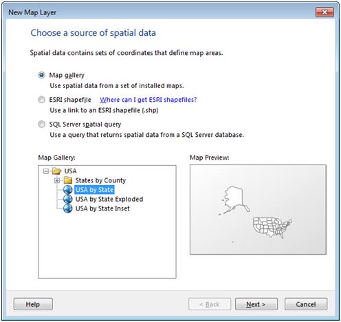
Figure 8. Map Wizard with USA by State Map Selected
The next screen will provide the option to change the map resolution, scale, and size. In addition, you have the option to include a Bing Maps layer, which will allow you to use the Bing web service to display actual geographic information about the area. Let’s keep all of the default options and click Next.
| Note: Using a Bing Maps layer will entail detailed reading into the legal ramifications for your organization. Be sure to check out the Privacy and Legal links in the Map Wizard if you want to take this route. |
The next screen lets us select what type of map we want to display: either show an area or show a piece of information for each area. With the three options of Basic Map, Color Analytical Map, and Bubble Map, we will select Color Analytical Map and click Next. After picking the CustomerCountByState dataset that we just created, we need to set up our analytical data.
The screen shown in Figure 9 allows us to match the metadata from the map file to the metadata from our dataset. The first section allows us to choose how we want to tie the information together. The second section (Spatial data) and the third section (Analytical data) show what the data looks like. Because our dataset returns full state names, we want to use the Spatial Dataset Field: STATENAME, and the Analytical Dataset Field: StateName.
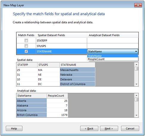
Figure 9. Map Wizard with Metadata Match Selected
Finally, we need to tell Reporting Services how to populate the bubbles. On the next screen shown in Figure 10, choose the Data field [Sum(PeopleCount)], and select a color theme. Once completed, click the Finish button.
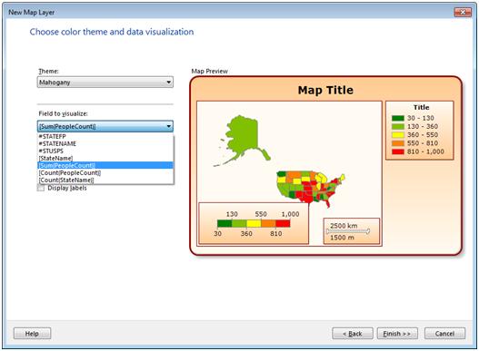
Figure 10. Map Wizard with Data Selected
Keep in mind that you can go back at any time and make changes to the map by selecting the inner area of the map and selecting the appropriate property pane. You can also make modifications directly to the map report item in the Design pane. After making a few tweaks, you can end up with the report shown in Figure 6!
No Longer the Unknown
After this article, we are now hopefully “Charting the Known” and are ready to start creating some great visualizations for our reports. We know how to create different types of charts and use maps to show geographic information. Our next step is to use the same principles we’ve learned here and take them to the next level. If your manager likes pie charts, he’s going to love dashboards, shown in the next level of the Stairway to Reporting Services series, Designing a Dashboard.
