Excel PivotTable Fields order different after upgrade to SQL 2022 SSAS tabular
-
June 14, 2023 at 12:50 pm
Hello,
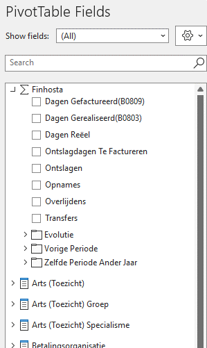
We have upgraded one of our SSAS Tabular environments to SQL 2022, and are noticing changes in the way the measures and dimensions are shown in the “PivotTable Fields” section in Excel when connecting to models on this server.
The tabular model we are using has compatibility level 1500, and when we deploy this on an SQL 2019 SSAS tabular server and connect to it via Excel everything works as expected: on top of the “PivotTable Fields” list you first get the measures, and below that an alphabetical list of the dimensions with their attributes:

If we deploy the exact same tabular model (compatibility level 1500, connected to the exact same dataset) to the SQL 2022 SSAS tabular server and connect to it (via the same Excel on the same pc as before), we see that the “PivotTable Fields” section is now different: The measures no longer have a separate section on top, but are shown together with the dimension attributes, and everything has different icons:

Seeing the SQL 2022 SSAS tabular version is the only difference between the 2 cases, we assume it has something to do with this new server version, and thus our question: is there a way to get the old layout back in Excel where the measures are shown separately on top of the list?
Thanks in advance!
-
June 15, 2023 at 1:10 pm
Thanks for posting your issue and hopefully someone will answer soon.
This is an automated bump to increase visibility of your question.
-
November 25, 2023 at 9:59 pm
hello, I faced same issue today. did you manage to separate measures from dimensions ?
Thank you
Viewing 3 posts - 1 through 3 (of 3 total)
You must be logged in to reply to this topic. Login to reply

