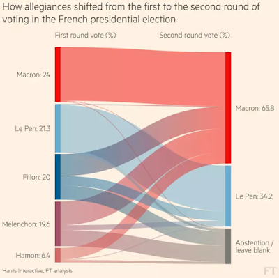
A usual use case for Stanley charts could a population migration between countries, as it has been shown in the Microsoft Power BI demo - https://powerbi.microsoft.com/en-us/blog/visual-awesomeness-unlocked-sankey-diagram/. Or, I've found it's a very fascinated case to show voters flow between first and second rounds in the recent presidential elections in France - French election results: Macron’s victory in charts via @financialtimes

I have been thinking about another case where Sankey diagrams could be used as well, which is a budget analysis, with multiple revenues flow contributing to an overall budget and then spending streams coming out of the same budget.
So I took the recent City of Toronto Budget 2018 open dataset: https://www.toronto.ca/city-government/budget-finances/city-budget/. With naturally good pie charts for separate revenue and spending categories. Here is how my two initial datasets looked like in Power BI:
Then for Revenue, I renamed my customer Category column to Source and added one more additional custom column Destination with a value "Budget". For Spending dataset, I added one custom column Source with a value "Budget" and renamed its custom category to Destination. Thus to show how sourcing revenue streams flow to the budget and then they flow from the sourcing budget to the sending destination. Here is how my final Sankey Budget dataset looked like:
Which could be used for the Sankey Power BI visualization that mainly requires Source, Destination, and Weight of the flow.
And now it looks like a budget book with revenue and spending data streams together.
Here is my actual report in Power BI that show this all information along with the regular pic charts, please let me know what you think.


