Update: Just getting started with Power BI? You can download the Power BI Report File for this KPI Report. Please find the link at the end of this post.
The Power BI KPI report is probably on top 10 of the most in-demand use-case for Power BI. In my previous post, I published the report I created with Power BI Desktop based on the Medicare payment data that I downloaded from Data.gov. That report was inspired by the New York Time’s “How Much Hospitals Charged Medicare for the Same Types of Cases” visual report. What I did differently on my report is slice the data a little bit further down to the provider level. If you check both reports, NYT’s and mine, you’ll see what I’m talking about.
I came across Jorge Segarra‘s (@sqlchicken) T-SQL Tuesday challenge to publish a Power BI report on the web for T-SQL Tuesday. So I went back to my Medicare Payment Power BI report and think of few ways to make it visually appealing and more “useful”.
If you’ve never tried Power BI before, I have written some getting-started posts:
Getting Started With Power BI Desktop: Installation
Getting Started With Power BI Desktop: Getting Data
Getting Started With Power BI Desktop: Simple Visualization
tl;dr
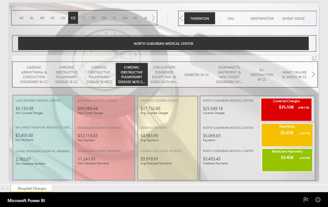
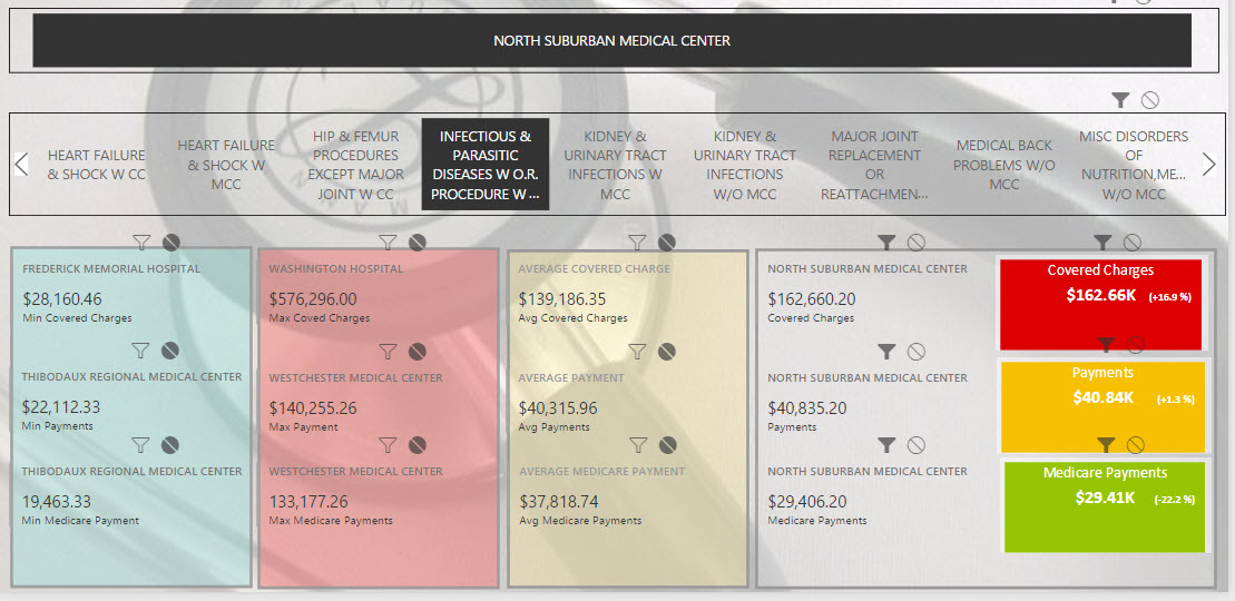
If you want to skip the whole how-to below, go directly to the Power BI KPI report by clicking the picture below.
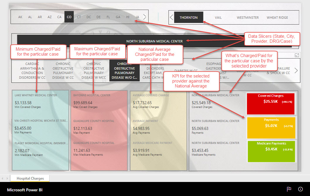
Guide to reading the Hospital Charge KPI report
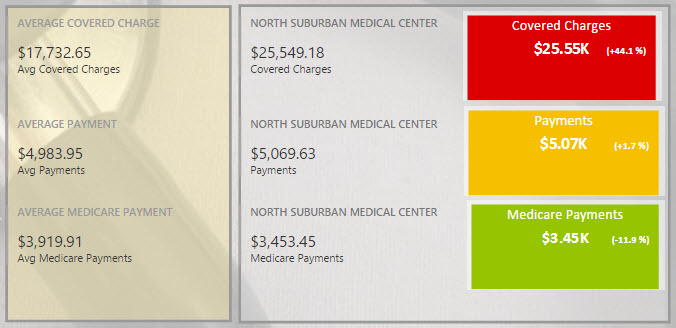
Here’s a simple illustration of how to read this Power BI KPI report. I hope it’s intuitive enough.
Power BI KPI: About the data
I downloaded the data that I used for this Power BI KPI report from Data.gov. I recommend you visit this site if you’re looking for data to play with for Power BI. The major columns that I focused on for this report are the Provider Name (Hospital), Average Covered Charges, Average Total Payment, and Average Medicare Payment. The amount of dollars provided in the data source and in this Power BI KPI report are not actual amount on per-case basis but the actual average of all those cases grouped together.
For example, the provider Southeast Alabama Medical Center have the following average amounts for the DRG case Extracranial Procedures w/o CC/MCC:
No of cases: 91
Average Covered Charge: $32,963.07
Average Total Payment: $5,777.24
Average Medicare Payment: $4,763.73
Just a little overview: “The data provided here include hospital-specific charges for the more than 3,000 U.S. hospitals that receive Medicare Inpatient Prospective Payment System (IPPS) payments for the top 100 most frequently billed discharges, paid under Medicare based on a rate per discharge using the Medicare Severity Diagnosis Related Group (MS-DRG) for Fiscal Year (FY) 2011. These DRGs represent more than 7 million discharges or 60 percent of total Medicare IPPS discharges.”
Slicers
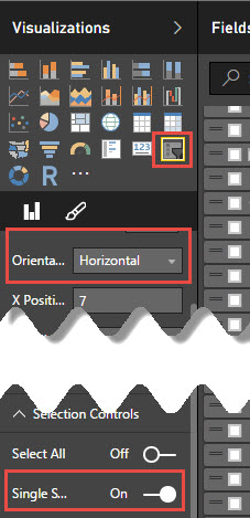
In this Power BI KPI report, the slicers, or filters, in this case, are Provider State, Provider City, and Provider Name. All the slicers are set up as illustrated (Horizontal orientation and Single Selection):
Slicer Interactions
The Slicer Interactions is a handy property that you can set to enable the slicer to cascade into another slicer. It also interacts as filters to other elements within the report.
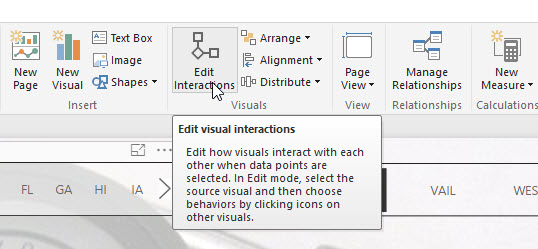
If you don’t see Funnel and Prohibition/No Sign icons on the visualization, select the Edit Interaction item in the Power BI ribbon:
![]() = Interaction between two (2) visualization or more components is ON.
= Interaction between two (2) visualization or more components is ON.
![]() = Interaction between two (2) visualization or more components is OFF.
= Interaction between two (2) visualization or more components is OFF.
The table below indicates (shaded/grayed) which visualization components interact with which component:
In the example below, the Provider Name slicer interacts with, or in this case, filters, the actual values and KPI’s but not with the Minimum values, Maximum values, and Average values cards.
New Table for Averages
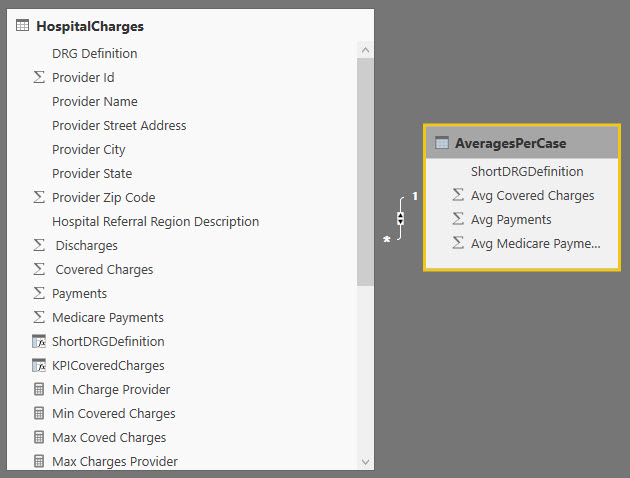
For the DRG averages, I created a separate table using the SUMMARIZE() function; and created a relationship between that and the main table using the DRG Definition as the relationship key.
[sql]
AveragesPerCase =
SUMMARIZE(
HospitalCharges, HospitalCharges[ShortDRGDefinition],
"AvgCharges", AVERAGE(HospitalCharges[ Covered Charges ]),
"AvgPayments", AVERAGE(HospitalCharges[Payments]),
"AvgMedicarePayments", AVERAGE(HospitalCharges[Medicare Payments])
)
[/sql]
String Function to remove Prefix
The DRG Definition has prefix numeric code [e.g., “nnn - “]. I created a new Column without this prefix using the RIGHT() and LEN() functions:
[sql]
ShortDRGDefinition =
RIGHT(
[DRG Definition],
LEN([DRG Definition])-6
)
[/sql]
Before: 039 - EXTRACRANIAL PROCEDURES W/O CC/MCC
After: EXTRACRANIAL PROCEDURES W/O CC/MCC
Minimum and Maximum Values
For this Power BI KPI report, I created new measures for Min/Max values for Covered Charges, Payments, and Medicare Payments using the MIN() and MAX() functions:
Minimum Values
[sql]
Min Covered Charges =
MIN([ Covered Charges ])
[/sql]
Maximum Values
[sql]
Max Covered Charges =
MAX([ Covered Charges ])
[/sql]
Multi-Row Cards
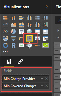
For the visualization of these min/max values, I used Multi-row card visualization component containing the Provider (Hospital) that charges that min/max amount and the min/max amount:
To find the matching provider to the min/max value, I used the LOOKUP() function:
[sql]
Min Charge Provider =
IFERROR(LOOKUPVALUE(HospitalCharges[Provider Name],
HospitalCharges[ Covered Charges ],
MIN([ Covered Charges ])),
"*Multiple hospitals")
[/sql]
 The
The IFERROR() function is there to handle multiple values. What I found out is that there are some min/max criteria that return multiple hospitals. For example, hospital A and B has the same dollar amount for x DRG which happens to be the minimum/maximum dollar amount in that category. So, if two (2) or more hospitals share the min, or max, dollar amount, the field will return the literal “*Multiple hospitals.”
Custom Visualization: KPI
Power BI Desktop, as of this writing, does not have a native or built-in KPI visual component. Thanks to Power BI Visuals Gallery. As adaption to Power BI grows, I’m sure we can have more and more of these visual components added to the gallery.
To add a third-party visual component to your Power BI report, Download the visual from the gallery. On the Power BI report designer, click on the Ellipsis on the Visualizations pane to add a visual component file:
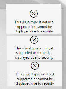
Since the component is from a third-party, Power BI won’t initially allow you to use it. It will notify you that you are taking a risk in installing it.
Aside from the notification bar that appears on the report designer, the visualization will appear as follows:
To enable the visualization, click on the enable button on the notification bar:
Key Performance Indicator in Power BI
The custom visualization that I used is called KPI Status with History (downloaded from the Power BI Visual Gallery). I don’t particularly need the “history” portion of the component for this particular KPI. I just need to see the deviation of the “actual value” from the “target value” which is the average value.
The threshold is set as follows (built-in in the visual component):
LOW (GREEN) – Less than Zero Amount compared to the Target Value
MEDIUM – OK (YELLOW) – 3% Band
HIGH (RED) – More than the 3% banding
My baseline for the KPI is the “average amount” (the “target value”) for that particular DRG with a 3% band, which means anything that goes beyond 3% of the “target value” is considered HIGH.
The percentage represented is the percentage of the increase/decrease based on the average amount. Think of it as a “markup” percentage, which is calculated as:![]()
Where:
Target Value = Average Amount
Actual Value = Actual Value of the selected provider
In the illustration above, the Covered Charges amount of $24,549.18 is 44.1% more than the average Covered Charges, which is $17,732.65 (HIGH – RED). The Payment amount of $5,069.63 is within the 3% band, which is 1.7% more than the Average Payment amount of $4,983.95 (OK – YELLOW). The Medicare Payment of $3,453.45 is 11.9% lesser than the Average Medicare Amount of $3,919.91 (LOW – GREEN).
Visualization Formatting in Power BI
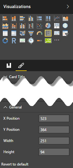
I set all the Multi-row card with the same width and height. I used a rectangle shape to group related visualizations together (min values, max values, average values, and the current values and their KPI). The visualization properties are the easiest way to align components in your report.
Adding a background to the Power BI report
Here’s how to add a background photo to your report.
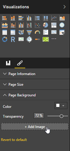
Click an empty space in your report, so that the report itself is selected (and not any of the components). Expand the Page Background from the Format Menu in the Visualization pane and click the Add Image button:
After the image has been imported and embedded to the report, select the Transparency and the Image Fit that you want.
Power BI Publication to Web
The latest feature in Power BI is the ability of the Power BI developer to give access to anonymous report viewers or public access.
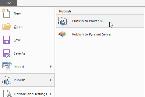
From the Power BI Desktop, save and Publish the report to Power BI Web:
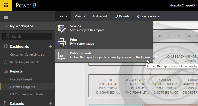
Go to File > Publish > Publish To Web
Then login to your Power BI web Account.
Open/select the Report that you want to publish to web. Go to File >Publish To Web
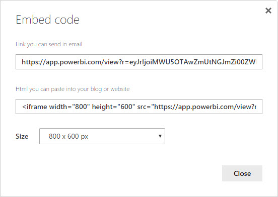
Power BI will give you a link that you can share via email or social media sites like Twitter, LinkedIn, and Facebook. It also provides you a code that you can use to embed the report in your blog.
For example, see my previous blog for the embedded Power BI Report.
Try it for yourself
Here you can download the Power BI Report file: HospitalChargeKPI.pbix
The post Power BI KPI Report: Hospital Charge Data appeared first on SQL, Code, Coffee, Etc..


