This time we were looking at the 211 Youth Services Data data set that lists all social services available for youth in Toronto.
Before I begin to share my experience working with this data set and building my new Power BI visualization, here is a link to a live Power BI report 211 Youth Services (Word Cloud) that I had a chance to present there.
The data set itself was an Excel file with 24 worksheets representing different categories of services for 1447 agencies, where each of the agency had the following attributes:
- AgencyName
- LegalStatus
- OfficePhone
- Website
- Address
- Neighbourhood
- Accessibility
- Hours
- Eligibility
- Languages
- Application
- DescriptionService
- DateUpdated
And I thought to myself, what if I can retrieve more insights out of this data in order to get better understanding of what actual work each of them do? And is there an efficient way to work work with such unstructured text data. So, I decided to specifically look at the DescriptionService column which is a free text attribute that describes different activities and programs for each of the agencies.
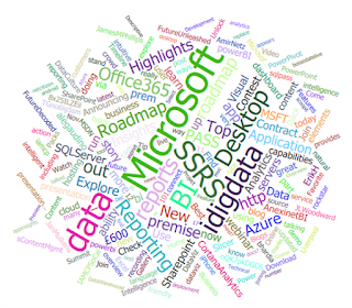
And I think, that I've found a perfect visualization instrument that works really well with text data; it's the Word Cloud visual control was introduced for Power BI in November of 2015 (Visual Awesomeness Unlocked - The Word Cloud). Basically this visualization shows a set of words in a form of a cloud where font size of each word is defined by how frequently it is used within a given data set.
Usually they demonstrate a use case with Twitter data being analyzed, however I decided to challenge this with a text field from 211 data set where column size varied from 17 to 4197 characters for different agencies. Could Power BI Word Cloud handle that much of text data in a single row and could I work with at least a thousand records to build my visualization? It actually worked!
The beauty of the existent Power BI reporting approach is that your can build a report where each of the visualizations can interact with each other. So if I click the word "employment" in my Word Cloud visualization then both Bing Map and Agency count with this word are affected as well:
It's amazing that such interaction can drive further data analysis and possibilities are limitless: from better understanding of high frequently activities and outlier analysis within a set of programs that each agency provides.
A few additional thoughts if you want to work with this Power BI Word Cloud visualization:
- Spend more time cleaning and preparing your data, you wouldn't want to let your cloud of words to be filled with some incorrect text sentiments.
- Keep the "Rotate Text" option Off, otherwise the Word Cloud looks a bit messy.
- And definitely set "Stop Words" option to On; it helps to hide some common words (to, from, or, and, etc.) from your cloud, also you can add some other exceptional phrases to your stop list.
In overall, I've enjoyed working with this Word Cloud visualization and would highly recommend it for any unstructured text data analysis.
So, If you have a Cloud of Words, let them Fly! 🙂


