I had the pleasure of helping Karla Landrum (@Karlakay22) for the PASS Summit 2012 by creating two dashboards: SQL Saturday events and PASS Chapters on a world map. If you attended either SQL Saturday round table or Community Zone at the Summit, you may have seen them.
I used PowerView for Excel 2013 preview to create them and deployed to Office 365 SharePoint preview. Preview license will eventually expire, and those dashboards will be gone. So I thought I’d save them on this blog.
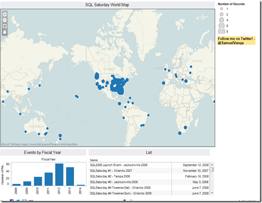
Since PowerView dashboards can’t be published for public access, I created similar dashboards using Tableau Public. If you’re interested in SQL Saturdays, I suggest you bookmark this page, because I plan on updating this view as new events are added in the future.
Clicking on the below image opens in a new window.
Tip: Use the + and – icons on the top left to zoom in and zoom out for a better experience!
PowerView Screen Prints
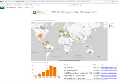
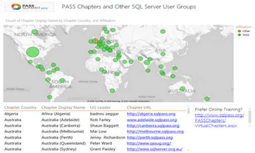
And, here are the screen prints people saw at the Summit, created using PowerView.
SQL Saturday Events on a World Map:
Highlight Upcoming Events:
Highlights Events for a Fiscal Year:
Drilldown by Country:
User Groups by Country:
You too can create these with PowerView. Here is how:
Download Excel 2013 preview from here, and the workbook I used from here. Dan English (@denglishbi) wrote an article titled PowerView meet Excel 2013 part1 and part2. That helps you get started. Dan also wrote a book on PowerView you may to check out. I haven’t read the book yet, but I heard good things.
Conclusion
I hope you enjoyed this post. If you saw these maps at the Summit, please let me know what you thought either by leaving a comment below or by sending a tweet to @SamuelVanga. I’d greatly appreciate that.
I enjoyed every bit of volunteering on this project for Karla and PASS. I appreciate the opportunity. Karla, Thank you! And thanks to Niko Neugebauer for his constant feedback to make the dashboards look better.
I’m glad I was able to help!


