By Steve Bolton
…………Most of the previous articles in this self-tutorials on using SQL Server to find outliers required us to implement statistical formulas, in order to derive measures that required some explanation before they could be interpreted correctly. In this segment of the series, we’ll be discussing a group of outlier detection methods that require very little interpretation, because they’re often self-evident. Many of the tests outlined in previous installments of this series can of course be trussed up with some eye candy in SQL Server Reporting Services (SSRS), but would still require some knowledge of the concepts involved in order to interpret them correctly. In this segment of the series we’ll instead highlight plots and charts whose significance can be grasped intuitively, even by amateurs like myself with few technical skills; we’ll be building reports that constitute separate outlier detection methods in and of themselves, rather than merely displaying the results of some other outlier test like Z-Scores or Chauvenet’s Criterion. The strength of data visualization methods like histograms and scatter plots is their simplicity, which allows even an untrained eye to spot outliers. On the other hand, their simplicity is also their major drawback, because they lack sophistication and rigor. All of the methods highlights in this segment amount to a sort of brute force approach to visualizing outliers, using an unconscious assessment that “if this data point looks out of place, we’ll look at it more closely.” It’s a quick but superficial strategy. For that reason it may pay to put these visualization techniques at the beginning of any outlier identification workflow, so that more rigorous and costly methods can be applied later on to the data points singled out by them for further investigation.
…………In addition, this set of visual detection methods is not immune from the downsides that have pervaded this series. Like any other outlier identification technique, charts of this kind don’t tell you why a record is an outlier; they merely flag them as worthy of further analysis. Moreover, as we have seen throughout this series, the sheer number of records we’re dealing with in typical modern database tables presents many challenges; we might not be constrained to the same degree as we were with statistical measures that are designed for hypothesis testing on a mere few hundred rows at best, like with Grubbs’ Test, the Modified Thompson Tau Test, Dixon’s Q-Test, Chauvenet’s Criterion, the Tietjen-Moore Test and the Generalized Extreme Studentized Deviate Test (GESD), but we still run into issues with fitting all of the data points of interest into a single chart. Various workarounds are available for this issue, such as displaying counts of distinct data points rather than each point individually, or more advanced methods like binning and banding (perhaps by fuzzy set membership), but some of them defeat the purpose by hiding the outliers from view. Furthermore, these visual methods are not insulated completely from the chicken-and-egg arguments over whether or not the aberrant values are departures from the expected distribution, or if they represent evidence that a different distribution would actually model the data better. Like an open-ended algebraic expression with too many variables, that question can only be solved by adding more evidence, in the form of goodness-of-fit tests – which are, as I’ve discussed previously in this series, are omitted with shocking frequency in many fields, as many professional statisticians lament. Outlier detection as a whole is essentially a crude form of pattern recognition, in which we single out records that don’t fit that pattern – which begs a question that is still debated in that field of machine learning, namely what the definition of a pattern is. That is why sooner or later, it will be necessary to apply some substantial domain knowledge to defining what type of pattern we’re looking for and whether or not particular records represent aberrations from it. Visual methods like scatter plots may give quick and cheap suggestions that a particular data point that is distant from all the rest may constitute an outlier, but they tell us nothing about why it is aberrant, or even if it is indeed a departure from our expectations. For that reason, these methods ought to be considered a starting point an outlier detection process, not its culmination.
…………For example, histograms are easy to read because they merely represent the counts of records for each distinct value in a set as a data bar, but they tell you nothing about what the counts are supposed to be. Like any other good idea, there are many variations on the theme, such as cumulative histograms in which the totals accrue until the entire count of records is reached, at a the upper right corner; I won’t present an example of this subtype, however, because it is difficult to spot outliers with them. It is more common to implement some kind of binning or banding scheme to the values, which normally appear on the horizontal axis, rather than changes to the frequencies (i.e. counts) that normally appear on the vertical axis. Figure 1 presents a stored procedure that allows users to choose between three different types of HistogramType values, in which the first is a simple frequency count (which isn’t of much practical use, so I’ve omitted any examples), the second organizes the counts of distinct values by their distances from the mean and the third bins them by the number of standard deviations from the mean, as is customary. Each HistogramType value is implemented in a different common table expression (CTE) in Figure 1, which ends with logic that selects between them. The rest of the T-SQL follows essentially the same format as the rest of the code samples provided in this series, such as the use of @DecimalPrecision to allow users to avoid arithmetic overflows by setting their own precisions and scales. The other four parameters enable users to create a histogram from any table in any database for which they have requisite access, as usual, while the rest is similar to the dynamic SQL examples provided in previous posts. The simple logic is implemented in a few math functions and windowing functions which are actually quite easy to follow, once you’ve subtracted the dynamic SQL they’re enclosed in.
Figure 1: Code for the Basic Histogram Stored Procedure
CREATE PROCEDURE [Calculations].[HistogramBasicSP]
@DatabaseName as nvarchar(128) = NULL, @SchemaName as nvarchar(128), @TableName as nvarchar(128),@ColumnName AS nvarchar(128), @HistogramType tinyint = 1, @DecimalPrecision AS nvarchar(50)
AS
DECLARE @SQLString AS nvarchar(max), @HistogramTypeString nvarchar(max), @SchemaAndTableName nvarchar(400), @IntervalNumber bigint = 1
SET @SchemaAndTableName = ISNull(@DatabaseName, ”) + ‘.’ + @SchemaName + ‘.’ + @TableName
SET @SQLString = ‘DECLARE @Min int, @Max int, @PopulationMean decimal (‘ + @DecimalPrecision + ‘), @StDev decimal(‘ + @DecimalPrecision + ‘), @StDevBucketNumber int,
@Count bigint, @PercentageMultiplier decimal (‘ + @DecimalPrecision + ‘)
SELECT @Count = Count(‘ + @ColumnName + ‘), @Min = Min(‘ + @ColumnName + ‘), @Max = Max(‘ + @ColumnName + ‘), @PopulationMean = Avg(CAST(‘ + @ColumnName + ‘ AS decimal(‘ + @DecimalPrecision + ‘))), @StDev = StDev(‘ + @ColumnName + ‘)
FROM ‘ + @SchemaAndTableName + ‘
SELECT @StDevBucketNumber = CEILING((@Max – @Min) / @StDev) — basically asking the question, “How many StDevs can we cram in between the min and max values?
SELECT @PercentageMultiplier = 100 / CAST(@Count AS decimal(‘ + @DecimalPrecision + ‘)) — for calculating percentages against the entire set;
WITH FrequencyCTE
(IntervalNumber, FrequencyCount)
AS (SELECT DISTINCT TOP 99999999 IntervalNumber * ‘ + CAST(@IntervalNumber AS nvarchar(50)) + ‘ AS IntervalNumber, Count(T3.’ + @ColumnName + ‘) OVER (PARTITION BY IntervalNumber)
FROM (SELECT DISTINCT ‘ + @ColumnName + ‘, CEILING(CAST(‘ + @ColumnName + ‘ AS decimal(6,2)) /’ + CAST(@IntervalNumber AS nvarchar(50)) + ‘) AS IntervalNumber
FROM (SELECT DISTINCT ‘ + @ColumnName + ‘
FROM ‘ + @SchemaAndTableName + ‘
WHERE ‘ + @ColumnName + ‘ IS NOT NULL) AS T1) AS T2
INNER JOIN ‘ + @SchemaAndTableName + ‘ AS T3
ON T2.’ + @ColumnName + ‘ = T3.’ + @ColumnName + ‘
ORDER BY IntervalNumber),
DividedIntoStDevIntervalsCTE
(IntervalNumber, FrequencyCount, DistanceFromTheMean, StDevInterval)
AS (SELECT *, ”StDevInterval” =
CASE WHEN DistanceFromTheMean / @StDev <= 0 THEN FLOOR(DistanceFromTheMean / @StDev)
ELSE CEILING(DistanceFromTheMean / @StDev)
END
FROM (SELECT *, CAST((@PopulationMean – IntervalNumber)
AS decimal(6,2)) * -1 AS DistanceFromTheMean
FROM FrequencyCTE) AS T1),
DistributionWithIntervalsCTE
(StDevInterval, FrequencyCount)
AS (SELECT DISTINCT StDevInterval, SUM(FrequencyCount) OVER (PARTITION BY StDevInterval)
FROM DividedIntoStDevIntervalsCTE)’
— DECIDE WHICH TYPE OF HISTOGRAM TO RETURN
SELECT @HistogramTypeString = CASE WHEN @HistogramType = 1 THEN
‘SELECT IntervalNumber, FrequencyCount
FROM FrequencyCTE‘
WHEN @HistogramType = 2 THEN
‘SELECT IntervalNumber, FrequencyCount, DistanceFromTheMean, StDevInterval
FROM DividedIntoStDevIntervalsCTE‘
WHEN @HistogramType = 3 THEN
‘SELECT StDevInterval, FrequencyCount
FROM DistributionWithIntervalsCTE ‘
ELSE NULL END
— *** I could also add to this by converting the Counts to Percentages *****”
SET @SQLString = @SQLString + @HistogramTypeString
EXEC (@SQLString)
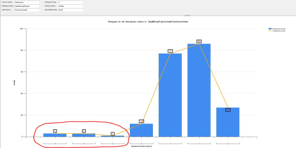
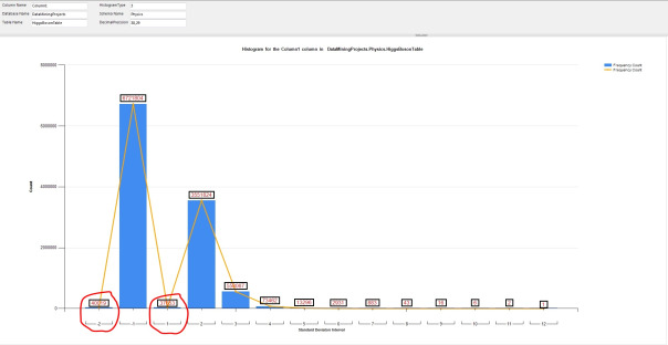
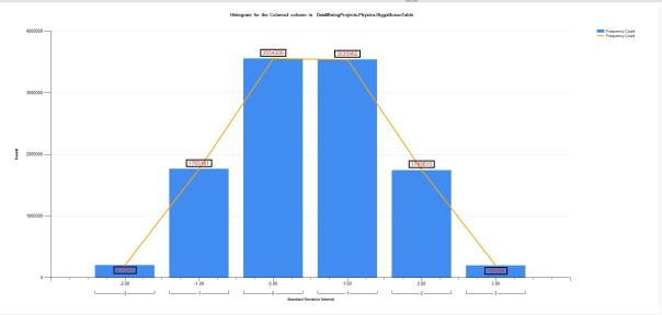
…………The procedure above was used to supply values for the four Reporting Services bar charts depicted in Figures 2 through 5, which display data from various columns from a 209-row dataset on the Duchennes form of muscular dystrophy and an 11-million row dataset on the Higgs Boson, which I downloaded from the by Vanderbilt University’s Department of Biostatistics and University of California at Irvine’s Machine Learning Repository respectively and converted into a database of about 7 gigabytes. The level of detail is dramatically reduced in the first two histograms, which represent different views of the same column in the DuchennesTable. The peaks and troughs that occur with interstitial outliers in Figure 2 are completely obscured in Figure 3, which limits us to looking at how frequently values fall outside the expected range – which is quite a bit in the cases of the values I’ve circled in red, since some of them are a whopping four or five standard deviations beyond the mean in a relatively small dataset. HistogramType 2 might provide more detail, but can’t be used with the far larger Higgs Boson Dataset, since we’d essentially run out of screen space to provide the counts of all the distinct values of any column compared to its mean. Note how lopsided the values are for the middle four standard deviations of the first float column in the HiggsBosonTable, which are shifted far to the left in the diagram because there are so many values occurring at exceptionally high standard deviation. As indicated by the red lines I circled them with, the values for the first standard deviation above the mean are minuscule in comparison to those for one standard deviation below it, just as the values two standard deviations above the mean vastly outnumber those that are two below it. This is a perfect illustration of how outlier detection methods often represent the flip side of goodness-of-fit tests, because unless the table consists of little else except outliers, then this column clearly does not fit the bell curve shape of the Gaussian i.e. “normal” distribution. Column 2 in the same dataset may fit the normal distribution though, as is self-evident from the roughly bell-curved shape of Figure 5.
Figure 2 to 5: Four Sample Reports with Outliers for the Histogram Stored Procedure (click to enlarge)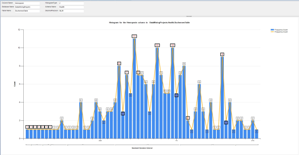
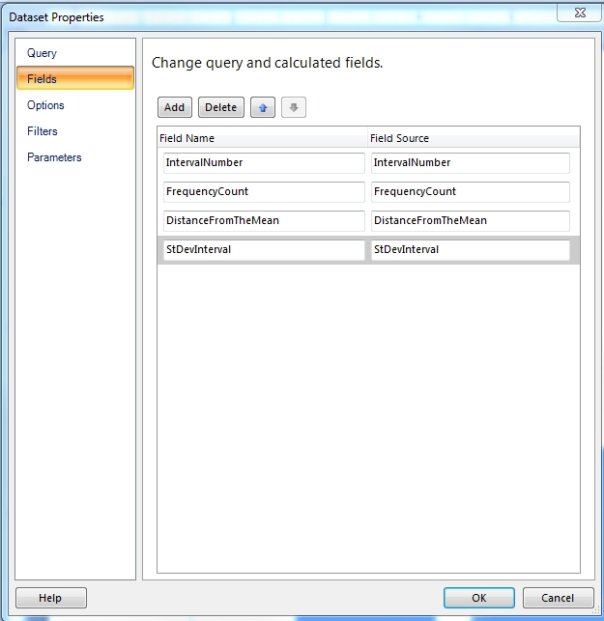
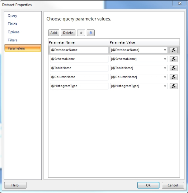
…………This is not a lesson in how to do basic tasks in Reporting Services, like adding a diagram to a report, which I will omit in order to avoid the kind of extraneous detail that so often clutters tutorials on other computing subjects. There are plenty of other tutorials available that can explain such tasks more competently and cleanly than I can. Yet there are a few nuances here that require explanation, including the technique used to populate these reports from the stored procedure.[1] As depicted in the three Report Builder windows in Figure 6, you have to right-click the Datasets folder in the Report Data Explorer, then select the “Use a dataset embedded in my report” button on the Query tab, then select the Stored Procedure button under Query Type and pick the right procedure out of the drop-down list that appears under “Select or enter stored procedure name.” Typically, you’ll have copy and paste the names of the columns returned by the stored procedure into both columns displayed on the Fields tab. You may also need to copy and paste the parameter names (including the ampersands) on the left column in the Parameters tab, then again enclosed in brackets on the right column, or use the function buttons to the right to add the parameters manually. It is also sometimes necessary to add the parameters again by right-clicking on the Parameters folder in the Report Data Explorer, although SQL Server sometimes autocompletes these. I’ve highlighted the difference between the two Parameters locations in the top graphic. It is important (but not all that important) to follow these directions, since we’ll be essentially following the same script to implement other procedures in the next two tutorials.
Figure 6: Setting Up a Reporting Services Dataset to Use a Stored Procedure
…………One the key principles of visual outlier detection is to highlight them in some way, as I’ve done in Figure 2 by changing the label color and box border width whenever the frequency counts are more than two standard deviations beyond the mean in either direction, or when they fall or rise by more than a count of three from one value to the next. The code for this is depicted in Figure 8. There may be a workaround for this – I’m familiar with SSRS but am certainly not knowledgeable – but you’re apparently only limited to a Previous function that is essentially equivalent to the T-SQL Lag function with a value of one, since there is no “Next” function equivalent to Lead that would allow you to go in the other direction. If you need reports of this kind for outlier detection, it may pay to do the reading I have not done yet on how the human eye reacts to contrast, shading and various other stimuli in order to highlight such values. One common sense example of this principle is the use of red for highlighting. One avenue I want to investigate further is to set the normal values semi-transparent, which might provide the needed contrast in an eye-catching way. Unfortunately, I don’t think there is any clean, straightforward way of implementing it through a Transparency or Opacity property at present, although I may be wrong. As SSRS developer Graeme Malcolm lamented in one useful tutorial, “It turns out you can only set a transparency level for gauges and charts in Reporting Services – not for shapes or data regions.”[2] One workaround is to either set the Fill color to No Color in the Properties[3] or set the color to Nothing programmatically[4] when a particular value meets your conditions. You might also get achieve semi-transparency by setting the bars of the normal values to colors only slightly different from the background, such as a different shade of white. A little imagination could go a long way when designing reports for outlier detection; you could, for example, apply gradients to shade data points based on their Z-Scores or something similarly fancy. Keep in mind, however, that there are limitations in terms of things like screen space that eventually force tradeoffs and constrain the possibilities. Once data records get numerous enough, you can adjust the widths and heights of SSRS charts and their constituent elements to accommodate them, but eventually you may run out of room entirely and be forced into strategies like binning, as we were in the case of the 11-million-row HiggsBosonTable.
Figures 7 and 8: Setup for the Hybrid Line Chart and Associated Outlier Highlighting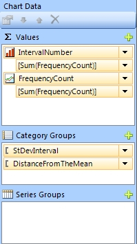
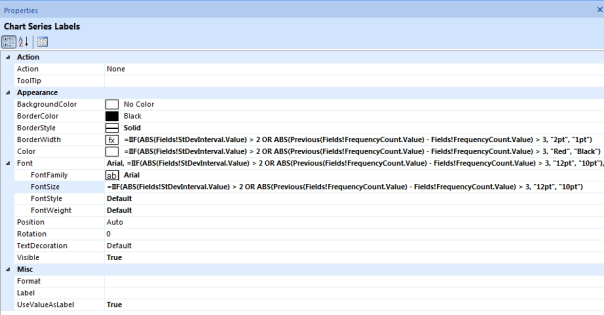
…………All four sample reports include a line chart that traces the peaks of the bar graph, thereby adding more information in an easily comprehensible and efficient manner. I followed the directions for creating a hybrid visualization of this kind in the “Column and Line Hybrid Charts” section of Robert M. Bruckner’s classic TechNet white paper, “Get More Out of SQL Server Reporting Services Charts.”[5] The Cliff’s Notes version of the implementation is to create a second data series, right-clicking in the Chart Data and select Change Chart Type. That is why we have one series for IntervalNumber and another for FrequencyCount in the sample Chart Data window depicted in Figure 7, which was used in the four sample reports.
…………The directions for building and interpreting a line chart of this kind are trivial, so I’ll dispense with them. Once we know how to create one, however, it is child’s play to adapt it for use as an alternative form of outlier detection known as a run sequence plot or run chart. For the most part, what we’re looking for is the same kind of peaks and troughs evident in the hybrid charts we’ve already seen, except without the accompanying histograms. It is actually a more limited identification method, however, because we’re comparing values vs. time slices rather than values against their counts, which doesn’t necessarily tell us anything about how frequently a value should occur. A line chart for department store sales, for example, might see a big jump in sales before Christmas and a commensurate slump afterwards, but domain knowledge would tell us that the associated peaks and troughs represent the expected distribution, not actual outliers. More subtle relationships might be discovered through Time Series algorithms like the ones I covered in A Rickety Stairway to SQL Server Data Mining, Algorithm 9: Time Series, which are often visualized through run sequence plots of the same kind.
Figure 9: Code for the Simple Run Sequence Plot Stored Procedure
CREATE PROCEDURE [Calculations].[RunSequencePlotSP]
@DatabaseName as nvarchar(128) = NULL, @SchemaName as nvarchar(128), @TableName as nvarchar(128),@ColumnName AS nvarchar(128), @TimeColumnName AS nvarchar(128), @DatePeriodType as nvarchar(400), @DecimalPrecision AS nvarchar(50)
AS
DECLARE @SQLString AS nvarchar(max), @SchemaAndTableName nvarchar(400), @DatePeriodTypeString nvarchar(400)
SET @SchemaAndTableName = ISNull(@DatabaseName, ”) + ‘.’ + @SchemaName + ‘.’ + @TableName
SELECT @DatePeriodTypeString = CASE WHEN @DatePeriodType = ” THEN ‘@TimeColumnName‘
WHEN @DatePeriodType = ‘Year’ THEN ‘Year(‘ + @TimeColumnName + ‘)’
WHEN @DatePeriodType = ‘Month’ THEN ‘Month(‘ + @TimeColumnName + ‘)’
WHEN @DatePeriodType = ‘Day’ THEN ‘Day(‘ + @TimeColumnName + ‘)’
WHEN @DatePeriodType = ‘Week’ THEN ‘Datepart(week, ‘ + @TimeColumnName + ‘)’
ELSE NULL END
SET @SQLString = ‘SELECT DISTINCT ‘ + @DatePeriodTypeString + ‘ AS TimePeriod, Avg(CAST(‘ + @ColumnName + ‘ AS decimal(‘ + @DecimalPrecision + ‘))) OVER (PARTITION BY ‘ + @DatePeriodTypeString + ‘ ORDER BY ‘ + @DatePeriodTypeString + ‘) AS Mean,
Min(CAST(‘ + @ColumnName + ‘ AS decimal(‘ + @DecimalPrecision + ‘))) OVER (PARTITION BY ‘ + @DatePeriodTypeString + ‘ ORDER BY ‘ + @DatePeriodTypeString + ‘) AS Minimum, Max(CAST(‘ + @ColumnName + ‘ AS decimal(‘ + @DecimalPrecision + ‘))) OVER (PARTITION BY ‘ + @DatePeriodTypeString + ‘ ORDER BY ‘ + @DatePeriodTypeString + ‘) AS Maximum, StDev(CAST(‘ + @ColumnName + ‘ AS decimal(‘ + @DecimalPrecision + ‘))) OVER (PARTITION BY ‘ + @DatePeriodTypeString + ‘ ORDER BY ‘ + @DatePeriodTypeString + ‘) AS StandardDeviation Var(CAST(‘ + @ColumnName
+ ‘ AS decimal(‘ + @DecimalPrecision + ‘))) OVER (PARTITION BY ‘ + @DatePeriodTypeString + ‘ ORDER BY ‘ + @DatePeriodTypeString + ‘) AS Variance
FROM ‘ + @SchemaAndTableName + ‘
WHERE ‘ + @ColumnName + ‘ IS NOT NULL
ORDER BY ‘ + @DatePeriodTypeString + ”
EXEC (@SQLString)
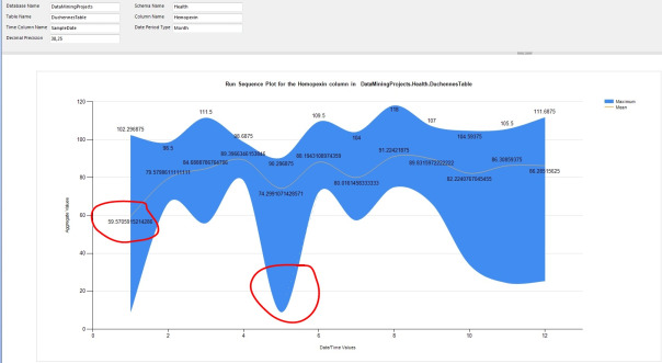
…………Run sequence plots are not only simple to interpret but a breeze to program. The procedure in Figure 9 may be the shortest I’ve posted to date in this series and can be followed effortlessly, if you’re familiar with T-SQL and have seen the sample code I’ve posted previously. All it does is extract a count of all distinct values for a particular column, partitioned by another column that typically represents a time slice. The can of course be easily extended to handle other DatePart values like quarter, month, dayofyear, weekday, hour, minute, second, millisecond, microsecond, nanosecond, etc. – whatever your use cases call for. I’ve thrown in the kitchen sink as far as built-in aggregates go, but the ones you don’t need can of course be removed with a few backspaces. The @DatePeriodType parameter accepts the values Year, Month, Day and Week to partition the time column by particular intervals, or can be left blank to return all time periods. Note that it may be necessary to use the @DecimalPrecision parameter to avoid missing values in the chart, not merely to prevent arithmetic overflows; for whatever unfathomable reason, SSRS sometimes returned blank charts with no warnings or error messages unless I ratcheted the precision and scale down a little. For example, I was using 38,29 most of the time and my means wouldn’t show up, nor my mins and maxes, but changing it to 38,27 brought them back.
Figures 10 and 11: Simple Run Sequence Plot Example with Outliers (click to enlarge)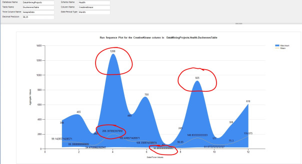
…………Run Sequence plots are frequently used to compare the Time Series values of multiple columns for exploratory data mining purposes, but I’ve only included a single column in the example in Figure 10 because our purpose is outlier detection. I’ve adapted it to that purpose by adding a Smooth Range Column visualization that displays the minimum and maximum values for the same column at the same time slices as the line chart, which displays the mean. That gives us a more accurate picture of the variability of the values over time without adding much difficulty to the interpretation or wasting white space that could be providing more information. For example, the sample reports above show not only a few obvious outliers on the line chart for the CreatineKinase and Hemopexin columns of the DuchennesTable, but a few extreme peaks and troughs in the min and max values.[6] This may not be a typical use for run sequence plots, but it does make them more useful for outlier detection purposes. In the next article I’ll delve into other chart types like box plots that are grouped together with the Range Column and Smooth Range Column in Report Builder, but which are unfortunately hampered by constraints that make them much less useful in detecting outliers in large datasets.
[1] Please note that I consulted several webpages awhile back in order to learn how to do this, but can’t find my original citations in order to give proper credit
[2] Malcolm, Graeme, 2010, “Using a Transparent Background in Reporting Services,” published Oct. 13, 2010 at the Content Master website. Available online at http://cm-bloggers.blogspot.com/2010/10/using-transparent-background-in.html.
[3] I got this idea from Yilmaz, Eralper, 2014, “Building Transparent Stacked Column Charts Using MS SQL Server Reporting Services 2008,” published at the Kodyaz Development Resources website and available at the web address http://www.kodyaz.com/articles/transparent-stacked-column-in-reporting-services.aspx
[4] I took this idea from the reply by the user name i_h in the thread “’Transparent’ is not a Valid BackgroundColor?” published Jan. 13, 2012 in the MSDN forums. Available at the web address https://social.msdn.microsoft.com/Forums/en-US/81ec0049-f007-4619-b8df-ee74ec2b9ec1/transparent-is-not-a-valid-backgroundcolor?forum=sqlreportingservices
[5] Bruckner, Robert M., 2006, “Get More Out of SQL Server Reporting Services Charts,” a white paper published by Techet in September 2006. Available online at http://technet.microsoft.com/en-us/library/aa964128(v=sql.90).aspx
[6] These results should be taken with a grain of salt, however, because I have had trouble accurately converting the SampleDate column in the original Duchennes dataset to a SQL Server date data type.


