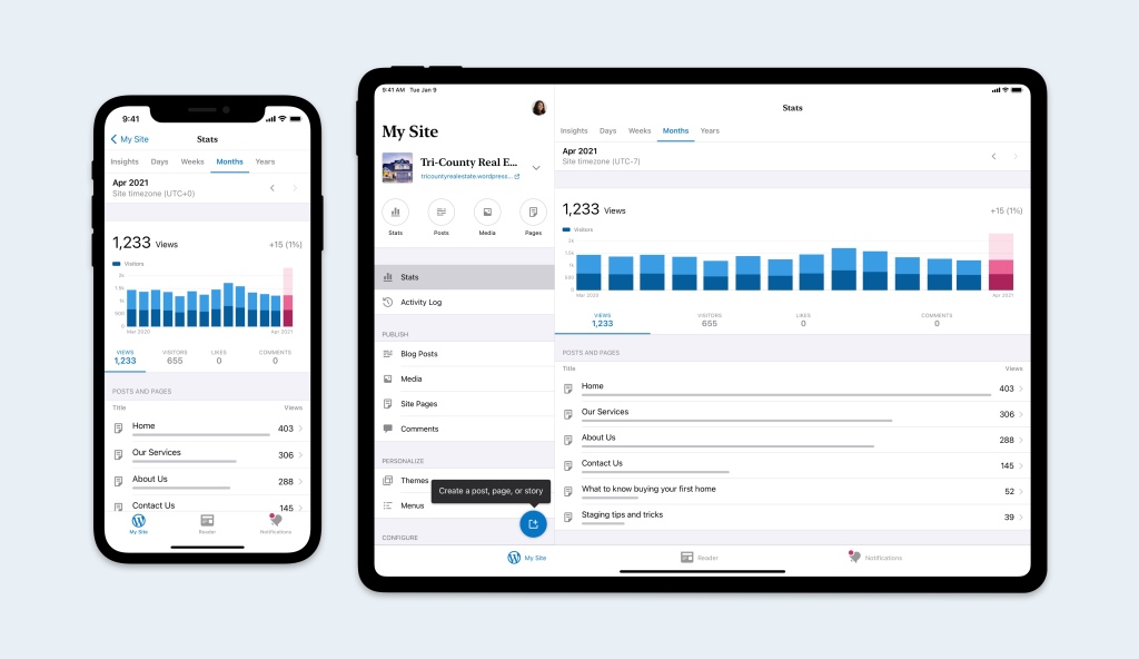
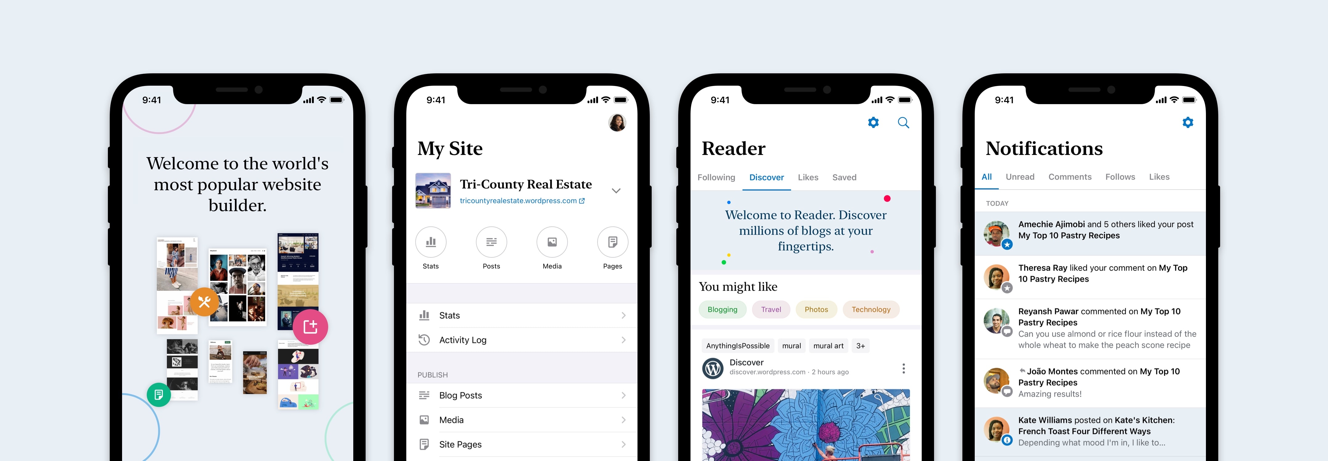
The WordPress mobile apps are the best way to manage your site from anywhere. If you’re already using the app, you might have noticed a new visual design that’s been rolling out. That rollout is complete in WordPress 17.1, which is available today for both Android and iOS. If you’re not already using it this is the perfect time to give it a try!

We add new features and improve the WordPress apps in every release, but our visual design hasn’t changed much in the last few years. Over the last few months we’ve thought about how to modernize the design of the apps. As we’ve implemented features like Dark Mode, we’re taking advantage of new components made available in the latest versions of iOS and Android.
Bigger, bolder headers call out key product areas and create a distinction between the top level tabs and deeper levels of the apps. A new color palette pairs a more neutral background that lets your content shine with brighter blues that make interactive elements even more noticeable. A new serif typeface is a nod to WordPress’s roots in writing and publishing.

We hope you enjoy these updates as you use the apps and we’d love to hear your feedback. Reach out to us from within the app by going to My Site, tapping your photo on the top right, tapping Help & Support, and then selecting Contact Support.
