This is the third installment of our Getting Started With Power BI Desktop series. The first post is about installation and the second is about getting data. In this post, let’s see how easy it is to create visualization on Power BI Desktop. If you’re quite familiar with creating graphs in Excel, you already got what it takes to start using this powerful visualization tool.
Fire up the Power BI Desktop app. When the splash screen pops up, select the report file (.pbix file) that we saved from the previous post (Consumer_Complaint_US.pbix).
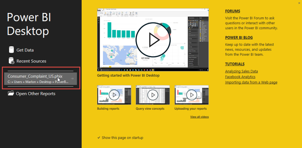
You can also open this file by going to the File tab (ribbon) and select the Open an existing report option.
On the left side of the report designer are the Visualizations and Fields panes. Most of the simple visualization tasks are accomplished by drag-and-dropping the components and elements from these panes.
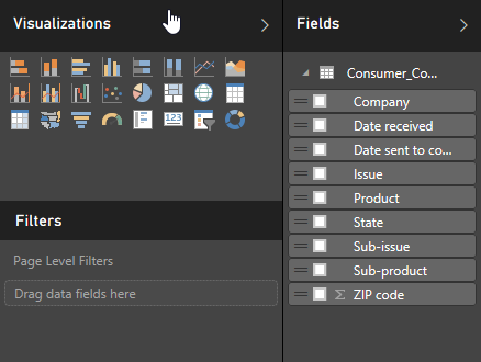
Let’s create a simple graph for a start.
Select (click) the Bar Chart from the Visualizations pane.
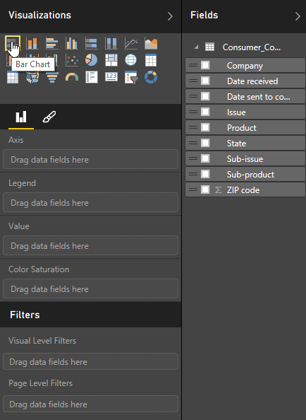
An empty graph then appears on the designer.
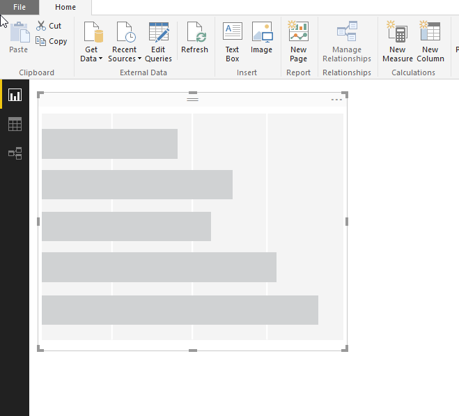
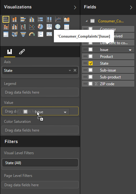
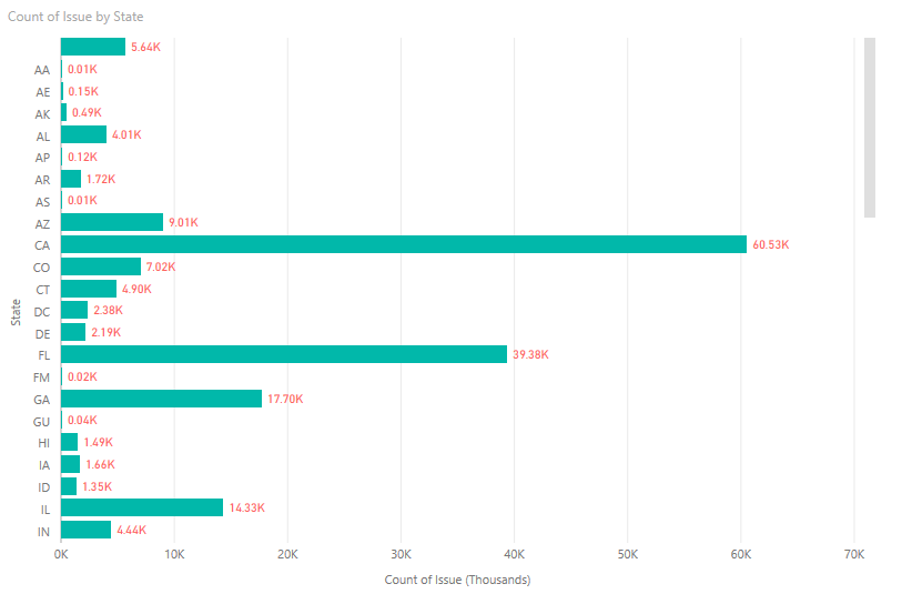
Drag-and-drop the State field on the Axis and Issues on the Value.
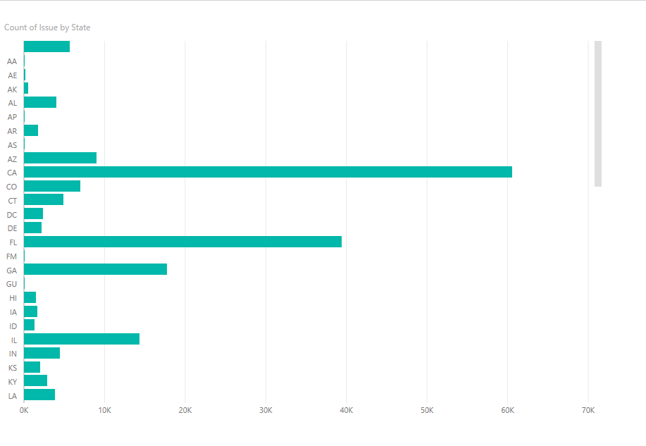
And, just like that, your first visualization on Power BI Desktop is complete.
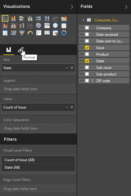
Let’s do some formatting . Click the Brush icon in the visualization pane.
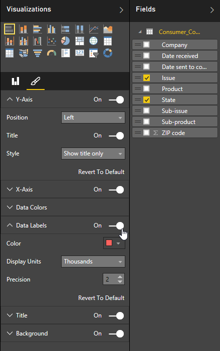
Let’s set some properties to change the appearance of our bar graph. Change whatever you want.
And here it is…a simple visualization created in Power BI Desktop.
We’ll dig more visualization techniques in the next installments of this Getting Started With Power BI Desktop series.
The post Getting Started With Power BI Desktop: Simple Visualization appeared first on SQL, Code, Coffee, etc..


