Accessibility is often overlooked or ignored when it comes to reporting and data visualization. I think there are two reasons why:
- We often don’t consider user scenarios with which we aren’t familiar. If we don’t know someone with color blindness/low vision/dyslexia/repetitive strain injuries, we don’t understand the difficulties they might have interacting with our reports.
- Making accessible data viz is still quite challenging. Reporting tools aren’t very mature in this area. It gets overwhelming or disheartening when we can’t accommodate all the different accessibility scenarios with the tools we already have in place. And there aren’t a lot of good examples or design guidelines for making accessible reports.
It’s easier to build accessibility into our report designs from the beginning rather than trying to retrofit. While there aren’t many people talking about building accessible data viz, there is quite a bit of information on accessibility for web design that is applicable to data viz. The WCAG 2.0 guidelines and techniques provide several good ideas.
We should not adopt the attitude that since we can’t make our Power BI reports accessible for everyone, we should not bother making it accessible for anyone. Making reports more accessible often results in increased usability in general. Understanding that we can’t easily meet all current and future accessibility needs, we can identify which design tactics provide the greatest return on effort and start by implementing those. Here are four things that you can do today to increase the accessibility of your Power BI reports that don’t require a lot of effort.
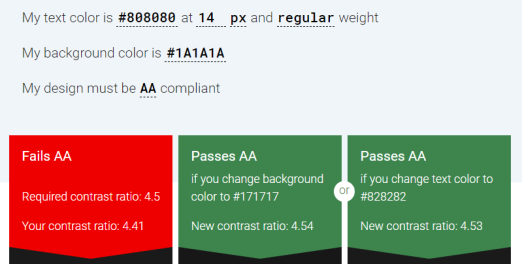
- Make sure there is enough contrast between text and background colors. Check your text boxes, chart titles, axis titles, and data labels to make sure they can be easily read over your selected background color(s). Websites like http://accessible-colors.com/ can help you check your color contrast. ISO standards recommend a minimum contrast ratio of 3:1 while WCAG AA standards use 4.5:1. You can copy hex values or use a free tool like Instant Eyedropper to get the hex values of your colors into the site and check your contrast ratio. The Accessible Colors site will check your current contrast ratio and recommend similar colors that increase your contrast ratio to meet WCAG guidelines. This accommodates low vision users as well as people with aging eyes who spend all day looking at a screen. Check out the color combinations here for examples and ideas.

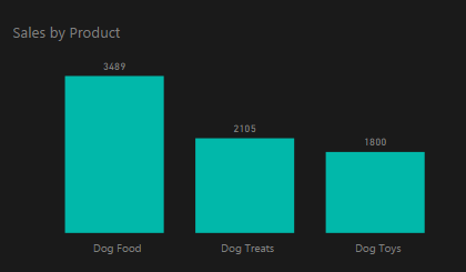
Chart with inadequate color contrast between background and text 
Output from Accessible Colors showing the contrast ratio from hex values entered 
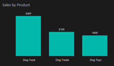
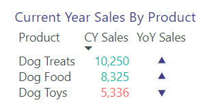
Chart with improved color contrast between background and text - Avoid using color as the only means of conveying information. Add text cues where possible. It’s very common to show KPIs with a background color or a box next to a metric that uses red/yellow/green to indicate status. Users who have difficulties seeing color need another way to understand the status of a key metric. This could mean that you use a text icon in addition to or instead of color to indicate a status. Power BI reports often include conditional formatting to change the background color or font color of items in a table to convey high/low or acceptable/unacceptable values. If that is important for your users to understand, you could add a field containing the values “high” and “low” to the table itself or to the tooltips. Tooltips are accessible to screen readers via the accessible Show Data table (Alt + Shift + F11).

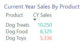
Matrix with only color used to indicate the year-over-year sales trend 
Matrix with color and icon used to indicate the year-over-year sales trend - Replace unnecessary jargon and acronyms. Try to avoid causing an unnecessary learning curve just to read and understand the titles and labels of your report. This helps those with cognitive disabilities, those whose native language is not that of your report, and those who are new to the subject area your report addresses. There is a balance here – sometimes it’s good to use common industry terms and assume a certain amount of knowledge. We don’t want to oversimplify information in a report or clutter a report with information that distracts most users rather than helps them. And sometimes it’s difficult to fit long chart titles and labels in Power BI. But if you show your report to a representative of your intended audience, and they have to ask about the acronyms/abbreviations/jargon used, you have some opportunities for improvement.
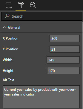
- Add alt text to all non-decorative visuals on the page. You may not have screen reader users now, but you may in the future. It only takes a couple of minutes to add alt text to your reports starting now, rather than wait and have to complete a big project to add alt text to all your reports later (or have a user that can’t read your reports because it was decided that it’s not worth the time/cost to go back and add alt text). Alt text is an easy way to summarize the important findings in a visual when you are making a report with static data. When you have data that is periodically refreshed, you can use the alt text to describe what the chart is showing. This helps the user decide if they want to look into the accessible See Data table for more information.

It’s common to assume that we don’t need to make our Power BI reports accessible when we can’t see anyone in our intended user group that has an obvious disability. Many people have struggles that are not immediately noticeable. And many of the design changes we would make for accessibility also make our reports more usable for people with conditions we don’t consider to be “real” disabilities (distracted/low attention span, aging eyes, new to the job).
Perhaps you don’t have users with low vision (or cognitive or muscular disabilities) consuming your reports today, but wouldn’t it be great if you were already prepared for them when they do begin consuming your reports, rather than being another person who has unintentionally excluded them?
If you would like to learn more about building accessible Power BI reports, please attend my session at SQLSaturday Phoenix on March 17 or SQLSaturday Colorado Springs on March 24.


