The SQL Server PDW (Parallel Data Warehouse) is a beast of a machine. Spreading workload across multiple nodes inside the PDW provides a huge performance gain over a traditional SQL Server; however, when laying out tables it is a little different. There are two options for creating tables on the disk:
- Replicated: The entire table is stored on each node of the PDW
- Distributed: The table data is spread over all the nodes
Skew comes into play when talking about distributed tables. Skew is when data is not uniformly spread across the appliance. For instance, if you are working with a 10 node system then ideally 1/10 of your data will be on each. This is probably never going to be the case. How these two types of tables work in the background is a discussion for a separate entry.
When creating a distributed table on the PDW a distribution key is specified that determines where the data will be stored based on a hash function performed on the appliance. The query below will create a table hashed on the column ID.
CREATE TABLE myTable (
id int NOT NULL,
lastName varchar(20),
zipCode varchar(6))
WITH
( DISTRIBUTION = HASH (id) );
The end result is anytime the same ID is encountered, the number 8 for instance, it is always sent to the same distribution, and for argument sake we will say compute node 1 distribution 6. The problem comes in when you choose a column that has a lot of values that produce the same hash. If 50% of the data produces the same hash result then 50% of our data is going to be stored in the same distribution. The result is any query needing data from the distribution with more data will take longer to process than the rest.
Knowing the distribution skew is therefore very important. It is not uncommon to change the distribution column several times before finding the right one or even store the data multiple times with different distribution keys to cater to query performance. So, how do we find the skew in our data?
On PDW we can run DBCC PDW_SHOWPARTITIONSTATS and provide a table name to find the skew. Something to note here is that the table name has to be in double quotes, not single like most SQL syntax.
DBCC PDW_SHOWPARTITIONSTATS(“MyDistributedTable”)
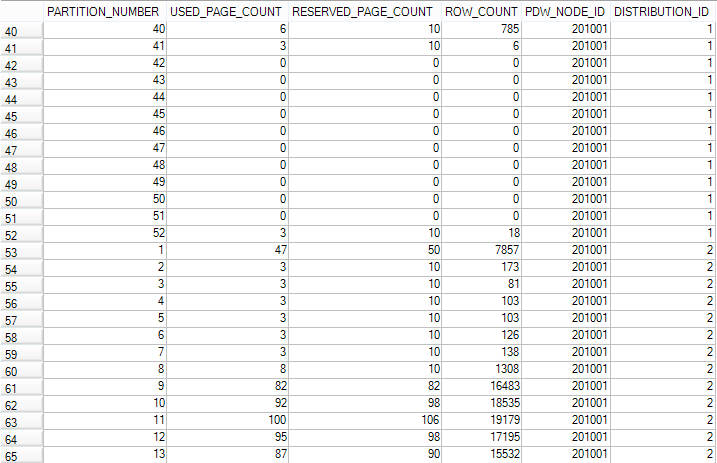
Let’s examine the results. We end up with a record for each partition, node, and distribution combination.
- PARTITION_NUMBER: If your table is partitioned as mine is in this screenshot you will have a record for each partition. If the table is not partitioned you will only see partition_number of 1.
- USED_PAGE_COUNT: This is the number of pages of data in the partition on that node and distribution.
- RESERVED_PAGE_COUNT: This is the number of pages allocated to the partition.
- ROW_COUNT: This is what we are really after, the number of records in the given partition, node and distribution combination.
- PDW_NODE_ID: The ID of the compute node.
- DISTRIBUTION_ID: Distribution ID for the data.
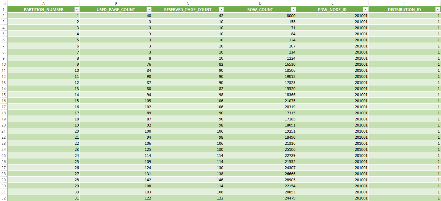
For the discussion of skew we don’t really need to worry about the partition. What we really want is the total summed row count by PDW_NODE_ID and DISTRIBUTION_ID. This is a nice little output, but I find it much easier to look at skew not only with the raw number of records per distribution, but also visually. I tend to take these results and copy them into an Excel workbook and format the data as a table.
Now we have the same results (in my case 4,160 rows = 52 Partitions * 10 Compute Nodes * 8 Distributions per node).
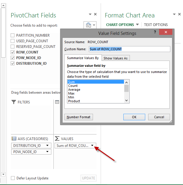
Next, we will create a PivotTable and PivotChart from the table. In Excel on the Insert tab select PivotTable from the far left. Select to add this table to a new worksheet. From the PivotTable field list drag DISTRIBUTION_ID to rows followed by PDW_NODE_ID to rows. Then drag ROW_COUNT to Values. By default this will be a count of ROW_COUNT, not a sum. To switch it to a sum click the arrow on the right side of ROW_COUNT and select Value Field Settings. Change the Summarize value field by from Count to Sum.
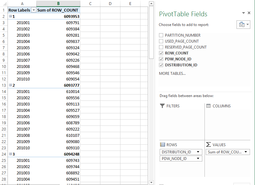
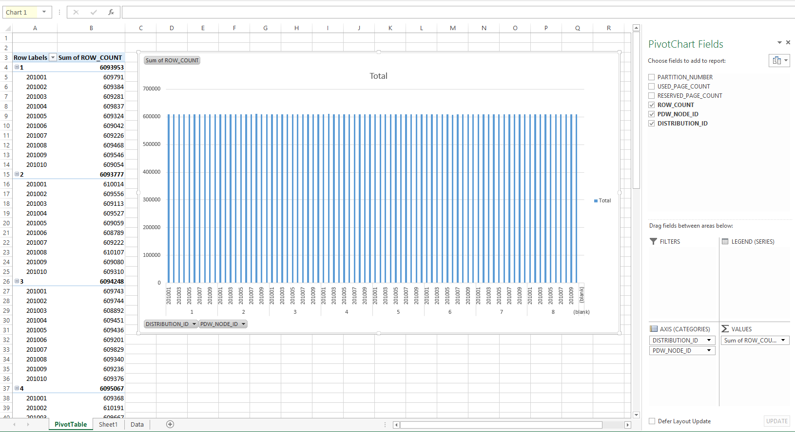
The result should look like this:
Now we have a count of rows in each distribution. Ideally this should be as close to the same number in each distribution as possible. My table happens to have an awesome distribution key and the skew is less than 1,000 from the smallest to largest distribution. Not bad for a table with over 48 million records!
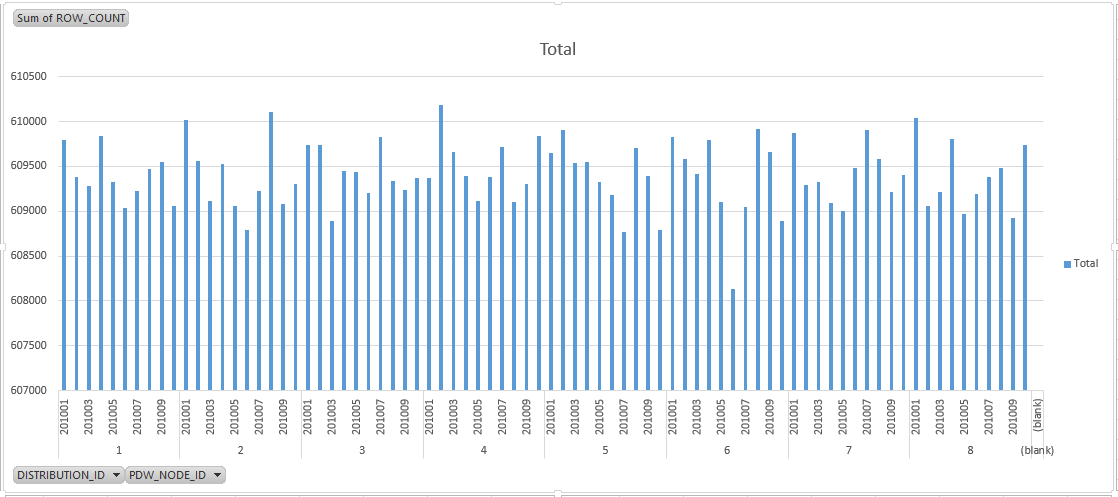
Let’s take it one step further though. We want to not only see the numbers, but have a visual of our skew. With the PivotTable selected go to the Insert tab and select column chart. Doing this will tie the column chart to the same data that is in the PivotTable. Initially our data doesn’t look so good. There are some large peaks and valleys in the chart, but we know that the skew isn’t bad. If you look at the scale for the chart you’ll notice that Excel has “intelligently” decided to start the scale at a value that will allow us to see the difference in each bar. It does not start at 0.
If you right-click on the Y-axis and select Format Axis you can change the minimum bound from the automatically chosen value to 0. Now the skew in the chart is a much better representation of the data in the table.
From here you can change the filters and look at skew inside each individual node or a combination of distributions/nodes. I have posted a copy of the Excel sheet I created so you have a reference to use later on.
One last note: for distribution keys try to choose a column with no NULL values or very few. NULL will always hash to Compute Node 1, Distribution 1 no matter the data type.
Download my Excel Sheet for visualizing skew


