Microsoft has stated pretty clearly that they’re putting code on Azure first, ahead of the desktop. Which makes one wonder when we’re going to start to see some of this cool stuff within SSMS. What cool stuff you ask? Well, let me explain. Let’s start with a query:
SELECTm.MovieName,
msd.MovieStageName,
st.StageTypeDesc
FROMdbo.Movie AS m
JOIN dbo.MovieStage AS ms
ON m.MovieId = ms.MovieID
JOIN dbo.MovieStageDefinition AS msd
ON ms.MovieStageDefinitionId = msd.MovieStageDefinitionId
JOIN dbo.StageType AS st
ON msd.StageTypeId = st.StageTypeId
WHEREm.MovieId = 42;
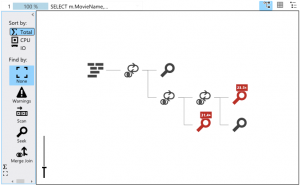
When I run this on Windows Azure SQL Database (WASD) I get the following execution plan:
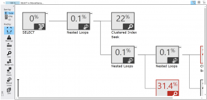
Kind of weird, kind of useful, right? First thing new that I can do is zoom in using that slider bar you seen in the lower left and then graphical part of the plan looks like this:
The icons have shifted into the corner and you get the costs of every operator. You also get text describing what the operator does. You can scroll around to see the other operators. Pretty cool stuff. Yeah, I know you can zoom in & out on SSMS, but it doesn’t modify the icons in any way, making viewing it zoomed out all but useless. WASD gets better. Notice the tool bar on the left. I have it here in full size so you can see everything:
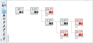
Now things get fun. First, at the top, there is a little arrow pointing to the left. You can hide this tool bar by clicking anywhere within it that’s not on one of the icons. The arrow is indicating the possibility of hiding the toolbar. Once hidden, the arrow changes to pointing to the right. Clicking again expands the toolbar. Immediately below that arrow, you see the really fun stuff: Sort by:. You’ll notice that Total is currently selected. This shows me the total estimated cost for each operator within the plan. But, I can modify the display of the plan so that I only see estimated CPU cost or estimated IO cost. The following graphic shows the same plan with CPU selected. See how the estimated cost percentages have all shifted to show the different highlights?
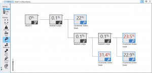
This is a great way to rearrange the view of the plan, bringing out different information. The only beef I have with it is that it doesn’t really sort the operators so much as change the display. I understand what they mean, but I think it’s misleading. Anyway, useful, but I’ve got more. Moving down the tool bar we find the great part: Find by:. Currently on the plans above you can see that None is selected. But what if I select a different operator such as Seek:
Now, each instance of the operator type I selected is highlighted in blue, but, the sort totals for estimated costs are still displaying the numbers in red, so I haven’t lost any of the display that I’ve set up so far. This is wonderful stuff. As you can see, you only get a few operator types, Warnings, Scan, Seek, Merge Join, Hash Match, Nested Loops and Sort. But it’s a great way to begin to explore the plan in ways that we can’t currently within SSMS.
![]() Let’s also note the little icons in the upper right of the plan, displayed to the left in full size. Clicking on these completely changes what’s represented to us from the execution plan. First the little grid looking icon results in this execution plan:
Let’s also note the little icons in the upper right of the plan, displayed to the left in full size. Clicking on these completely changes what’s represented to us from the execution plan. First the little grid looking icon results in this execution plan:
You can click on the graphic to make it bigger so you can see everything. What we have are the operator nodes, listed by Node ID order, showing some of the interesting information from the properties in a grid format. And yeah, because it’s a grid, I can click on any of the column headers and get different sort order for the data. For large plans, this can be a quick and easy way to find the highest estimated cost, or the largest number of actual rows. The grid isn’t a text plan. The grid is just the same XML data that makes up the execution plan laid out slightly differently. Great stuff indeed. What if we click on the little bullet list looking icon?
Now we have a sort of nested display, almost like a human-readable XML. And the little blue icons next to the operator names do allow you to expand and collapse the layout. I haven’t decided how excited I am by this layout because I’m just not sure how I would use it. You can’t resort on the columns even though this looks like a grid. It’s just a way to simplify the display with the collapsible nesting. Still, another tool in the toolbox.
Microsoft is doing some really cool stuff out there on WASD, making the portal there functional and useful.Let’s hope that some of this translates down to the core product.
If you’re interested in learning more about this kind of thing, you should take a look at the pre-conference seminar at TechEd 2013 that I’ll be putting on with Thomas LaRock (b|t) and Dandy Weyn (b|t) in New Orleans and Madrid, Spain. It’s called How to be a Successful DBA in the Changing World of Cloud and On-Premise Data. We’ll spend all day getting you deep into the guts of Azure SQL Database showing how to administer it, tune it, grow it, and make it work. You don’t want to miss it. Click here for New Orleans or here for Madrid to register for this and TechEd 2013.
I promise you, with Tom, Dandy and I all talking at once, this will be informative and entertaining.


