NOTE: the DAX presented in this blog post is written in my locale (nl-BE). This means that semicolons are used in the functions and lists instead of commas. Also, we use the comma as the decimal seperator. 0.95 (in the US) is 0,95 in my locale. A couple of well placed search and replaces should fix those issues if you are in another locale.
Yesterday I published the blog post Dynamically Changing Shapes in Power BI, which seemed to be quite popular in social media. It showed a lot of people were struggling with this issue and that some people had also found (alternative) solutions for it. In the comments of that blog post, you can find a solution proposed by Jason Thomas (blog | twitter). Jason has quite the Power BI & SSRS knowledge and he has found a cool trick to solve our changing images problem. In this blog post, I’m going to explain the solution step-by-step.
First of all, we have to create a disconnected table that will store the URL of our images, along with a short description. You can do this in DAX by using a calculated table:
Images = DATATABLE (
    "ShapeURL"; STRING;
    "State" ; STRING;
    {
        { "http://sqlkover.com/wp-content/uploads/2017/02/thumbsup.png";"ThumbsUp"};
        { "http://sqlkover.com/wp-content/uploads/2017/02/thumbsdown.png";"ThumbsDown"}
    }
)
The next step is to create a measure. This measure will calculate a filter value, which we are going to use later on to filter our visual.
FilterValue = SUMX(
                    VALUES(Images[State]);
                    SWITCH(Images[State];
                                "ThumbsUp";
                                    IF(CALCULATE(
                                                    AVERAGE(ServerAvailability[availability])
                                                ) > 0,95
                                            ;1
                                            ;0
                                      );
                                    IF(CALCULATE(
                                                    AVERAGE(ServerAvailability[availability])
                                                ) > 0,95
                                            ;0
                                            ;1
                                        )
                        )
               )
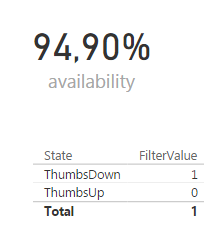
We can visualize the result in a table:
Let’s take a closer look at this measure.
- SUMX(VALUES(Images[State]);…). This is an iterator. It goes over the rows of a table and will calculate an expression for each row of that table. At the end, the results are aggregated using Sum. Here the table is the result of the VALUES function, which gives two rows: ThumbsDown and ThumbsUp.
- The next step is evaluating the SWITCH function. If the current row is equal to ThumbsUp, it will evaluate an IF statement. If it’s not, it will evaluate another IF statement.
- The IF statement checks if our server availability is higher than 95%. If it is, the result is 1 (for ThumbsUp) and if it’s not, the result is 0. If the current row is ThumbsDown, the logic is the other way around: if the availability is higher than 95%, the result is 0, otherwise 1.
- We need to put CALCULATE around AVERAGE(ServerAvailability[availability]). This is needed to transfer from a row context into a filter context. If the images table had a relationship with the fact table, the current row would have an impact on the filter context. However, we are using a disconnected table, so the filter context is the same for both rows. In other words, the calculated measure returns the same result. It’s the IF statements that decide if a 0 or a 1 is returned.
- When we take a look at the example above – availability = 94.90% – and we follow the logic, we can see that ThumbsDown has a filter value of 1 (meaning availability < 95%) and ThumbsUp has a filter value of 0. The total row repeats the same process and aggregates the result: 0 + 1 = 1.
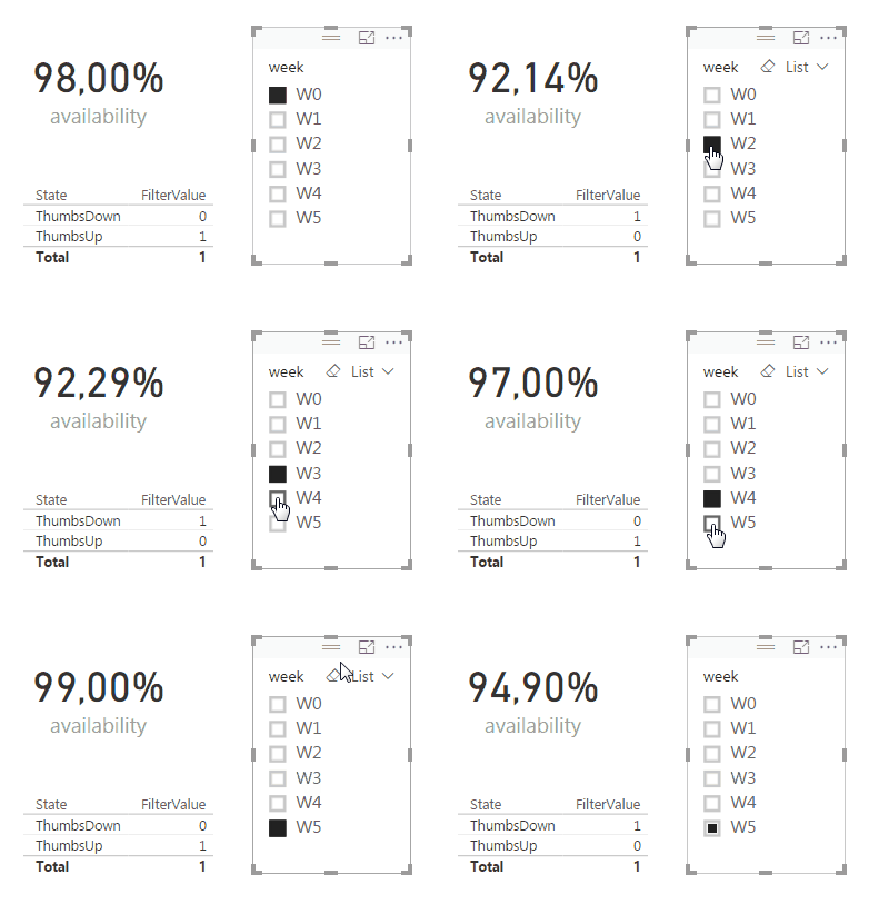
In the following animation you can see how our table behaves when we change the availability:
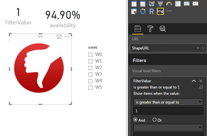
The next step is to use the custom visual Image Viewer to show our image. In the filter area, we add the FilterValue measure and we configure it to be greater than or equal to 1.
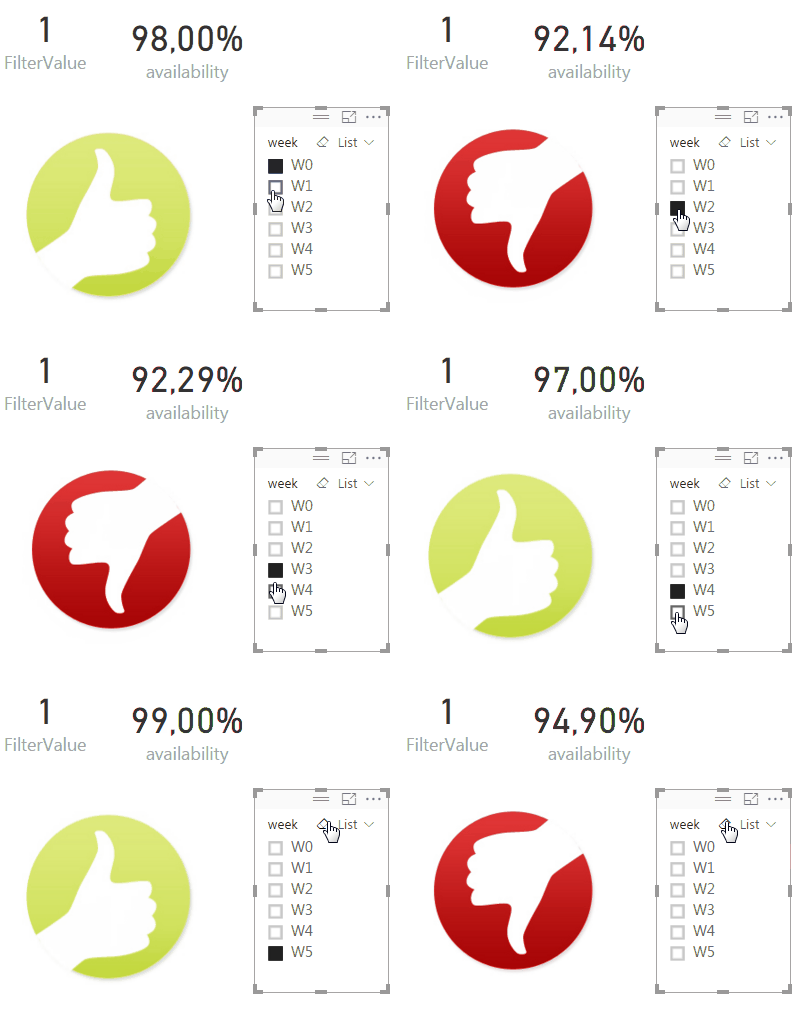
Now our image behaves the same as our table:
The clue behind this is that the Image Viewer visual still internally behaves like the table: there are rows you can loop over and thus rows that you can filter out. I didn’t realize this at first (I just thought the visual took the first image it could find if multiple images are provided).
The advantage of this solution is that you don’t have the dependency on R code and this solution will certainly work in PowerBI.com. The disadvantage is that you can only use image URLs, you cannot load images from disk (and there’s no option to load images in the model, like you can in PowerPivot).
Someone else suggested to use a calculated column, but then you lose all flexibility. If you have a report where the condition of the shape only needs to be determined when the model refreshes, than calculated columns are certainly a good option.
Will Thomson of the Power BI team had the following suggestion:
@Ko_Ver I have a no-code version… Still a workaround (multiple Card visuals stacked on top of each other but hey, it works. Also, animals! pic.twitter.com/z51c3Kkheu
— Will Thompson (@Will_MI77) February 8, 2017
Unfortunately, you cannot add a filter to a card visualization, so again, we lose the flexibility we have when working with measures. A last alternative – if you don’t like custom visuals – is using a table. The principle is the very same as when you use the Image Viewer. However, in a table you have almost no control over the size of the image.


