A couple weeks ago in a recent update to Power BI, an enhancement was added to enable a drill-down action in Power BI. This has been something that customers have been clamoring for but now its finally here!
Not all visualizations can be used to invoke the drill-down action. Here are the visualizations that you can use the drill-down action in Power BI:
- Bar Chart
- Column Chart
- Clustered Bar Chart
- Clustered Column Chart
- 100% Stacked Bar Chart
- 100% Stacked Column Chart
- Line and Stacked Column Chart
- Line and Clustered Column Chart
- Waterfall Chart
- Scatter Chart
- Pie Chart
- Treemap
- Map
- Filled Map
- Funnel
- Donut Chart
So most very visualization can be used to drill-down into lower levels of the data. This list excludes Line Chart, Area Chart, Table, Matrix, Gauge, Multirow Card, Card and Slicer visualizations.
Setting up the drill-down is pretty easy. First, add some attributes to the Group area of your visualization. Depending on which visualization you are using, this could the Group, Axis or Legend area. If you’re using a Bar or Column chart, it will be the Axis area. If you’re using a Pie or Donut chart, it will be the Legend area. For a Scatter Chart, it will be the Details area. For the Waterfall chart it will be the Category area. For a Map it will be Location and for a Funnel chart it will be the Group area.
Take this Funnel visualization for example. I’ve added some Geography related fields to the Group area of the chart. I added the fields in the order I would like the users to navigate. So in this case, the first level that will be visible to the users will be the Continent but then they will navigate to the Country level and so on.
When multiple fields are added to the Group area of the chart, a little icon featuring a downward arrow will appear in the top right of the visualization. To enable the drill-down functionality, click this arrow first. When the circle is darkened, as you can see in the below screenshot, this means that the drill-down functionality is enabled.
So if I select one of the bars in my funnel chart, instead of invoking the traditional cross-filtering action we’ve become familiar with in Power BI, we will drill-down to the next level of our data.
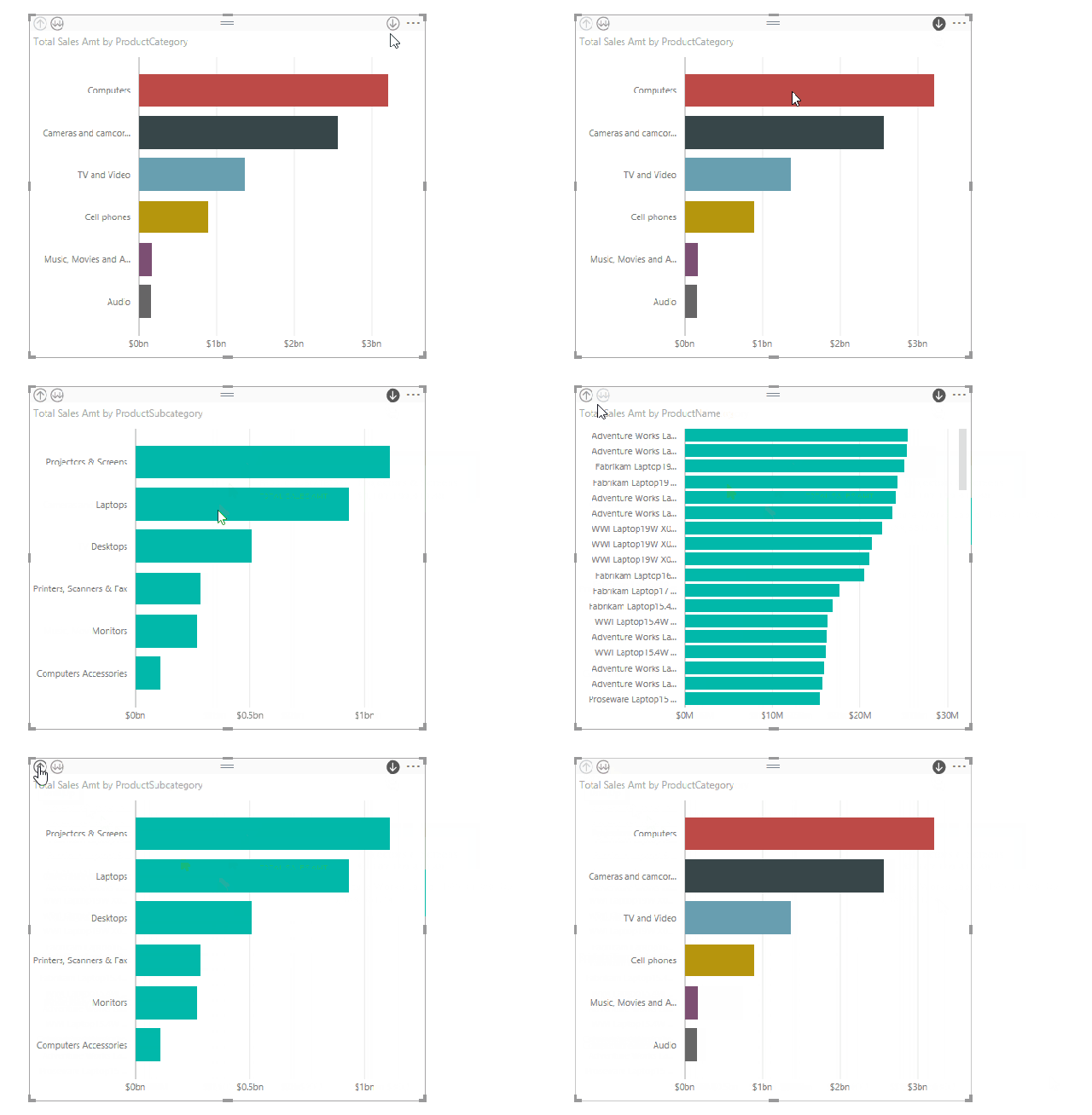
When you’re ready to drill back up a level, just click the up arrow in the top left of the visualization. Here’s an example of drilling down and then drilling back up in a Bar Chart.
And here’s drilling down in a Map Chart.
You may have noticed the little double downward facing arrow in the top left of the visualizations when using the drill-down functionality. This button allows you to drill-down to the next level of ALL groups.
It’s also important to note that when using the drill-down action, it appears that cross-filtering via the visualization using Drill Down is disabled until you turn off Drill Down by clicking the Drill Down button in the top right of the visualization. The chart with Drill Down turn on, however, can still be cross-filtered by other visualizations in your report.
Feedback
I hope you found this information useful! Leave a comment below or share it with a friend or coworker if you did! Thanks for reading.


