I have decided to write a series of blog posts about visual design concepts that can have a big impact on your Power BI Reports. These concepts are applicable to other reporting technologies, but I’ll use examples and applications in Power BI.
Our first design concept is cognitive load, which comes from cognitive psychology and instructional design. Cognitive Load Theory says that when we present our audience with information, we are asking them to use brain power to process it. That brain power (aka working memory) is limited, so we need to be intentional about the information we present to them.
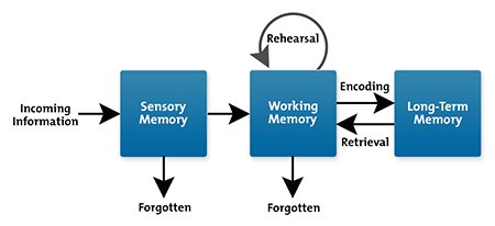
In order to commit information to memory and be able to recall it later, that information must go through sensory memory and working memory and then be encoded into long-term memory.

This process is not automatic nor guaranteed. There is a major constraint imposed upon us in that our working memory can only hold about 4 things at once.
Cognitive load theory identifies schemas, or combinations of elements, as the cognitive structures that make up an individual’s knowledge base. Schemas allow us to treat multiple elements as a single element in order for us to think and solve problems. For schema acquisition to occur, information delivery should be designed to reduce working memory load. Cognitive load theory is concerned with techniques for reducing working memory load in order to for our minds to build new schemas.
Cognitive load can be categorized into three types:
- Intrinsic cognitive load refers to the complexity of the information itself.
- Extraneous cognitive load refers to the way the material is presented.
- Germane cognitive load is the effort a person must expend to learn and build new schemas.
Here’s a short video I found that does a nice job of explaining cognitive load:
What Does This Mean For Report Design?
We need to design such that our audience can efficiently take in the information we are visualizing, commit that information to memory, and use that information to make decisions. This means we should be aware of our audience and their existing knowledge of the information we are presenting. It also means reducing extraneous cognitive load by keeping our design simple and clutter free.
Here are some things you can do to minimize cognitive load in your Power BI report:
- Choose a message/purpose for your report and don’t allow anything on the canvas that can’t be tied back to that message. We can’t just say we are building a financial dashboard for our company and put all of our financial metrics on the page. We need to choose which metrics are important and which ones go together in meaningful chunks.
- Create charts that take into account your audience and how they think about the subject of your report. If your audience might not know how to approach the subject matter of your visualization, you may need to add supplemental information (either in the report or as links) so they can begin to build schemas to help them think about the subject. If your audience has existing knowledge, use their terminology and approach to thinking about the subject as much as possible so they are building upon what they know.
- Remove clutter. Eliminate things from your report that do not make the information memorable. This could include removing decorative elements that do not support information intake (this doesn’t mean remove all color and images, just extraneous ones that distract more than help). Make sure you aren’t using super intense colors everywhere, which makes your report feel busy and makes it difficult to know where to look first. Also, remove redundant information. If you are direct labeling your charts, you probably don’t need gridlines and axis labels. Descriptive chart titles often eliminate the need for axis titles.
- Use consistent designs as much as possible, so users don’t have to refer to a guide for each new report you build. This can be applied by putting slicers in a similar location across reports, or using the same color for revenue in reports that show multiple metrics. This removes the cognitive burden of learning how the report works so users can focus on the information in the report.
In addition to paying attention to actual cognitive load, we should also think about perceived cognitive load – how much effort our users think it will take to consume our report. Our users are constantly being distracted by coworkers and children and cell phones, and Dog Rates. They have limited time and energy to consume our reports. If the report looks busy and complicated, or extremely aesthetically unpleasing, they may perceive that the task is not worth the effort and move on without looking at the report we spent hours building. Remember that we are designing for a specific audience, and it is their information needs and their perception of our report that matters more than our own design preferences.
This post is part of a series. Go here to see the list of posts in the series.


