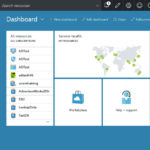
Not all of us are going to use Azure in the same way. That’s just common sense. Therefore, not all of us are going to want it to look the same. Here’s a default view of the portal for a login I created within my own domain:
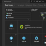
You can contrast that with this login to my portal that I use for most of my testing and training (this isn’t my company’s production or development portal, which looks still more different):
Clicking on either of these will open them so you can look at details. Not only are the color schemes different, but you’ll note that the selection lists on the left are different as are the grids on the dashboard. All this can be customized for each login, and, within a login, on each Subscription to which that login belongs.
All this means that you can customize the portal for your individual needs, even between your production and development areas within the portal (assuming you’re keeping them separate, which you ought to be). Let’s explore a few of those options.
Favorites
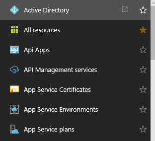
Over on the left of the screen, is a listing of favorite resources. At the bottom of this list you’ll see a “Browse >” button. Selecting this pops out a list of all available resources:
This is a complete listing of the resources available to your subscription, including anything that is in Preview. Note, on the right hand side of the screen are stars. One of the stars in the list above shows up as gold and filled in. This indicates that it’s currently on my list of resources as a favorite. Selecting one of the resources that is not filled in will add it to the list and selecting one that is filled in will remove it. This is your first customization. Add the resources to favorites that you use all the time. You can even drag them around to rearrange the order in which they appear.
Portal Settings
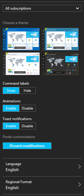
If you want to change the color scheme, you can do that too. At the top of the screen is a little icon of a gear. Clicking on that opens the Portal Settings blade:
Not only can you modify the colors scheme, but you get to set labels, animations & the language of the portal.
Dashboard
This is where you can get crazy. You have the ability to add all sorts of output, readouts, shortcuts, to your dashboard. You get to set their size, rearrange them, even create additional dashboards. Additional dashboards give you the ability to customize a view so that you could, for example, have your most important Azure SQL Databases displaying their DTU readouts as a single view:
Yeah, yeah, it reads zero. Test databases, remember. Anyway, customizing a dashboard is easy. If you click on “+New dashboard” or “edit dashboard” at the top of the screen, a new blade opens. This allows you to add and rearrange tiles. You’ll see a grid that has dashed lines for the resolution of a screen. It makes it very easy to figure out what’s going to be displayed and what’s not. On the left you get the ability to track down different kinds of tiles. In the example below I have a list of the tiles for Azure SQL Database (you will need to click on this one, it’s big):
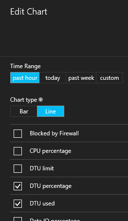
You can drag and drop the tiles from the left on to the screen. Once there you can rearrange where they are located, resize them, remove them, pretty much what you would expect. Further, you can customize each tile individually. The tile will have a clickable link called “Edit”. Clicking on that will bring up unique options depending on the tile. In the example below I’m showing the options for the Resource Utilization tile:
I’ve decided to just show DTU percentage and DTU used for the last hour as a Line chart. You can rearrange this as necessary to fit your own needs. You can rename the dashboard, and then, when you’re done, just click on the “Done Customizing” button and you’ll see the dashboard. You can pick which dashboard to look at. You can even share a dashboard with your team so that everyone has access to the same information you do.
Conclusion
This was just a bare bones run-through of what’s possible with the Azure portal. You really can achieve a very high level of customization to get just the information you need, in the way that you need it. Take advantage of this because, at times, it can be quite difficult to manage information on the portal.
The post Customizing Your Azure Portal appeared first on Home Of The Scary DBA.


