SQL Server 2017 In-Database Machine learning has brought the analytics closer to the data. It is now convenient to do data analytics either by using the programming language R or Python with the database engine.
In my previous post, I have demonstrated how easy it is to create a bar graph in SQL Server 2017 In-Database Machine Learning using R.
We’re going to build upon that basic graph.
Sometimes doing data analysis would require us to look at an overview of our data across specific partitions, say a year. For example, we want to see how our product groups fare on month-to-month basis across the last 4 years.
In a data analytics perspective, there are quite a handful of data points in this requirement – data aggregate (quantity), monthly periods, and year partitions.
One of the approaches to handle such requirement is by using a facet. Faceting is a way of plotting subsets of data into a matrix of panels based on one or more variables – or facets.
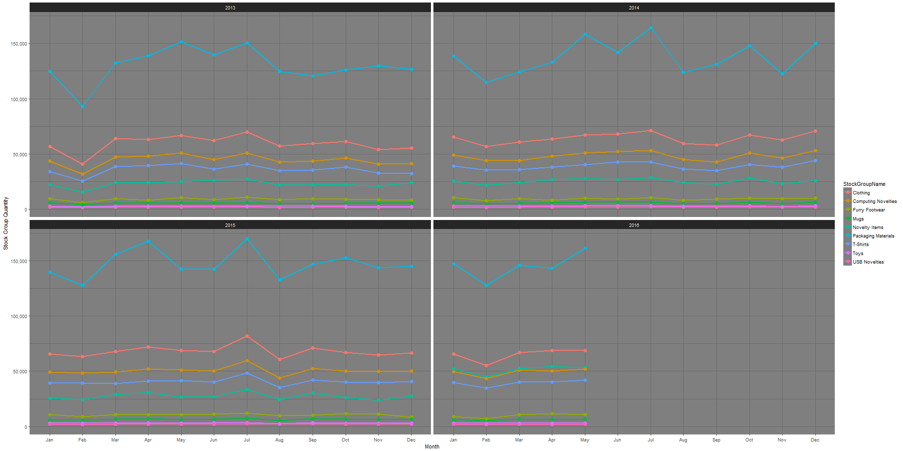
Again, let’s begin with the end in mind. Here’s what faceting looks like:
Dataset
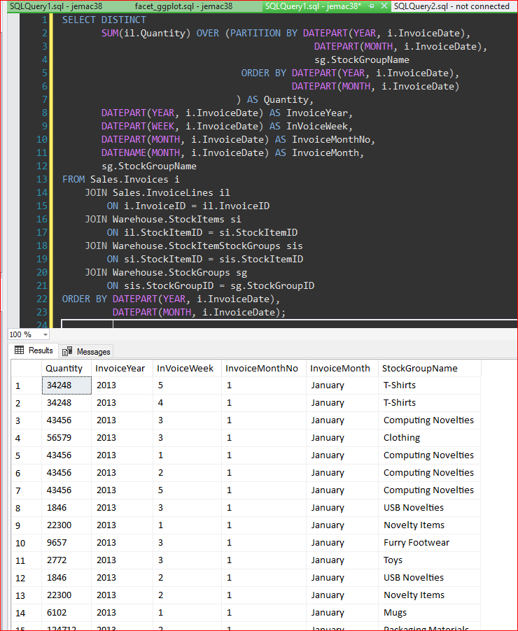
The quantity aggregates based on monthly period per product group are laid into the year partition facet in the following query. You can also set up your data like this in the R engine.
SELECT DISTINCT SUM(il.Quantity) OVER (PARTITION BY DATEPART(YEAR, i.InvoiceDate), DATEPART(MONTH, i.InvoiceDate), sg.StockGroupName ORDER BY DATEPART(YEAR, i.InvoiceDate), DATEPART(MONTH, i.InvoiceDate) ) AS Quantity, DATEPART(YEAR, i.InvoiceDate) AS InvoiceYear, DATEPART(WEEK, i.InvoiceDate) AS InVoiceWeek, DATEPART(MONTH, i.InvoiceDate) AS InvoiceMonthNo, DATENAME(MONTH, i.InvoiceDate) AS InvoiceMonth, sg.StockGroupNameFROM Sales.Invoices i JOIN Sales.InvoiceLines il ON i.InvoiceID = il.InvoiceID JOIN Warehouse.StockItems si ON il.StockItemID = si.StockItemID JOIN Warehouse.StockItemStockGroups sis ON si.StockItemID = sis.StockItemID JOIN Warehouse.StockGroups sg ON sis.StockGroupID = sg.StockGroupIDORDER BY DATEPART(YEAR, i.InvoiceDate), DATEPART(MONTH, i.InvoiceDate);
Setup
Please refer to Creating Bar Graph In SQL Server 2017 Using R for the setup. We need two (2) libraries for this demonstration:
- ggplot2()
- scales
Again, if you get “missing package” error, just install it. If you get a “no function x” error, chances are you have not declared the function’s parent package. The data is based on the WideWorldImporters database.
Properties
The x-axis is ordered by DATEPART(MONTH, i.InvoiceDate) AS InvoiceMonthNo.The substring function in R is more intuitive than other programming languages. This expression is used as the label for x-axis: substr(InvoiceMonth, start = 1 , stop = 3). The theme setting is simply set by theme_dark() function.
Chart
The whole chart creation code looks like this:
quantitytschart <- ggplot(groupqty , aes(x = reorder(substr(InvoiceMonth, start = 1 , stop = 3), InvoiceMonthNo), y = Quantity, group = StockGroupName, colour = StockGroupName)) + geom_line(size=1) + geom_point(size=3) + facet_wrap( ~ InvoiceYear) + theme_dark() + labs( x= "Month", y="Stock Group Quantity") + scale_y_continuous(labels = comma)
That’s it.
Facets*
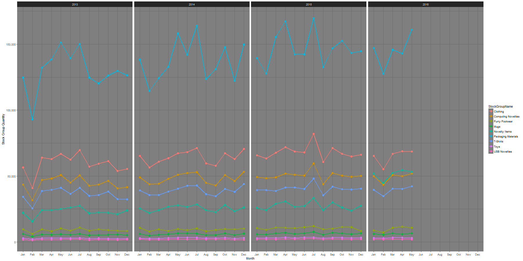
The above matrix is of type facet_wrap. Another option is facet_grid.
facet_grid(. ~ InvoiceYear)facet_wrap( ~ InvoiceYear)
facet_grid(row ~ col): this is what they call “bivariate”, which creates 2-D matrix of panels based on two factor.
facet_wrap(~cell): “univariate”, creates 1-D strip of panels, based on one factor, and wrap the strip into a 2-D matrix.
*Source: ggplot2 Quick Reference: facet
Here’s the facet_grid (See the screenshot of facet_wrap above):
Complete Code
Here’s the rest of the code:
EXEC sp_execute_external_script @language = N'R', @script = N' #Librarylibrary(ggplot2);library(scales);
chartfile <- "C:\\Marlon_test\\Groupqty.png" png(filename=chartfile, width=1800, height=900)
#Data Frame groupqty <- InputDataSet
quantitytschart <- ggplot(groupqty , aes(x = reorder(substr(InvoiceMonth, start = 1 , stop = 3), InvoiceMonthNo), y = Quantity, group = StockGroupName, colour = StockGroupName)) + geom_line(size=1) + geom_point(size=3) + facet_grid(. ~ InvoiceYear) + theme_dark() + #facet_wrap( ~ InvoiceYear) + theme_dark() + labs( x= "Month", y="Stock Group Quantity") + scale_y_continuous(labels = comma)
print(quantitytschart)', @input_data_1 = N'SELECT DISTINCT SUM(il.Quantity) OVER (PARTITION BY DATEPART(YEAR, i.InvoiceDate), DATEPART(MONTH, i.InvoiceDate), sg.StockGroupName ORDER BY DATEPART(YEAR, i.InvoiceDate), DATEPART(MONTH, i.InvoiceDate) ) AS Quantity, DATEPART(YEAR, i.InvoiceDate) AS InvoiceYear, DATEPART(WEEK, i.InvoiceDate) AS InvoiceWeek, DATEPART(MONTH, i.InvoiceDate) AS InvoiceMonthNo, DATENAME(MONTH, i.InvoiceDate) AS InvoiceMonth, sg.StockGroupNameFROM Sales.Invoices i JOIN Sales.InvoiceLines il ON i.InvoiceID = il.InvoiceID JOIN Warehouse.StockItems si ON il.StockItemID = si.StockItemID JOIN Warehouse.StockItemStockGroups sis ON si.StockItemID = sis.StockItemID JOIN Warehouse.StockGroups sg ON sis.StockGroupID = sg.StockGroupIDORDER BY DATEPART(YEAR, i.InvoiceDate), DATEPART(MONTH, i.InvoiceDate);';
Have fun and happy faceting!
The post Creating Facets in SQL Server 2017 Using R appeared first on SQL, Code, Coffee, Etc..


