I’m a great fan of running the latest version of Windows Server whenever I deploy SQLServer. I always try to push the latest and greatest windows server builds along with latest SQLServer builds because of many reasons (That can be a whole different post altogether).
I was all excited when I heard that Microsoft released the Technical preview of Windows Server (They might eventually call it Windows Server 10,but not sure for now), and decided to set this up.
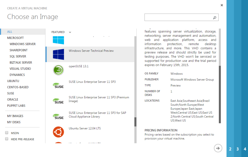
I just went to Azure and see if there is any template which is made available, and it was indeed available. Way to go Microsoft (Yep, I do praise good things !)
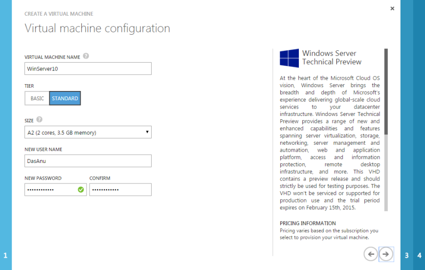
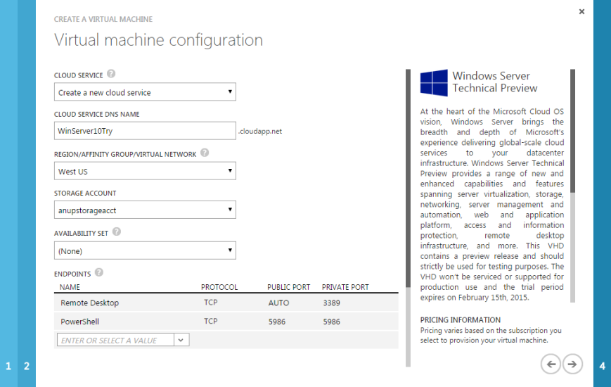
Gave it a name, sized it as I need and added few more details
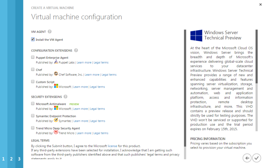
Got little surprised to see all these new additions
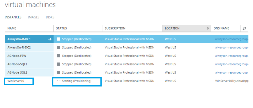
And there you go….Started provisioning my VM
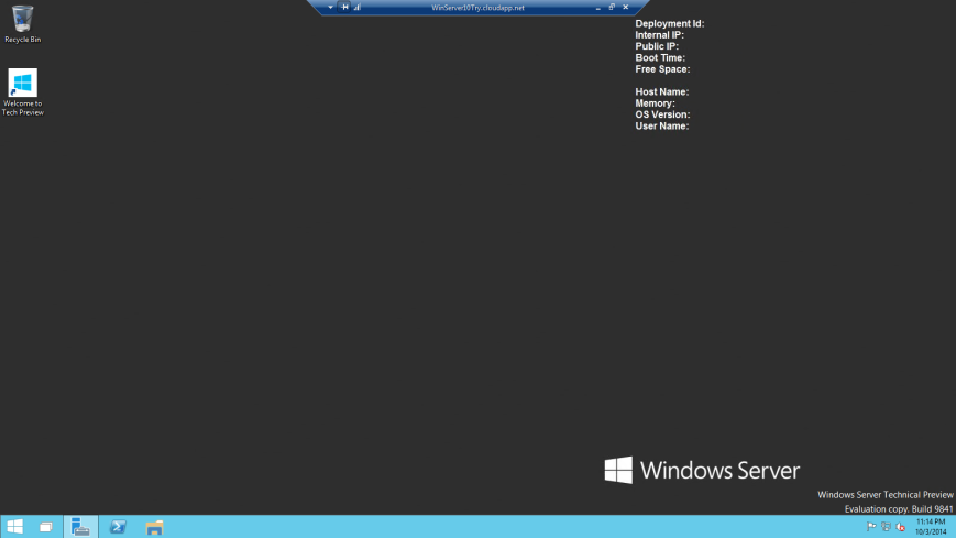
Once it was created. I downloaded the RDP file and got connected to it. When connecting to the server you need to make sure to use the ID and Password which was used while creating the VM.
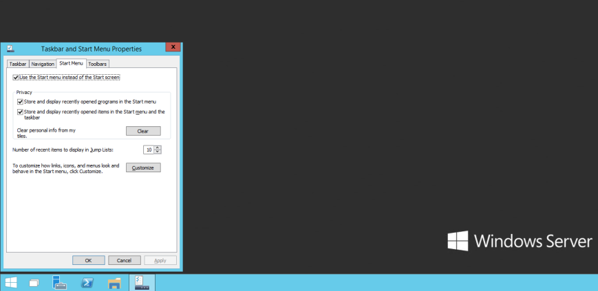
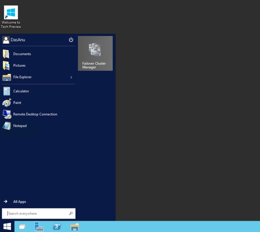
As soon as I logged in I realized that there are no major UI changes, but what Microsoft did here is re-touch everything and made sure that a proper Start Menu is back.
You have an option to choose Start Menu or Start Screen(I’m not a fan of Start screen ! ) and that flexibility is nice.
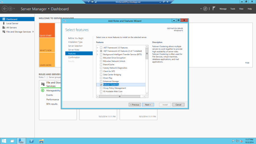
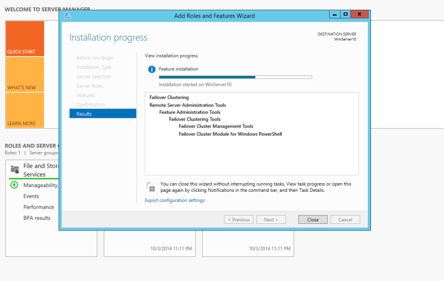
Windows Server Failover Clustering is one of the most important feature which I deal with Windows Server as its one of the pre-requisites for AlwaysOn Availability groups, so I decided to just add that feature(Not going to configure clustering now).
Nothing new here. Its all old story with same UI.
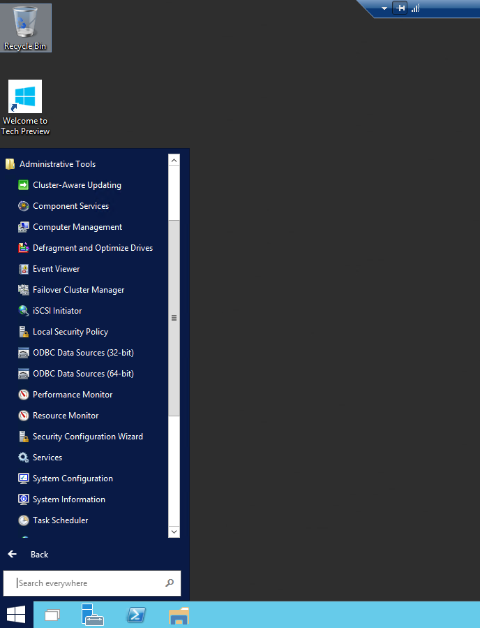
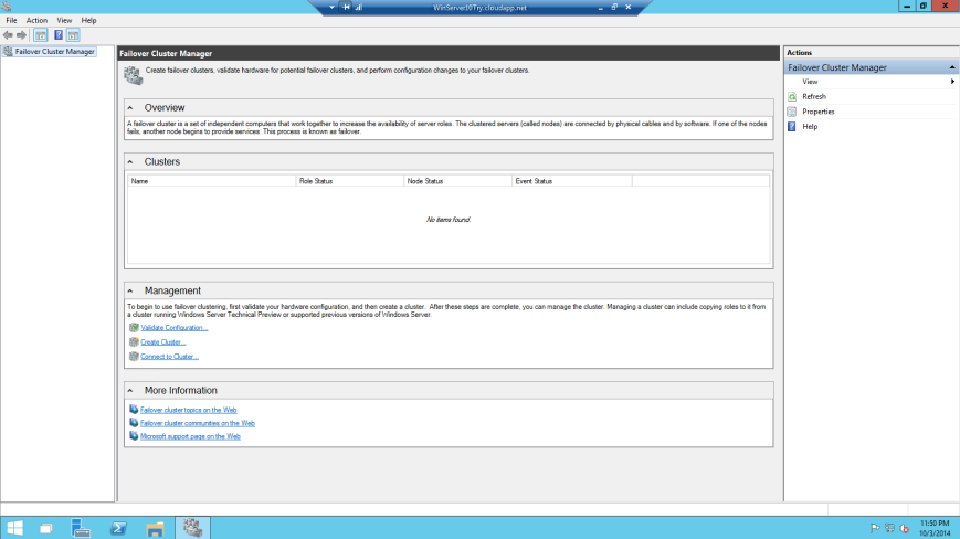
Once it was installed, I went to Start menu to launch it. This is kind of neat and I like this way rather than using charm bar and searching for it.
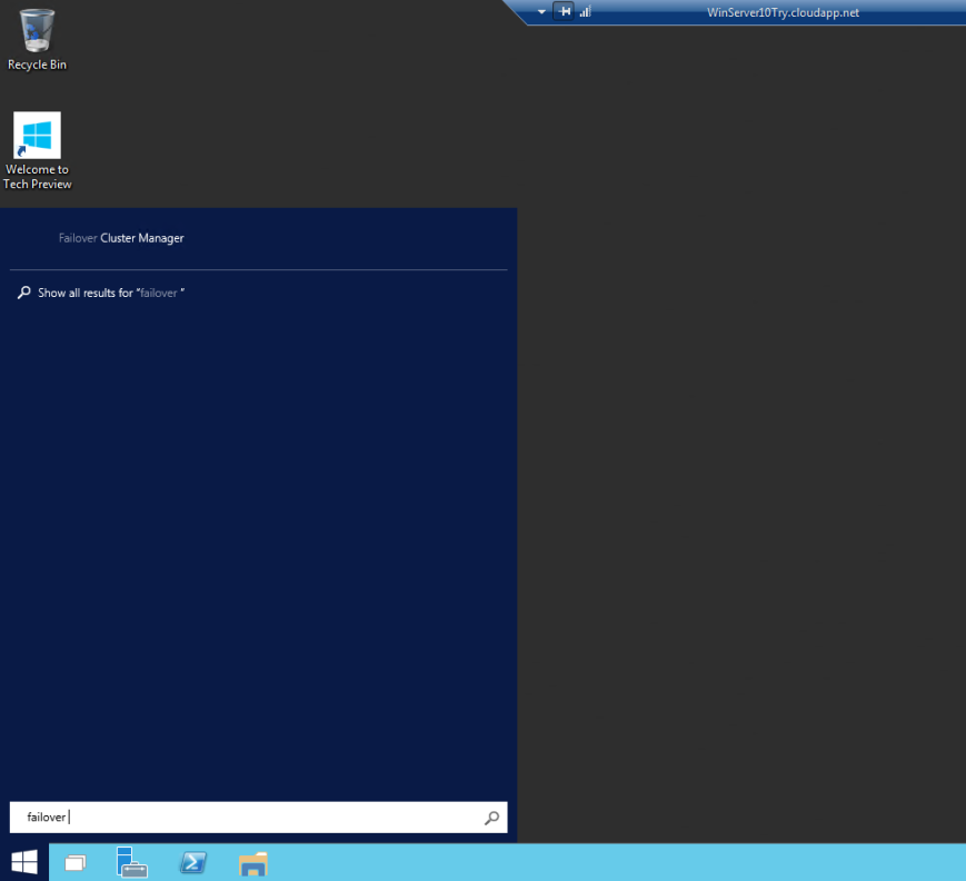
You can also search failover cluster manager using the search option available in the start menu. There are the small things which I care about and like. Nice !
And well if you like Tiles, then you definitively have an option to pin it. I like to pin things like Cluster Manager etc.
So here you go
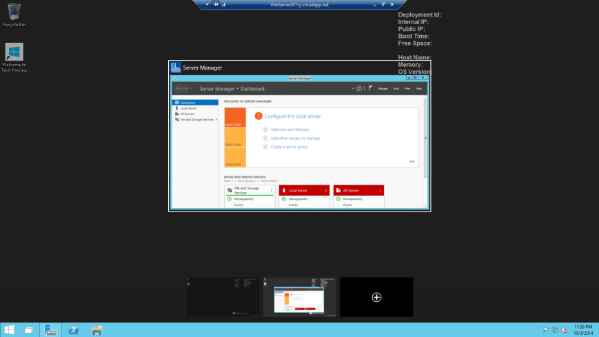
You also have an option to add multiple desktops. That’s kind of neat as I tend to open multiple windows and I can switch between desktop.
Conclusion :
That’s it for the UI changes for now. Nothing dramatically new and fancy,but I liked the way things look now. In the next few days I will configure clustering and will come with more updates.
Thanks for reading, and keep watching this space for more !


