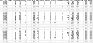
How much do you enjoy reading pages and pages of detailed report data? A large amount of information presented in a typical Excel spreadsheet can also be difficult to digest. Presenting complex data in a way that everyone can easily understand can be a challenge for companies. Data visualizations are a simple way to summarize data down into easy-to-understand terms. Various studies by companies like 3M, show that people respond better to data visualization rather than raw data.
When your company has complex or a large amount of information to present, instead of just putting a bunch of numbers into a report, data visualization allows you to tell a story that would otherwise be virtually impossible to tell due to the shear amount of data organizations have today. Busy executives can more easily see patterns at a glance.
Using charts, graphs and other visuals can help the company’s management:
- Easily spot areas that need improved
- See patterns in sales volume
- Understand customer behavior and what impacts it
- Better understand demographics of the customer base and how to anticipate future demand of products
- Make decisions on where to reduce expenses
Choosing the Best Visuals to Support Your Data
One of the biggest challenges in breaking down data into visuals is deciding which type of graphic would work best to present that information. There are many factors to weigh, including how much data needs to be presented, the overall goal of the visual and which items should be included and which shouldn’t. Working with someone experienced in visualizing data will help you better understand what types of visual data work best for different purposes and for your individual company.
Keep in mind that more than one type of graphic may be necessary to fully explore the data as a whole. One example would be sales figures for the year. A bar chart with top sales months highlighted might help your company understand which months are the busiest for sales and which months need more attention, while a pie chart of top-selling items could help you see if there are products that need replaced or updated.
Figuring out the Data’s Key Point
Another thing to consider is what the key point of the data actually is. Keep in mind that the visualization is meant to help the lay person more easily understand a collection of statistics and figures. First, everything needs to be labeled clearly, so a quick glance tells the viewer what the graphic is about. What information is it getting across?
Let’s say the graphic is a module on a dashboard that shows how many customers are using the company’s website and how they are using it. What is the most important information from those statistics? For the CEO, the most important information may be items like:
- What percentage of customers are visiting the website versus contacting the company over the telephone?
- How are they using the website? For information? To order? To interact?
- How does this compare to competitor websites?
Driving Action
The right visual drives action by presenting data, calling attention to key points and engaging the reader. Modern data visualizations also include interactive elements in some cases that allow you to drill down into the detailed data that the visual relies upon, but fancy visuals shouldn’t be added just for the sake of adding these items.
Like human DNA no two visualizations are exactly alike. Each company has a different story to tell and each set of data is another chapter in that story. Understanding which data visualization tells the story the best takes time and the ability to break down complex data.
How do you tell your data story?
The post Breaking Complex Data into Visualizations that Tell a Story appeared first on DawaBI.


