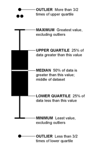
R is particularly good with drawing graphs with data. Some graphs are familiar to most DBAs as it has been things we have seen and used over time – bar charts, pie diagram and so on. Some are not. Understanding exploratory graphics is vitally important to the R programmer/data science newbie. This week I wanted to share what I learned about the box-and-whisker plot, a commonly used graph in R – and one that greatly helps to understand and interpret spread of data. Before getting into specifics of how data is described with this plot, we need to understand a term called Interquartile Range. For each range or subset of data we are involved with (or rather the field we choose to ‘group by’), the middle value is called ‘Median’. The middle of the top 50% of values is called first quartile, and middle of the bottom 50% is called ‘second quartile’. Difference between first and second quartile is called ‘interquartile range’. A box-and-whisker plot helps us to see these values visually – and in addition to this also shows outliers in the data. To borrow a graphic from here – it is as below.
Now, let us look at the dataset on chicken weights in R with the help of this type of graphic.This is basically a dataset comprising of data on 71 randomly picked chickens, who were fed six different types of feed. Their weight was then observed and compiled. Let us say we sort this data from minimum to maximum weight for each feed.
You need the mosaic R package installed, which in turn has a few dependencies – dplyr, mosaicData,ggdendro and ggformula. You can install each of these packages with the command install.packages(“<package name”, repos = http://mran.revolutionanalytics.com”😉 and then issue below command for pulling up with B-W plot.
library("mosaic")
bwplot(weight~feed, data=chickwts, xlab="Feed type", ylab="Chickem weight at six weeks (g)")
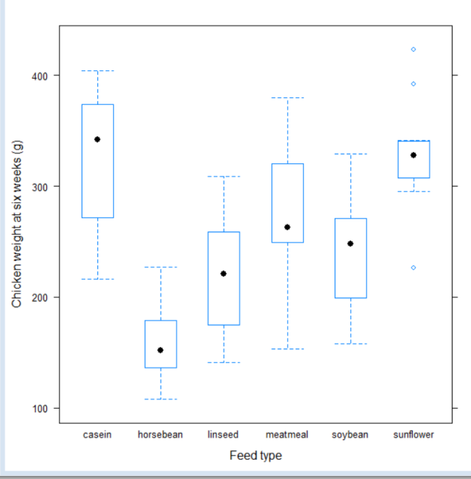
Results are as below:

With this we are easily able to see that
1 Feed type casein produces chickens with maximum weight
2 Feed type horsebean produces chickens with minimum weight
3 Feedtype sunflower has some outliers which don’t seem to match general pattern of data
4 The distribution of weights within each feed type seem fairly symetric.
5 There are also many overlapping weights across feed types.
To get to some of the numbers accurately you can just say
favstats(weight~feed, data=chickwts)
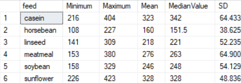
If you wish to get some of these values in T-SQL (i imported this data into SQL server via excel) – you can use query below. Comparing the values visually with graph will show that they are similar.
SELECT DISTINCT ck.feed,MIN(weight) OVER (PARTITION BY ck.feed) AS Minimum, Max(weight) OVER (PARTITION BY ck.feed) AS Maximum,
AVG(weight) OVER (PARTITION BY ck.feed) AS Mean,
PERCENTILE_CONT(0.5) WITHIN GROUP (ORDER BY ck.weight)OVER (PARTITION BY ck.feed) AS MedianValue,
STDEV(weight) OVER (PARTITION BY ck.feed) AS SD
FROM chickfeed ck ORDER BY feed;
Results are as below:
The math for Q1 and Q3 are a little complicated in T-SQL, I was unsure if it was worth doing since that is not the point of my blog post. You can find info on it here
As we can see, the numbers tie up regardless of which way we do it. But it is much harder though to find patterns and outliers using code. The graph is undoubtedly more useful in this regard.
In the next post we will look into applying some analysis of variance (ANOVA) to examine if the difference in weights across feed types is really significant to arrive at any conclusion on nature of the feed. Thanks for reading!


