

On the 5th of January, Brent Ozar (b|t) launched a survey on “Tell Us What You Make: The 2017 Data Professional Salary Survey” blog post.
Today I bring some data analysis based on the Excel raw data.
I will be using Power BI to draw some dashboards.
The data – With and without data care
We have a total of 2898 answers from 66 distinct countries.
When I first have looked to the data I decided to do some kind of data care and remove some outliers that could mess, even more, with the data.
Before continue I will enumerate some possible problems/challenges with the data:
- Answers that have “Education” different that “None” but the “EducationIsComputerRelated” is “N/A”. “N/A” should only appear if you don’t have a degree.
- Very high salaries like the maximum of 1 450 000 USD or very low like the minimum of 430 USD..this is around 35,90 USD per month
So, I have applied some data care:
- the Salary column – I set only values under 500000 USD (no minimum because I know that in some countries the values are real real low so cut off here can be tricky)
- the HoursWorkPerWeek column – I set the range between 25 (average 5h/weekday) and 70 hours (average of 10h/day). (yes, I decided to go for a balance between weekdays and full week).
With this filters the total number of answers went done to 2870 from 64 distinct countries.

Salaries

Here we can see the average salary by country. As a Portuguese and looking for European countries I don’t see any surprise. I’m just sad that Portuguese salaries still so low (in comparison with other European countries). But this is a subject to a blog post on another day.
Combined with certifications
Almost 50% (47,14%) never had a certification.

In the other hand, looking for the bar chart we can see those are the ones that receive the less (in average).
It seems that certifications continues to have some weight on the salaries.
Combined with education
More than half (52,54%) have a Bachelors (4 years) degree.
But the most interesting here is on the bar chart. From here we can have a full hand of perspectives:
- The ones that makes more USD (the ones with “Doctorate/PhD”) are the ones that have less “Database Servers” (in average)
- The guys with a degree but the lower one, “Associates (2 years)”, are the ones that make less USD (even less than people with no degree at all) but have a higher number of “Database Servers”. (like I have shared before on Twitter)

Does this mean that who have lower number of servers have the most critical ones (because they earn more)? Or, can we say that the graduates with lower degree are overwhelmed with the number of servers? Maybe both are true, maybe none is.
I tested to apply a 90 percentile on the number of databases servers because some answers are higher than 5000. And even this being true, and I believe it is, this messes up with the mean/median.

Calculating percentile 90

Applied percentile 90 – Value is 1805
As we can see on the chart, the mean of databases servers by education are more balanced, however the “Associates (2 years)” still being the ones with more database servers and less salary.
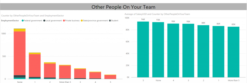
One man show? Or team play?
The lonely DBA predominates the ranking. Yeah! Special greetings to them!
Looking for the average salary they are in second place. Here the surprise, in my opinion, is the “5” and “more than 5” that are at opposite ends with a difference of 9000 USD .
What about number of working hours per week?
The number of hours with more responses is 40 with 1217 responses. (The color saturation indicates the number of answers, more saturation equal more answers)

If you look to the average salary series and using the 40 hours as reference, maybe you are tempted to say that you don’t mind to work the 45 hours per week (based on 550 answers) because you could win more 8 000 USD or 50 hours per week (based on 378 answers) because it could increase your salary by 15 000 USD.
The next chart shows only Portuguese data (only 8 answers) so you can compare between Portugal and every country.

Just another insight into the data
A lot more info could be extracted from this survey. This is my reading of some of the data, you may or may not agree with it. Please feel free to leave a comment. I would love to hear your feedback.
After this survey, and because the number of answers from Portugal were so low (only 8) I was thinking to launch an identical survey but for Portugal/Portuguese reality so we can do other kind of analysis.
What do you think about it? Would you willing to participate?
