After a couple months of fun with Power BI, I’ve picked up a few little tricks along the way that have helped me to be able to create some pretty cool data visualizations and dashboard reports. Here are five Power BI tips and tricks that you may find useful as you begin creating dashboards for your organization.
New to Power BI? Start here to get acquainted!
1) Use a pie chart or donut chart as a KPI
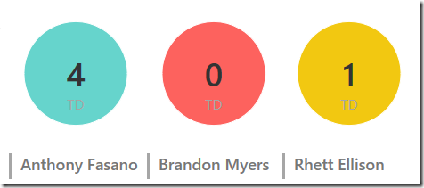
As of me writing this, Power BI is lacking a KPI visualization. I’m sure that eventually the Power BI team at Microsoft will be adding this but until then we’ll just have to deal with this. One of the ways we can work around the lack of a KPI visualization is to use a pie or donut chart visualization to mimic a KPI, which you can see here.
In the chart above, I create a KPI to quickly display which tight ends score more than, less than or equal to the average number of touchdowns all tight ends scored last year allowing me to quickly identify tight ends that score more TDs than average.
Here is my calculated column to create the KPI value for you to have as an example:
TD KPI = if(int('TE Stats')>INT('TE Stats'[Avg TE TDs]),"1",IF(int('TE Stats')<int('TE Stats'[Avg TE TDs]),"-1","0"))
Then configure a pie chart as follows.
First, I place my KPI calculated column as the Legend and as the Values.
Then I hid all the labels and configured the colors to display red (-1), yellow(0) or green(1) depending on the value of the KPI.
Now when I use a slicer to select a player, my pie chart acts as a stoplight KPI. Cool!
2) Use a chart as a slicer
I’ve previously blogged this tip before, but this one is too nifty to not share again, in my humble opinion. One of the advantages to using a visualization like a funnel chart as a slicer is you gain the ability to single-select a filter, which is something the current slicer lacks. Check out this post to learn more about leveraging Power BI’s natural cross filtering to create some pretty cool slicers.
3) Create a spark line with a line chart
A nice way to create a small trend line, also called a spark line, is to use a line chart visualization which you can see below.
This trick is pretty easy. Just create a normal line chart visualization, hide all the labels and shrink the chart down to the desired size.
4) Use a scatter graph and matrix to create a calendar chart with day labels
Last week you may have seen my blog post on how to use a scatter graph to create a calendar chart. One of the ways you can improve the calendar scatter graph is to create the visualization along side a matrix visualization, as seen below.
You can use the matrix to display the names of the week below each day in the calendar and then also optionally display the totals by day.
5) Right align the y-axis on a bar chart to prevent the labels from hiding
The bar chart is a great visualization type to use in your Power BI dashboard because its so easy to differentiate the differences between the categories. But one of the problems with the visualization in Power BI is that sometimes its hard to see the categories on the y-axis if the chart is too small. See the image below to see an example the issue I’m talking about.
One way you can work around this is to right-align the y-axis. This will cause the full value of the y-axis categories to always be displayed in all their glory albeit on the right side.
You just have to live with the category labels on the right side of the bar chart.
Resources
Need more Power BI tips? Check out these tips:
Here’s three Power BI best practices to follow.
Here are the new visualization types in Power BI.


