The Problem
Recently on a project, we had to figure out how to keep Power BI dashboards current. We discovered after pinning a series of visuals for the current month (November 2015), that while the information in the dashboard tiles would update for that month, it wouldn’t dynamically push to December without deleting and recreating all the dashboard tiles. Pinning visuals to dashboards keeps all filters applied at the time of pinning. This did not scale.
We needed the date range in our dashboards to move dynamically as days passed, so that the data displayed on the dashboard reflected the current period. After understanding how dashboard tiles worked in PowerBI.com, we figured out that we needed a simple date filter: a calculated column in the model that flags the current period and would always stay current. On the way to that solution, a dynamic date filter solution was also introduced so that users had a drop-down of options for filtering dates. We’ll present both here so you can see various DAX functions and modeling approaches to the problem and decide which is best for you.
Import Sample Data
To illustrate the concept, let’s analyze a set of data that constantly updates month to month. Historical stock information is available for free via Google’s Finance API. We’ll download Microsoft’s historical stock pricing as a CSV via the Google finance API. To do this, open Power BI and go to Home > Get Data > Other > Web and enter the following URL: http://www.google.com/finance/historical?output=csv&q=msft
When prompted that "External table is in unexpected format.", click Edit and specify you want to open the file as a CSV document and click OK.
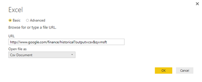
Leave the defaults and select Load. Right-click on the table and rename it to “GoogleFinance”.
Now let's create a base visualization that we'll apply date filters to. Click on the report tab and do the following:
1. Under Fields, select [Close] and [Date]. You should see a column chart with years on the X-axis as shown below:
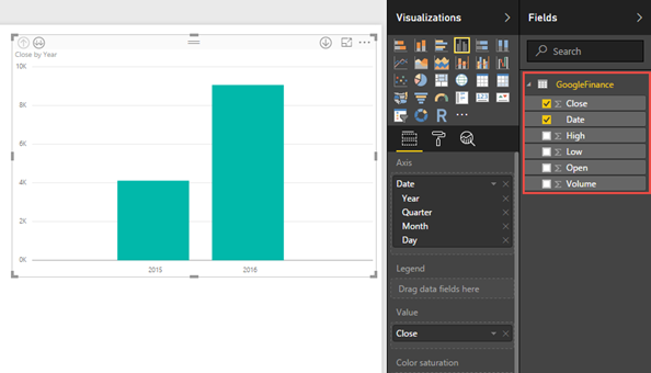
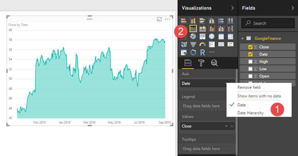
2. In the Axis Field Well, hit the drop-down and change it to use discrete [Date] instead of [Date Hierarchy].
3. Under Visualizations, change the visual to an Area Chart.
Simple Date Filter
Our first solution to the problem was a simple date filter; a calculated column (not a measure) that tags dates in a table with a value when it’s in the Current Period. There's a couple different ways to do this. We'll show you both to illustrate a couple of logical DAX functions:
Here is the code to check the [Date] against a single criteria:
Current Month (Single Label) =
IF (
    MONTH ( [Date] ) = MONTH ( TODAY () )
        && YEAR ( [Date] ) = YEAR ( TODAY () ),
    "Current Month",
    ""
)
Here is the code that will check the [Date] against multiple criteria:
Current Month (Multi-Label) =
SWITCH (
    TRUE (),
    [Date]
        >= EOMONTH ( TODAY (), -1 ) + 1, "Current Month",
    [Date] <= EOMONTH ( TODAY (), -1 )
        && [Date]
            >= EOMONTH ( TODAY (), -2 ) + 1, "Prior Month"
)
Both functions use row context and the TODAY() function to dynamically assign the "Current Month" label as time passes. However, the second example uses the SWITCH and TRUE functions together to assign additional labels based on more criteria for [Date]. This can be accomplished with Nested Ifs, but is a lot easier to code this way. Also note the use of EOMONTH here which returns the last day of the month from a given offset, and the first day of the month if you bump the offset and add a 1. Adding days to date columns is as easy as adding/subtracting whole numbers.
With either of these calculated columns in place, you can filter the Area chart for "Current Month" in preparation to pin this visual to a dashboard. Before we do, let’s look at the other type of filter we explored for this solution.
Date Window Filter
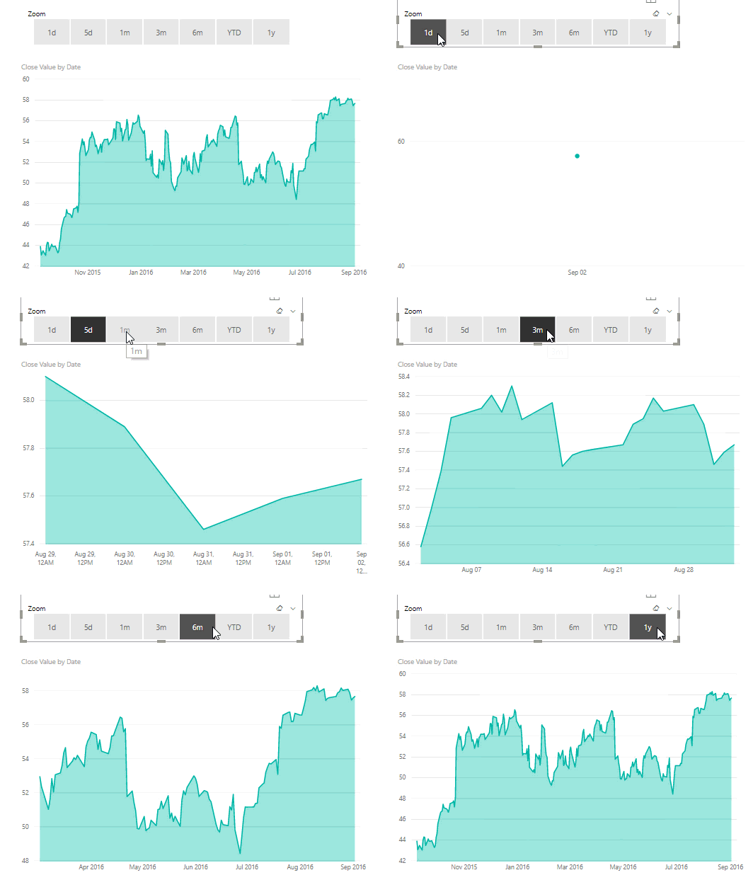
The idea behind a Date Window filter was not only to set the current month, but also provide a range of dates for an end user to pick from a drop-down to filter dates. (e.g. Current Week, Current Month, Last 3 Months, etc.) We can accomplish this by creating a set of date ranges in a parameter table to use elsewhere in our model. A parameter table is a reference list in our data model without relationships to any other table. So the final result in PBI Desktop will look like this:
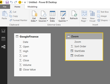
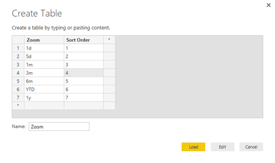
To get started, you'll need to add a manual list of date ranges you to filter by. In PBI Desktop, click on the Enter Data button in the Home tab.

You'll be presented with a dialog as shown below. Change the first column name to "Zoom" and add a "Sort Order" column. Enter the values as shown in the figure below and name your table Zoom as well:
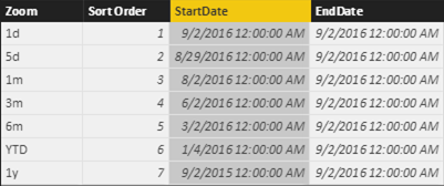
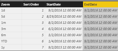
Now we'll add two calculated columns to dynamically set the date ranges: [StartDate] and [EndDate] to complete this parameter table. This ensures that with each refresh of the model, [EndDate] is set to the Last Closing date in the data, and [StartDate] of each range is calculated from there. Note the use of LASTDATE, EDATE, and STARTOFYEAR here. All handy time intelligence functions available when you have a Date-type column in your data set.
StartDate =
SWITCH (
    TRUE (),
    [Zoom] = "1d", LASTDATE ( 'DailyStockPrices'[Date] ),
    [Zoom] = "5d", LASTDATE ( 'DailyStockPrices'[Date] ) - 4,
    [Zoom] = "1m", EDATE ( LASTDATE ( 'DailyStockPrices'[Date] ), -1 ),
    [Zoom] = "3m", EDATE ( LASTDATE ( 'DailyStockPrices'[Date] ), -3 ),
    [Zoom] = "6m", EDATE ( LASTDATE ( 'DailyStockPrices'[Date] ), -6 ),
    [Zoom] = "YTD", STARTOFYEAR ( LASTDATE ( 'DailyStockPrices'[Date] ) ),
    [Zoom] = "1y", EDATE ( LASTDATE ( 'DailyStockPrices'[Date] ), -12 )
)
The data set should look like this for StartDate:
And with this code:
EndDate =
LASTDATE ( 'DailyStockPrices'[Date] )
The data set should look like:
Then we'll add a measure to the base table that utilizes this parameter table:
Close Value =

IF (
    HASONEVALUE ( 'Zoom'[Zoom] ),
    CALCULATE (
        LASTNONBLANK ( 'GoogleFinance'[Close], 1 ),
        FILTER (
            VALUES ( 'GoogleFinance'[Date] ),
            'GoogleFinance'[Date] >= MAX ( 'Zoom'[StartDate] )
                && 'GoogleFinance'[Date] <= MAX ( 'Zoom'[EndDate] )
        )
    ),
    LASTNONBLANK ( 'GoogleFinance'[Close], 1 )
)
Also, we’ll want to sort the Zoom column by the Sort Order. With the Zoom column highlighted in the Modeling window, go to Modeling > Sort By Column and selecting the Sort Order column.
Now you can swap out the [Close] measure in the visual with the [Close Value] measure, add a slicer with the [Zoom] field and see this in action.
<animatedgif>
Publish to PowerBI.com
To finish up, we'll publish this report to PowerBI.com, create a dashboard, and setup data refresh so you can see how this works.
Publish the workbook by clicking on the Publish icon in the Home tab. You’ll need to sign-in with your Power BI account. Once published, navigate to the report in PowerBI.com.
Change the Zoom filter to 1m (1 month) and hit the Pin on the upper right of the Area Chart:
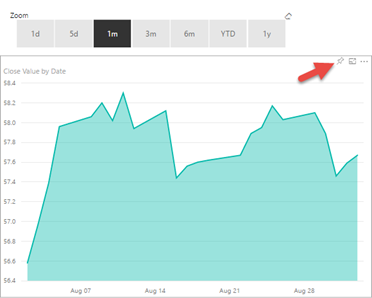
When prompted for a Dashboard, click on New Dashboard and call it “Microsoft Stock”. Repeat this process for 3m, YTD, and 1y.
Now navigate to your dashboard where you can edit the Subtitles of each tile to indicate what period they are for:
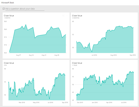
The last and final step is to make this dashboard refresh on a daily basis so that as days pass, you see each tiles’ date range change. In PowerBI.com, just to the right of the dataset for this report, click on Schedule Refresh.
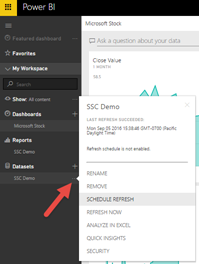
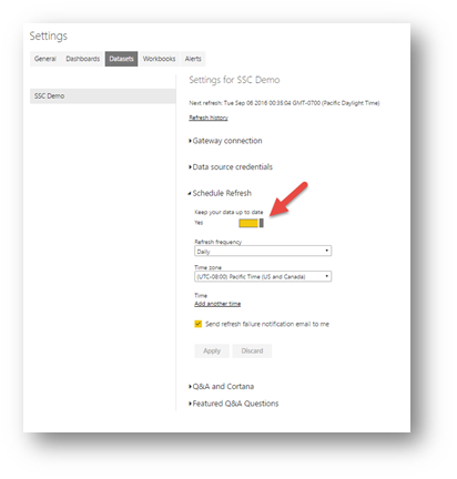
Expand Schedule Refresh and turn it on. Leave the default daily schedule. Now your dashboard will refresh every day, and as you pass into new months, the date filters will persist.
Caveats
Although we published the Date Window Filter in this example, in real-life, we went with the Simple Date Filter. The reason being that some of our measures were already using CALCULATE to do some complex date filters on many of our measures. So, if you already have a lot of measures in your data model and want to try this out, start small. Even if you are unable to use the Date Window filter approach, the Simple Filter is able to solve the issue of keeping Power BI dashboards on PowerBI.com current.
Also, our project differed in that we used SSAS Tabular as the data source. In that situation, all of the DAX formulas are the same, but the Simple Date Filter was applied in our Date table, or Date dimension. This will be the case for you if you have multiple data tables (i.e. fact tables) but would like one common date filter. Additionally, if trying this technique in SSAS Tabular or Power Pivot, you will need to set the Date Table explicitly in the model in order to take advantage of Time Intelligence functions.
Hope this helps any of you looking for to keep things current in your Power BI models, reports, and dasbhoards. If you have any questions or suggestions, please leave a comment or email me at angel@designmind.com.
