

Introduction
In a previous article, named How to visualize Python charts in Power BI, we show some charts using Python in Power BI. We saw some lines, bars, and a special function, named eventplot, to draw multiple lines. Most of the examples were charts that you can easily do with the default Power BI visuals. Now, we will show more advanced charts and examples using Python including histograms, trigonometric plots, and 3D images.
Requirements to visualize Python charts in Power BI
Please check the “How to visualize Python charts in Power BI” article. That article contains the requirements. I strongly recommend checking that article first if you are not familiar with Python in Power BI.
The histogram to visualize Python charts in Power BI
First, add the CustomerAlternativeKey field to the Visualization. This field comes from the vTargetMail view of the AdventureworksDW database mentioned in part 1 of this article.
I am assuming that you have the Python visualization added to the report.
Also, add this code.
import matplotlib.pyplot as plt
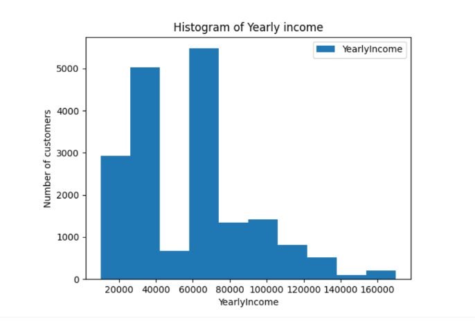
dataset.plot( kind='hist',y='YearlyIncome')
plt.xlabel("YearlyIncome")
plt.ylabel("Number of customers")
plt.title("Histogram of Yearly income")
plt.show()The code creates a histogram with the YearlyIncome field. The chart will be the following.
The code is similar to the code explained in previous articles. We added a title to the chart using the plt.title. Labels in the x and y axis using the plt.xlabel and plt.ylabel respectively.
Also, we used the kind=hist which means to use a histogram using the YearlyIncome field.
dataset.plot( kind='hist',y='YearlyIncome')
In addition, the histogram is grouping all the customers with a given Yearly income. We have around 3000 customers with a yearly income close to 20000, 5000 customers with close to 40000 USD yearly income, and so on.
How to visualize Python charts in Power BI – The sine chart
In this new example, we will create a plot of a trigonometric function. In this example, we are using the sine function. We will also generate some random numbers using the NumPy library, which was explained in the first part.
First, let’s take a look at the code.
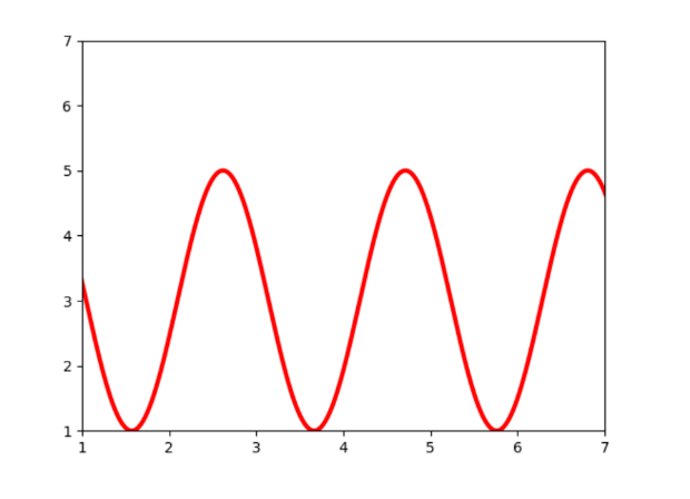
import matplotlib.pyplot as p
import numpy as n

x = n.linspace(0, 10, 800)
y = 3 + 2 * n.sin(3 * x)
fig, ax = p.subplots()
ax.plot(x, y, linewidth=3.0, color='red')
ax.set(xlim=(1, 5), xticks=n.arange(1, 8),
ylim=(1, 5), yticks=n.arange(1, 8))
p.show()
Secondly, let’s take a look at the plot generated.
Code explained
First, we are importing the matplotlib and numpy.
import matplotlib.pyplot as p
import numpy as n
Secondly, we are generating random numbers using the linspace function.
The linspace requires a start number, and a stop number and we are sending the number of samples.
x = n.linspace(0, 10, 800)
Also, the y-axis will generate a plot based on this formula which depends on the x values.
y = 3 + 2 * n.sin(3 * x)
In addition, we use the subplots function. And then we define the line width of the plot and the color. In this example red.
fig, ax = p.subplots()
ax.plot(x, y, linewidth=3.0, color='red')
Finally, we set the limits on the x and y-axis. The set function is used to set the limits. Xlim is used to define the limit at the left and at the right. In this example 1 and 5 respectively. The numpy arrange function returns evenly spaced values.
ax.set(xlim=(1, 5), xticks=n.arange(1, 8),
ylim=(1, 5), yticks=n.arange(1, 8))
How to visualize Python charts in Power BI using 3D plots
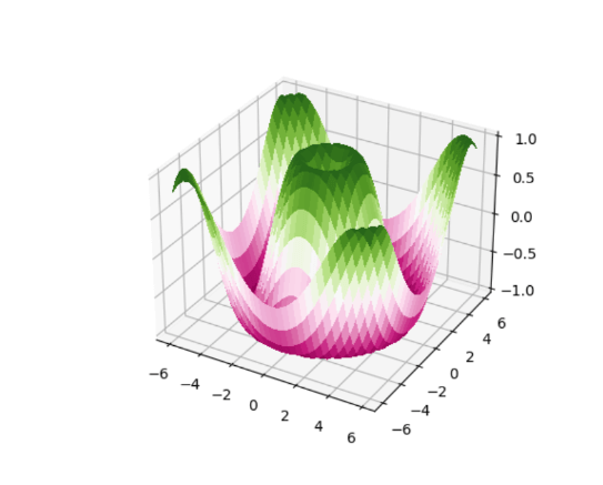
In addition, we will create a 3D plot using Python in Power BI. Here you have the plot.
Now, let’s take a look at the code.
import matplotlib.pyplot as p
from matplotlib import cm
import numpy as n

fig, ax = p.subplots(subplot_kw={"projection": "3d"})
X = n.arange(-6, 6, 0.35)
Y = n.arange(-6, 6, 0.35)
X, Y = n.meshgrid(X, Y)
R = n.sqrt(X**2 + Y**2)
Z = n.sin(R)
surf = ax.plot_surface(X, Y, Z, cmap=cm.PiYG,
linewidth=1, antialiased=False)
ax.set_zlim(-1.01, 1.01)
p.show()
Firstly, we invoke the libraries. I will not explain this section because it is similar to previous examples.
import matplotlib.pyplot as p
from matplotlib import cm
import numpy as n
Secondly, we invoke the subplot to create a subplot 3D.
fig, ax = p.subplots(subplot_kw={"projection": "3d"})The numpy arrange function is used to return spaced values within an interval specified. It requires a start number, stop number, and the step which defines the space between values. Also, we have the meshgrid function which is used to make coordinated arrays for vectorized evaluation of vector fields. In addition, we have the variable R receiving a sqrt function to find the square root of a number. This function produces a pretty nice 3D-Plot. Finally, we have the sine function for the z value. The sin function also generates nice 3-D plots.
X = n.arange(-6, 6, 0.35)
Y = n.arange(-6, 6, 0.35)
X, Y = n.meshgrid(X, Y)
R = n.sqrt(X**2 + Y**2)
Z = n.sin(R)
The plot_surface function is used to generate the plot. You can define the linewidth here. The cmap defines the colors.
PiYG is one of the options for Diverging colormaps.
surf = ax.plot_surface(X, Y, Z, cmap=cm.PiYG,
linewidth=1, antialiased=False)
And last, but not least, we set the z-axis view limits.
ax.set_zlim(-1.01, 1.01)
Conclusion
In this article, we learned 3 things. In addition, we learned how to graph a histogram using the plot function with the kind equal to hist. Also, we learned how to graph a sine trigonometric function in Power BI with Python using a random number and the NumPy library. Finally, we created a 3D chart using Python.