Gantt charts in SSRS aren’t included in the 2005 release. You can purchase a third-party add-on, or, if you can wait, these powerful project tools might make it in the 2008 release. Or Alternatively, you can do this now with the native RS Chart control by usinguse the methods David Leibowitz provides to do this now with the native RS Chart control.
Saint Nick feels the pressure:
With three weeks left until Christmas day, I decided the brave the elements and the crowds at my local shopping mall to search for some last last-minute stocking stuffers. Ok, so I was really just looking to see what goodies I could pick up on holiday sale for my own fireplace stocking (a new 60” Plasma might just stretch those red nylons out nicely), but let’s just keep that between us.
As I glided up the escalator, I surveyed the robust holiday decorations and spotted the perennial favorite in the center promenade...’ol Saint Nick. Starting at the end, I scanned the long line of children who lay in wait for the mere chance to request some lead-free toys for Christmas. And then our eyes met. Santa had me stuck in his gaze, then beckoned me forth with gestures by waving a large white gloved hand.
Giddy as a school boy, I ran down to meet him just as he hung a sign on the chair that he’d “Gone feeding the reindeer, be back in 45 minutes.” He pulled me aside and said we had to talk.
“Did I finally make the nice list?,” I blurted. It had been a long time since I’d seen anything but coal.
“Let’s talk about that later. I have serious problems this year..” he lamented.
He proceeded to tell me how production lead time went through the roof on toys, the elves were on strike for part of the year, and demand for the “Made by Santa” label tripled this year as parents purchased fewer toys with concerns over lead and questionable pharmaceutical content.
With a furrowed brow he sighed, “I really need some project reports, and I had high hopes for SQL Reporting Services.” Apparently Santa moonlighted as a developer too.
What he really needed was a Gantt chart, to visualize all of his tasks in an easily digestible graphical format. The Gantt is fairly common for displaying project tasks, complete with start and end dates and percent completion. It helps project managers, and Santa apparently, to program resources and dependencies on projects while being able to easily illustrate the timeline and duration to stakeholders.
But I knew his dilemma before he continued. A native Gantt chart does not exist within SSRS. Sure, he could wait until SQL Server 2008 when that product ships with additional Dundas charting technology sold to Microsoft. But that’s nearly a year away, and nobody but the Reporting Services team knows what controls will actually make it to the released product.
“It’s not even in the latest SQL Server 2008 CTP (Community Technology Preview),” he said with a grunt. Apparently Santa is active on MSDN too.
I suggested he could purchase a third party tool to accomplish this task today, but he’d have to pony up the scratch.
That’s when he broke the news.
“Being Santa Claus really doesn’t pay all that well. In fact it doesn’t pay at all. I do it all for the kids, “ he chuckled. I thought for a moment, then whipped out my laptop and told him he’d have a solution by the end of his lunch break. Yes, I take my laptop with me when I shop…free wireless at the café anyone??
Sixty minutes and three gingerbread lattes later, this is what I shared with him.
Set up your project
For this sample I created a new table on the Adventureworks database, but there are no ties to AW at all. Use the script in Listing 1 to add the ProjectStatus table and some sample data.
CREATE TABLE[dbo].[ProjectStatus](
[Project] [nvarchar](50) NOT NULL,
[Task] [nvarchar](50) NULL,
[TaskSequence] [tinyint]NULL,
[StartDate] [smalldatetime] NULL,
[EndDate] [smalldatetime] NULL,
[PercentComplete] [decimal](8, 2) NULL
)
ON [PRIMARY]GO
INSERT INTOProjectStatus
VALUES('Holiday Planner 2007', 'Make List',1,'2007-07-01','2007-10-01',1)
GO
INSERT INTO ProjectStatus
VALUES('Holiday Planner 2007', 'Check List Twice',2,'2007-08-01','2007-11-01',1)
GO
INSERT INTO ProjectStatus
VALUES('Holiday Planner 2007', 'Make Gifts',3,'2007-09-01','2007-12-01',.9)
GO
INSERT INTO ProjectStatus
VALUES('Holiday Planner 2007', 'Pack Gifts',4,'2007-12-10','2007-12-24',.65)
GO
INSERT INTO ProjectStatus
VALUES('Holiday Planner 2007', 'Deliver Gifts',5,'2007-12-24','2007-12-26',0)
GO
Next, create a new report, or just download the RDL file from the link at the end of the article, and follow along after changing your database connection info on the dataset).
If you are starting from scratch, create a new data with a new datasource pointing to the database with the ProjectStatus table you created. Use the select statement below to extract the data and perform some necessary conversions.
StartDate, EndDate, PercentComplete,
DATEDIFF(DAY, StartDate, EndDate)
*
PercentComplete AS CompletedDays,DATEDIFF(DAY, StartDate, EndDate)
* (
1 - PercentComplete) AS RemainingDaysFROM ProjectStatus
You’ll notice that the percent of completion is used to derive some new fields to be used in our report. With this data we will be able to easily visualize if each task is on track. Depending upon your actual application, you may already have those inputs in place.
No such thing as a free lunch
Before we get started I should explain that there are a few limitations of thise approach I will define. The first and most important is that time is always on the X-axis of the report in SSRS. Second, labels on bar charts are centered. Therefore the only way to make the start and end dates easy to read option for readability of our start and end dates is to angle the text and to place them on “hidden” segments. You would typically present major and minor gridlines on a Gantt chart to help derive the timeline visually. You’ll see later why we cannot use this approach. To be kind to our usersSo that our users can read them easily, we’ll display the start and end dates of the project task for readability on each task line; and to do so we’ll add a hidden label segment. We’ll just need enough real estate to display a label without stomping on top of our percentage label.
I have found that a good rule of measure in a multi-month report is about 10 days for this hidden segment. Since your results may vary, we’ll add that as an internal parameter.
So, create your label buffer parameter called LabelBuffer, set it to Integer and Hidden with a default value of =10.
Layout the Report
Switch to Layout view in your report and add a Chart control from the Toolbox. Right click the chart, then hover over Chart Type, then Bar, and select Stacked Bar. Our approach will provide stacked bar elements for the completion and remaining components of each task. While most stacked bars begin at the Y-axis, (or 0), ours will begin with a hidden segment so as to show the relative starting point of each task. We’ll do this with default setting first so you can see the approach before we dress it up a bit.
Bind to Data
Right click the chart again and select Properties. Click the Data tab and select DataSet1 for your connection. Next we’ll add some values, following this order:
Value 1
Series label: Start Date – Value
Value: =DateAdd("d",(Parameters!LabelBuffer.Value) *-1,CDate(Fields!StartDate.Value))
What this does: Sets the starting point for our stacked bar not at the start date, but at the task start date minus our “label buffer”. All we need is a small margin to place a date label for the real component of the chart

Value 2
Series Label: Start Date – Label
Value: =Parameters!LabelBuffer.Value
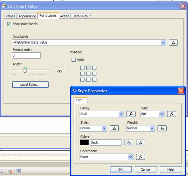
On the Point Labels tab, select “Show point Labels”
In the Data Label area, select “=Fields!StartDate.Value”
For Format code, “d” will suffice, then slide the Angle indicator to -35. Next, click the Label Style button and set the output to Arial and 8pt which should be fine for a little label.
What this does: Provides the actual space for our label. In this case, the Start Date.

Value 3
Series Label: Completed
Value: =Fields!CompletedDays.Value
On the Point Labels tab, select “Show point Labels”
In the Data Label area, select “=Fields!PercentComplete.Value”
For Format code, P0 will display a properly formatted percent for our decimal value. Next, click the Label Style button and set the output to Arial and 7pt. Note that you will have to manually enter any values below 8pt as they do not appear on the drop down selector.
What this does: This is the segment that will visualize the amount of completed work for the task.
Value 4
Series Label: Remaining
Value: =Fields!RemainingDays.Value
What this does: This segment will provide a bar segment for the amount of work to be done.
Value 5
Series Label: End Date – Label
Value: =Parameters!LabelBuffer.Value
On the Point Labels tab, select “Show point Labels”, then in the Data Label area, select “=Fields!EndDate.Value”
For Format code, “d” will suffice, then slide the Angle indicator to -35. Next, click the Label Style button and set the output to Arial and 8pt, just as we did for the Start Date Label.
What this does: Provides the actual space for our End Date Label.
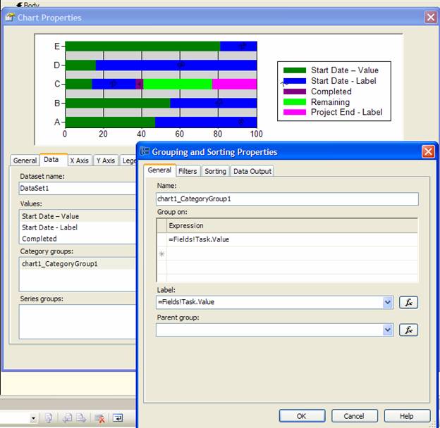
Back on the Data tab of the Chart Properties, well add the categorization by Task. In the Category groups section, click Add. For the Expression and Label properties, use =Fields!Task.Value. Then on the Sorting tab, ensure that the Expression is set to =Fields!TaskSequence.Value and Ascending.
We use TaskSequence because your layout might display by Task description or start date of the activity. On a Gantt chart, we want to ensure that the task sequence is correct since that typically notes dependencies of those activities.
With this last property set, your chart control should look like this:

Dressing it up – Let’s Make a Gantt!
Now, back in Chart Properties, click the X Axis tab and mark a checkbox in “Side Margins” and “Reversed.”
On the Y Axis tab, uncheck “Major gridlines” and “Side Margins”. In the Label format code use M/yyyy, which will convert the dates to a Month / Year. Lastly, set the Scale Minimum property to =Min(DateAdd("d",Parameters!LabelBuffer.Value * -2.2,Fields!StartDate.Value)) and Scale Maximum to =Max(DateAdd("d",Parameters!LabelBuffer.Value * 2,(Fields!EndDate.Value)). This will fix the range to our start and end points, plus a little more buffer for readability. Note that the expression editor button is absent from these fields, but you can add code to be evaluated at run-time. Hopefully this will be more intuitive in SQL Server Reporting Services 2008.
If you click Preview now, it won’t be so terrible, though the default color scheme may leave you a little nauseous. Hopefully you can see what we’ve been working towards though. The “Make Gifts” section below illustrates this nicely. The hunter green and blue sections are our hidden segments that tell us when the task starts and also provides a placeholder for the label. These “push” out the start of our task data to a relative position on the chart. Unfortunately, there is no “Transparent” color setting for the bar chart elements, but we can achieve this functionality by simply setting the background and border colors to match the background of the Chart. You might be wondering why we have the blue section at all. Earlier I mentioned that labels within bar groups are placed in the center and you have no other options for layout. The later a task starts the larger its hidden segment, and therefore the start date label will be rendered further away. In order to maintain some consistency, I’ve added the blue segment to ensure that labels are no more than the equivalent of 10 days away. As discussed earlier, your needs may vary and that’s why we’ve made that a parameter.
The bulk of the Gantt reporting is in the purple and lime green sections to note completion and remaining time. The last pink segment is the label placeholder for the end date of the task.
![]()
Now that you understand the framework, our next steps will be some final dressing up. Click the Layout tab on your report then return to the Chart Properties.
On the Legend tab, ensure that “Show legend” is unchecked. Gantt’s are fairly visual and we don’t need the loss of screen real estate. On the General tab, click ‘Plot Area Style’, select the Fill tab and change the background color from LightGrey to White.
On the Data Tab, double click the value “Start Date – Value”, select the Appearance tab and click ‘Series Style.’ On the Fill tab, set the color to White. Make the same color settings for the value “Start Date – Label” and “Project End – Label.”
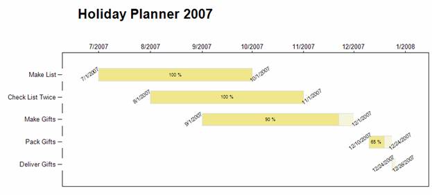
For “Completed”, go to ‘Series Style’ on the Appearance tab. On the ‘Bonder and Line’ tab, ensure that Style is Solid and the color is Gainsboro. On the Fill tab, select the color Khaki. For the “Remaining” value, also set the Border to Solid and Gainsboro. But on the Fill tab, select Beige.
If you’ve followed the bouncing ball, your project plan should look like the following image.

Note that you will have some considerations to make with your Gantt charts, like label buffer size and buffers on either end of the chart (added in the Y Axis Min/Max Scale properties). Also, you might be tempted to add major and minor gridlines which are common on Gantt charts. Unfortunately it will look choppy as the lines fall behind our white colored hidden segments. Such is the cost of a work-around.
Epilogue
I handed the .RDL solution over to Santa and he immediately deployed to his server. Without a moment to spare, he heaved himself onto his sleigh and hastily prepared to return to the North Pole.
“So did I make it to the nice list?” I anxiously questioned.
“Let’s talk about that later,” he said as his sleigh took flight. As he ascended I could hear in the distance, “In the meantime, now that I see the value of this report, I have another report request for you…”
Typical end-user.
Happy Holidays!


