Azure Data Studio (ADS) is a lightweight IDE built on Visual Studio Code. I've written a few articles on how the tool works, and this one continues the series. In this article, I want to look at the database dashboards and how you can customize them.
The other articles in this series on ADS works are shown here:
- Getting Started with Azure Data Studio
- Getting Comfortable Writing Code in Azure Data Studio
- Using Notebooks in Azure Data Studio
- Using Azure Data Studio with TFVC
- Using Azure Data Studio with Git
- Editor Tips and Tricks for Azure Data Studio
- Using the Import Extension in Azure Data Studio
- The Profiler Extension in Azure Data Studio
- Server Dashboards in Azure Data Studio
You can download the tool and read those articles to learn about how to use this in writing code. I've gotten more comfortable with the tool, and while I still like SSMS, there are some features in ADS that I prefer.
The Default Database Dashboard
In a previous article, we covered server dashboards in ADS and how to customize those for your needs. There also are database dashboards in ADS as well, which are very similar and function in a similar way. To launch a dashboard for a database, I'll pick one of my connections in the server blade and right-click it. I choose Manage, which gives me the database context. Below I see the ZeroDowntime database and some details. The server dashboard had info about the host and counts of missing backups. This one shows me the specifics of this database. I see
- recovery model
- last backup (db and log)
- compatibility level
- owner

Below this, I have a list of objects and a search bar, where I can look for a particular object. If I were to search for "customer", I'd see these results: a table and two procs. On the right side, I have a clickable area below Actions. For the table, I see: edit data, script as create, and select top 1000.

For the procedures, I get scripting options.

I like that there are scripting options instead of just running things. That's a more code-first, DevOps approach to the world. Hopefully developers save these scripts in a VCS.
Custom Dashboards
To customize this dashboard, we use a similar process to the server dashboard. We go to the settings with the command palette (CTRL+Shift+P).

We could scroll down, but the best thing to do is search in settings. Look for dashboad.database.widgets.

If we click "edit in settings.json" we get a file to work with. This looks familiar, and similar to the server dashboard settings. Once again, the default settings are not included, so if you start to customize this, you lose the defaults. I don't like that design decision, but I'm not in charge.
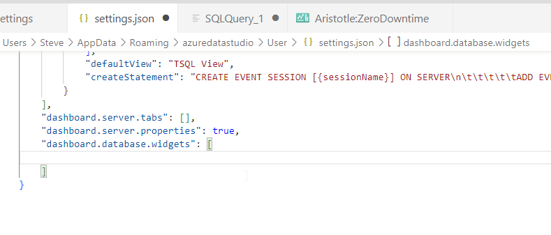
Adding a Widget
Microsoft has a few tutorials that show sample widgets. There is a table space widget tutorial, which has us adding this code to the file.
{
         "name": "Space Used by Tables",
         "gridItemConfig": {
             "sizex": 2,
             "sizey": 1
         },
         "widget": {
             "table-space-db-insight": null
         }
     },
Once I add this, I save the settings and then close and re-open the database dashboard. I still see the basics at the top, but now my search for objects is gone. I have a graph of table spaces.
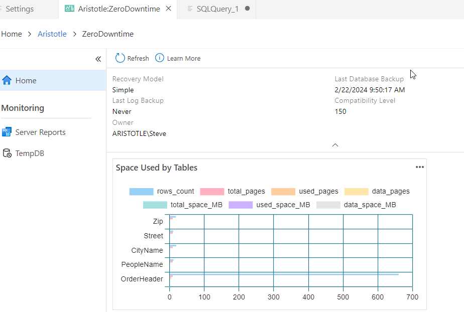
Interesting. If I change the sizex and sizey to 4 and 2 (doubling them), I see this dashboard.

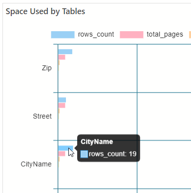
This is an interactive widget, as I can hover over a bar and see the details.
Custom Widgets
Just like the server dashboard, we can add custom widgets. We do this by letting ADS write the code for us from the results of a query. For example, maybe I want to get a count of role members in my database. I could run a query like this:
select a.name
, count(*)
from sys.database_principals a
inner join sys.database_role_members r on a.principal_id = r.role_principal_id
group by a.name
When I run this in ADS, to the right of the result set I have a set of types. One of these is chart, and if I click this, I get a chart that I can see. Note that near the top I have a "Create Insight" option,
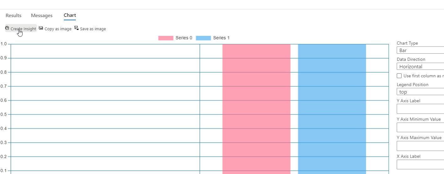
I'll change the chart slightly to use the first column as row labels, which gives me a better chart. If I click the Create Insight, then I get a bunch of JSON. I can copy and paste this into my settings file, above the previous widget. I'll also rename this to something that makes sense.
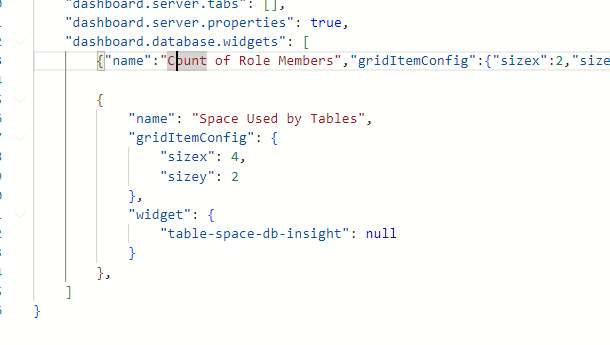
I also need to save the query to my disk. I'll do that in a utilities folder I have.

Now I need to reference this with the path in my insight. If I go to the end of the JSON, I see a queryfile element. I'll edit that to look like this. Note that I had to escape the backslashes.

Note I can refresh my database dashboard by closing and opening it. I now see two widgets:

This is an interactive wizard, and it will update with data changes. I'll run this in my database:
create user Bob for login Bob_sa
go
alter role ClientApp add member Bob
go
Then I can click the three dots in the upper right corner and select refresh for my membercount chart. When I do that, I now see this:

I can add widgets for any data I want, especially data that might change, and then include them in my dashboard.
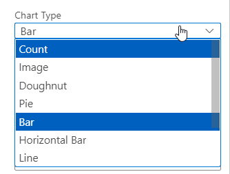
As another example, perhaps I want to check the status of a particular table, maybe the count of new rows in the last hour compared to the average per hour for the last day or week. If I can write a query, I can create a widget that is a table or a chart. I have these chart types.
Microsoft also includes a 5 slowest query widget in a tutorial, but I don't find a list of whether there are any others.
Summary
In this article, we looked at the basics of the Database Dashboard in ADS and how you can customize this with your own widgets. This is very similar to a server dashboard in how you add widgets. Run a query, save it, and then select chart results. From there, you can create a widget that you paste into the settings.json file.
Give this a try and customize ADS to work with the databases you manage with custom metrics and settings. Just be aware that any widgets you add will apply to all databases.


