I am a fan of Thomas Davenport, who writes about advanced business analytics for publishers such as the Harvard Business Review and Forbes. Davenport has a simple, uncomplicated perspective of analytics moving from classical business intelligence (descriptive summaries and simple charts), through to predictive and prescriptive analytics (predicting the future and making decisions based on these predictions respectively). There is a theme of evolution in business intelligence (BI) here that are similarly reflected in the various reports from Gartner, material from SAS, whitepapers from EY and even in the emerging sales pitch for Microsoft Azure and Azure Machine Learning.
Across all of these media, there is a consistent emphasis on prediction; the prediction of customer churn, the prediction of house prices, the prediction of credit scores etc... However, prediction alone is a pretty mindless exercise, which often fails to highlight the factors which are truly driving business trends. There is a large bridge to build between raw prediction and business insight / decision making.
In this post, I want to try and give some substance to this idea and demonstrate how exploratory analysis can help cross that gap between typical business intelligence and predictive analytics. I will use a time series dataset from AdventureWorksDW2012 to demonstrate the appeal of very simple exploratory techniques to build upon simple charts and help uncover patterns and relationships in this data that are not revealed via predictive analytics.
To be concise, I am less interested in predicting next month's sales, than I am in understanding which products are selling well, which are underperforming and whether there are clear groups of products which behave similarly. Whilst I am a huge fan of machine learning hopefully, this post will remain as a reminder to myself, and others, that simple exploratory techniques can yield a wealth of information.
The Data & Classical BI
For this post, we are going to work with a time series dataset from AdventureWorksDW2012. This dataset plays a central role in Microsoft's Data Mining Tutorial. Everything we do here will be in R. I have created an ODBC connection to the server which hosts this data warehouse, and can extract the data as shown below:
library(RODBC)conn <- odbcConnect("R-SQL")vTimeSeries <- sqlQuery(conn, "select * from AdventureWorksDW2012.dbo.vTimeSeries")odbcClose(conn)| ModelRegion | TimeIndex | Quantity | Amount | CalendarYear | Month | ReportingDate |
|---|---|---|---|---|---|---|
| R750 North America | 200712 | 62 | 33479.38 | 2007 | 12 | 2007-12-25 |
| M200 Europe | 200604 | 8 | 27099.92 | 2006 | 4 | 2006-04-25 |
| R750 Europe | 200802 | 35 | 18899.65 | 2008 | 2 | 2008-02-25 |
| R250 Europe | 200803 | 16 | 39093.60 | 2008 | 3 | 2008-03-25 |
| R250 Europe | 200604 | 27 | 96613.29 | 2006 | 4 | 2006-04-25 |
The goal of Microsoft's tutorial is to predict future sales. However, we intend to dig a little deeper and describe the sales of each product across all 3 regions. To begin with, it seems sensible to plot the trend over time:
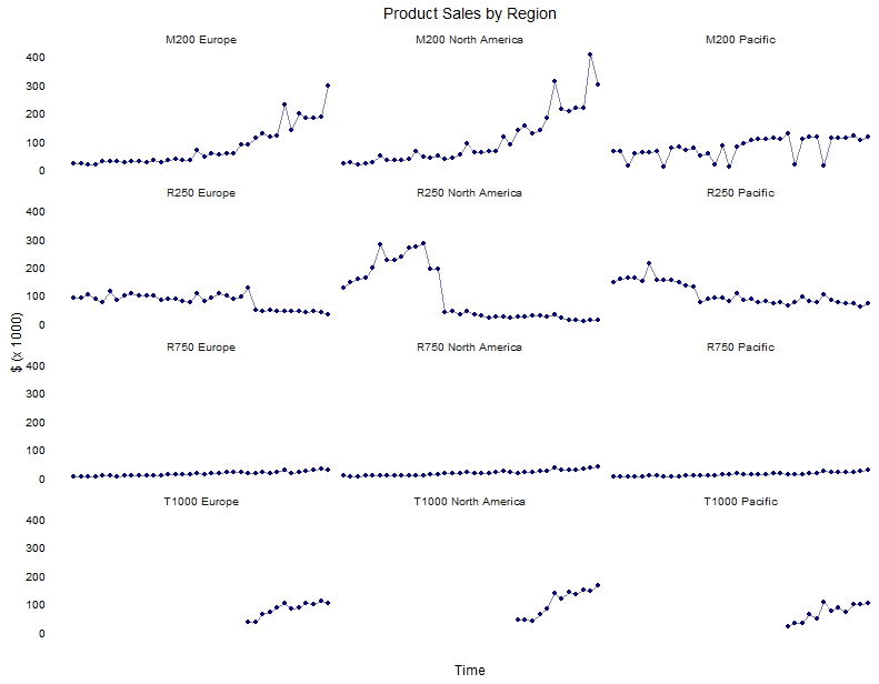
library(ggplot2) ggplot(vTimeSeries, aes(x = factor(TimeIndex), y = Amount / 1000, group = ModelRegion)) + geom_point(colour = "darkblue") + geom_line(colour = "darkblue", alpha = 0.5) + facet_wrap(~ ModelRegion, ncol = 3) + theme_minimal() + theme(panel.grid = element_blank(), axis.text.x = element_blank()) + ylab("$ (x 1000)") + xlab("Time") + ggtitle("Product Sales by Region") + guides(group = "none", colour = "none") 
This is clean, nice data (which we would expect from a tutorial). All the same, there are some interesting trends above. We can see that the M200 product line shows sales growth in Europe and North America. There has been a sharp decline in the sales of the R250 product in North America, and less extreme in Europe and the Pacific. The sales of R750 look like they have slowly increased in all three regions. The T1000 product has performed quite well since its introduction in the later part of this period. There are some interesting peaks and troughs which could be explored with the business, but let's try to capture the major sales trends.
Product Clustering
It's great that this dataset is so clean, and that the trends are so easy to see. This will make it easier for us to understand the following two plots and help come to terms with what they represent. In any dataset, there are three questions that I really want to know about: what items (products in this case) are similar, which are dissimilar and what is it that separates groups of products from each other? We are going to use hierarchical clustering to provide some initial answers to these questions, and principal components analysis to visualise the contrasts.
Currently, the data is held in a long format: one row per observation. This is ideal for machine learning algorithms, but not for most exploratory methods. We have flipped this data around so that there is one row per product / region, and separate columns for every time point. In the end, we have a matrix with 12 rows (4 products x 3 regions) and 36 columns (monthly data over 3 years). To keep this post short and to the point, I have excluded the code for this. But there are many ways of achieving this.
To identify groups of similar / dissimilar products, we are going to use hierarchical clustering. Hierarchical clustering builds a tree, where similar products will end up in the same branches and dissimilar products will end up in other branches. We are going to use R's heatmap function for this, and ask it to compare products using a correlation distance (note, the default is euclidean distance, but as this is longitudinal data, a correlation distance is far more suited).
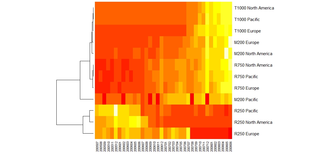
heatmap(byRegion, distfun = function (x) as.dist((1 - cor(t(x)))), Colv = NA) 
There is quite a bit going on here; we will take it slow and not try too hard to over-interpret it. The colours range from red (low sales) to yellow (high sales). Here we can clearly see the drop in sales for the R250 product line, and we can see that this drop is actually the most acute for the European region. Similarly, the odd little troughs for M200 in the Pacific are blindingly obvious and show up as 6 red bands. For all other products, there is a gradual increase in sales.
It's a little hard to tell from the dendrogram to the left of the heatmap, but I would suggest that there are 4 groups of products here: Group 1: M200 which have shown strong improvement in sales, especially in Europe and North America; Group 2: R250, where the sales have declined over the years; Group 3: R750 which has all steadily increased; Group 4: T1000, which came on the scene about midway through this period and have shown strong increase in sales. M200 in the Pacific is an outlier as far as I can tell.
Honestly, we didn't need to perform clustering and plot a heatmap to see these trends. They were obvious from the original charts. However, clustering (and heatmaps) are really useful for much larger, more complex datasets. As an example, they are used almost exclusively in human genomics to visualise the relationships between hundreds of thousands of people and millions of mutations. At scale, strong trends can become very easy to spot.
Communicating Trends
I like heatmaps, but I would very rarely put one in front of a business person. There are better ways to communicate these trends, that require less detail and are simpler to consume. Given that we used a correlation distance above, principal components analysis should do a similarly good job of separating out the product groups. Below, we will perform principal components, and then format the data to create a simpler, more appealing plot:
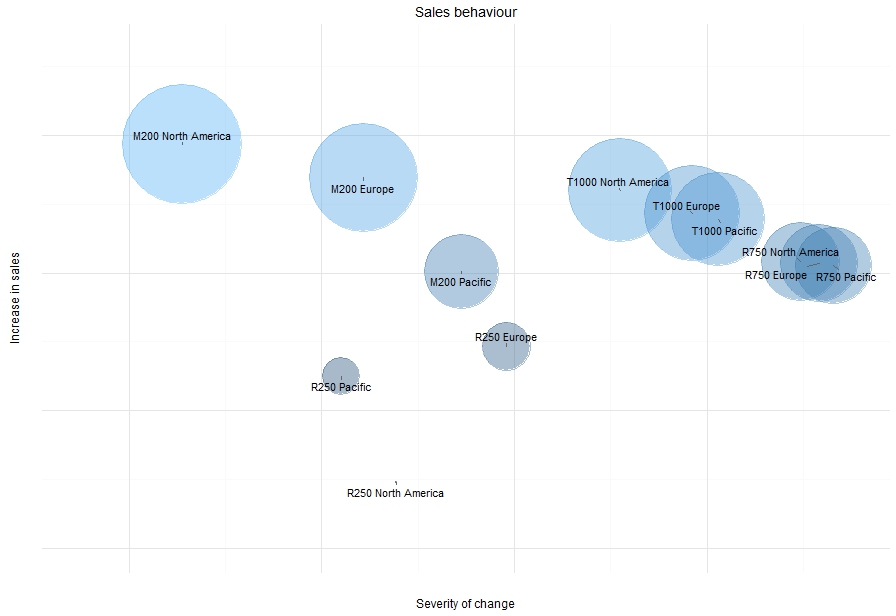
pca_regions <- prcomp(byRegion, scale = FALSE, center = FALSE)plot_data <- data.frame(pca_regions$x)plot_data$Region <- rownames(pca_regions$x)library(ggrepel)ggplot(plot_data, aes(x = PC1, y = -PC2)) + geom_point(aes(colour = -PC2), alpha = 0.4, size = -scale(plot_data$PC2, center = max(plot_data$PC2), scale = 17500)) + geom_text_repel(aes(label = Region), colour = "black") + xlim(-850000, -50000) + ylim(-800000, 650000) + theme_minimal() + theme(axis.text = element_blank()) + xlab("Severity of change") + ylab("Increase in sales") + guides(colour = "none", size = "none") + ggtitle("Sales behaviour")Now we get a different view of the data.

The first two principal components here do a nice job of separating out our 4 product groups. The y-axis describes the amount of improvement in sales over the 3 year period, with higher values indicating stronger increases. For example, the M200 product line in North America and Europe both showed strong upward sales trends in our initial charts and is consistent here.
The x-axis describes the severity of change in sales, where the severity increases the further to the left. For example, the strong upwards trend in M200 (Europe and North America) and the distinct drop in sales of R250 in North America (and somewhat also in the Pacific) are emphasised. Interestingly, the original time series charts really highlighted the sharp drop in sales of the R250 product in North America. But, this chart suggests that while the dorp in R250 sales in the Pacific was less extreme (and less noticeable in the time series charts), it may have had a larger relative impact on sales in the Pacific compared to North America. This would be interesting to explore further.
Final Thoughts
There is a large difference between "what will our future sales look like?" and "what factors are driving / hurting sales?". Predictive analytics and machine learning are incredibly powerful tools, but they often don't give the whole story. In fact, prediction alone very rarely provides insight into trends, or what might be driving these trends. With simple exploratory techniques however, these questions are often simple to answer. As always though, statistics are open to interpretation - so (to me) simple is almost always better, and clear, direct communication of results trumps flashy technical presentations any day.

