A reader of one of my previous posts pointed out that the legend order and segment order in my core visual stacked column chart did not match. I had to ask the Power BI team about this, and they explain that there is a way to make them match, but it’s a bit unintuitive.
The Problem
My default, the legend order and segment order are opposite of each other, as shown in the chart below.

Notice how the gray segments are at the top of each column, but at the bottom of the legend.
The Solution
You can fix this by selecting your chart, going to the format pane, finding the Columns section, and enabling the Reverse Order toggle.

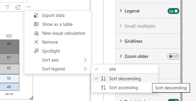
This will reverse the order of the segments in the actual chart. You can then sort the chart from the visual’s more options (…) menu.

Now your column segment order and legend order will match.

I had probably noticed the reverse columns setting but had not considered its effect vs the legend.

