Color is a powerful attribute in data visualization. In a good visualization, it can focus attention and enhance meaning and clarity. When color is used poorly, it creates clutter and confusion. Power BI has a default color palette, but it isn’t always optimal or even appropriate for many reports. Luckily, Power BI allows you to use any color that can be defined by a hex code where visuals allow colors to be changed. With so many choices, choosing a color palette can be overwhelming. Below are some tips to help you choose a good color palette for your Power BI reports.
A color palette is simply a collection of colors applied to the visual elements in your report. What we typically refer to as color is a combination of three main properties: hue (base color on the color wheel), intensity (brightness or gray-ness) and value (lightness or darkness). You can build an engaging and professional looking report with just 6 colors. It’s possible to have fewer colors or more colors, but 6 should cover many common visualization needs. If you are using more than 6 colors, you might want to check that you are optimizing engagement and cognitive load.
- Main color – default color on graphs
- Color 2 – used when multiple colors are needed in a graph or report
- Color 3 – used when multiple colors are needed in a graph or report and Color 2 has already been used
- Highlight color – a color used to highlight important data points to make them stand out from other points on the page
- Border color – a light color used for borders on tables and KPIs where necessary
- Title color – color used for visual titles and axis labels as appropriate

While your title and border colors don’t have to be variations of gray, gray is a practical color for these purposes when using a white background. You could also use brown, blue, purple, etc. You just want to ensure that your text color has sufficient contrast from its background and that it isn’t more intense than your data colors. I tend to make my border color a tint of the title color.
This is a good place to define a few terms. A hue is a base color without black, white, or gray added, which you might find on a basic color wheel. A shade is achieved by adding black to any pure hue, making it darker. A tint is achieve by adding white to a pure hue, making it lighter. A tone is achieved by adding gray to a pure hue, making it less saturated and more muted.
I think it’s easiest to start your color palette by choosing the main color. This could be inspired by your corporate color palette or logo, your favorite color, or a color associated with the subject matter of your report. Be aware that color has cultural meaning and conveys emotion, and you want to choose a color that conveys the appropriate tone of your report. This can get tricky, so just try to make sure you don’t choose a main color that has a lot of cognitive dissonance with your subject. For instance, if you are creating a report for a U.S. audience about our gun violence problem, you probably wouldn’t use a light, happy, pastel green as your main color. But you could be fine using a bright red, dark blue, orange, black, or several other colors.
You will want to choose a main color that has a medium intensity. If it is too bright or too dark, you won’t have any room to use a more intense version of that color to focus attention. And since you want your main, secondary, and tertiary color to be the same intensity, it would feel as if everything on the page were yelling at you if all three colors were bold. If you are starting from a corporate color palette, be aware that most brand color palettes were designed for websites and print collateral, not data visualization. They are usually too intense or bright to serve as your main data visualization colors. But you can use a tint or tone of your corporate colors so your reports stay on brand.
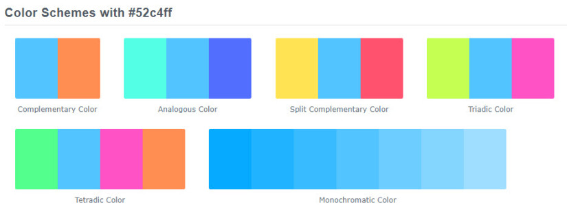
Once you have chosen your main color, you need to decide what type of color scheme you would like to use. Common options include:
- monochromatic – tints and shades of a single hue
- complementary – colors that are opposite each other on the color wheel
- analogous – colors that are next to each other on the color wheel
- split complementary – a base color plus two colors that are adjacent to its complement on the color wheel
- triadic – colors that are evenly spaced on the color wheel

My current favorite tool for choosing colors is ColorHexa. It provides hex colors, color schemes (as shown above), tints, shades, and tones.
Once you have made some initial color choices, test it out on a few charts to ensure you can answer yes to the following questions:
- Are all colors easily distinguishable from each other? If you were to use the main, secondary, and tertiary color in a line chart, could you easily follow the lines as they cross each other?
- Is your color palette color blind friendly? You can use ColorHexa or Coblis to check this. It’s not always obvious when you have people with color vision deficiency in your intended audience, so it’s better to use colors that are easily distinguishable by those with red-green color blindness (deuteranomaly, deuteranopia, protanomaly, and protanopia).
- Does your highlight color have high contrast from your other colors so it is obvious that it is being used to draw attention to a trend or data point?
- If you are using a non-white background color, do your colors stand out sufficiently from your background?
- When you look at your color choices, do you find the combination generally appealing, balanced, and not overly jarring? This is a bit subjective, but if you look at your colors and have a negative reaction then your audience will probably have a similar reaction.
Finally, be aware that colors display differently on different screens and surfaces. You can put a lot of time and effort into choosing the perfect colors, then share a report with someone and have it look rather different on their monitor or when viewed on a projector screen. If you can, review your colors on the equipment that your intended audience will most commonly use to make sure it looks good for them.
If you are still having trouble choosing colors, you can check out the Power BI Report Theme Gallery for some inspiration. Not every example in the gallery shows good color choices, but you can still use it to get ideas.
Once you have your color palette, you can reuse it in future reports by making a report theme. And if you aren’t a fan of manually writing JSON for your report theme, check out the Report Theme Generator from PowerBI.Tips. If you define your colors in a report theme, Power BI will create tints and shades of your colors for you, saving you the trouble of having to look them up yourself.

If you have advice to help others choose colors, leave a comment on this post or tweet me.


