Creating a bar graph with R in SQL Server 2017 is relatively easy. It’s just a matter of finding the correct functions, components, and properties of the package of your choice. For our example here, I am using ggplot2 which is probably the most popular plotting system for R.
Let’s create a quick colorful bar graph. This should demonstrate how easy it is to use ggplot2 in SQL Server 2017 with R. “Easy”, of course, is a relative term. Well, it’s not easy on the onset as you have to get yourself familiarized with all the components of the package. But once you’re doing this on regular basis, you’ll get the hang of it. Think of the time when you’re still learning how to write your first Select statement in SQL.
Cheesy Bar Graph
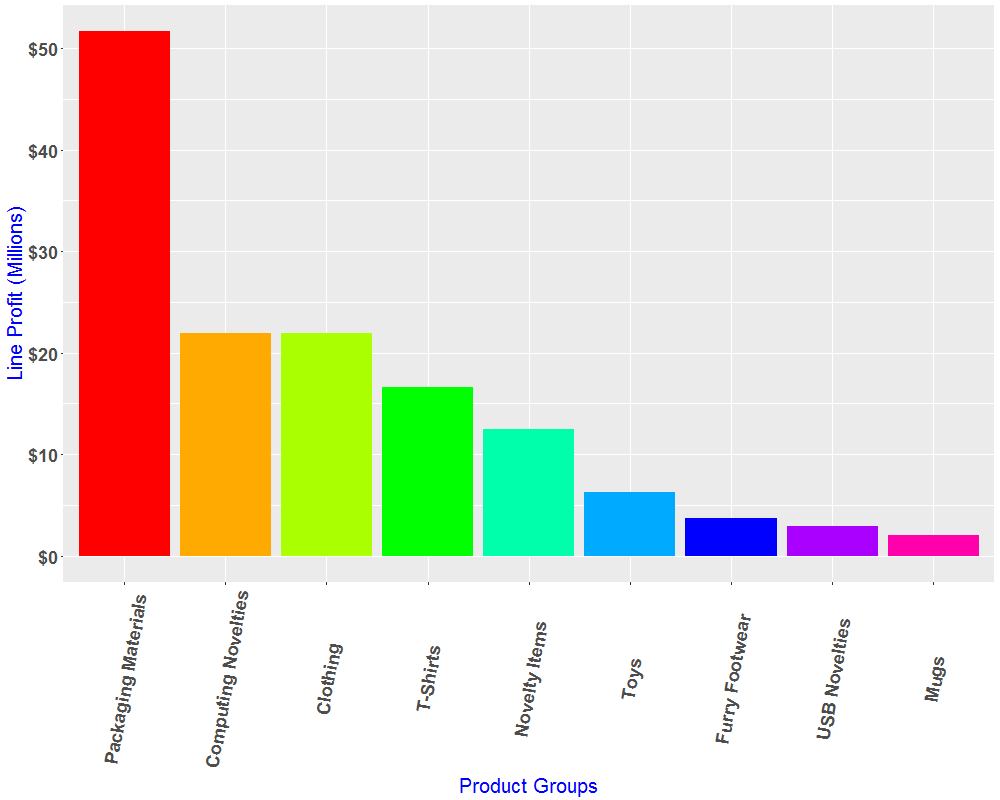
Let’s begin with the end in mind. Here’s our cheesy colorful bar graph:
Install Package
Let’s install the package if it hasn’t been installed yet. The easiest way to do that is to run RGUI.exe that came with your SQL Server 2017 In-Database Machine Learning installation. You can find it here:
C:\Program Files\MSSQL14.MSSQLSERVER\R_SERVICES\bin\x64
Take note that you need to run the executable as Administrator. Also, if you’ve installed the R engine prior to your SQL Server 2017 In-Database Machine Learning with R, you have to explicitly tell the R package installer where you want your package installed.
> install.packages("ggplot2", lib="C:\\Program Files\\Microsoft SQL Server\\MSSQL14.MSSQLSERVER\\R_SERVICES\\library", dep = TRUE)
dep = TRUE tells the installer to install dependencies. ggplot2 depends on a lot of other packages. You can check dependencies using MiniCRAN.
Dataset
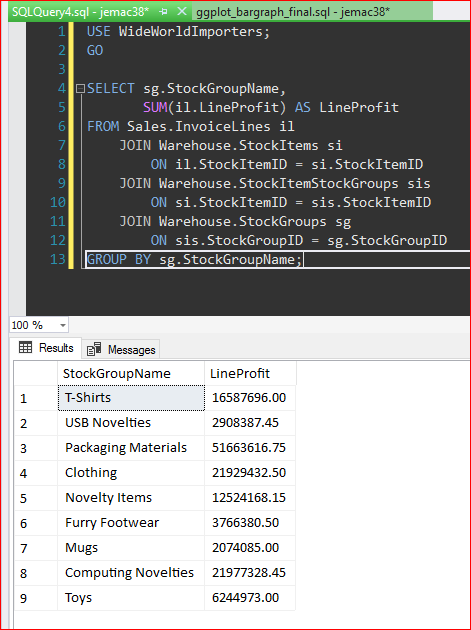
Our dataset is based on the WorldWideImporters database. Here we’ve got the Sum of Line Profit per Stock Group:
USE WideWorldImporters;
GO
SELECT sg.StockGroupName,SUM(il.LineProfit) AS LineProfitFROM Sales.InvoiceLines ilJOIN Warehouse.StockItems siON il.StockItemID = si.StockItemIDJOIN Warehouse.StockItemStockGroups sisON si.StockItemID = sis.StockItemIDJOIN Warehouse.StockGroups sgON sis.StockGroupID = sg.StockGroupIDGROUP BY sg.StockGroupName;
Setup
Let’s create a directory for the graphics output –C:\Marlon_Test.
Here’s the script that we pass to @script parameter for sp_execute_external_script:
library(ggplot2); chartStockGroupProfit <- "C:\\Marlon_test\\StockGroupProfit.png" png(filename=chartStockGroupProfit, width=1000, height=800) StockGroupProfit <- InputDataSet StockGroupProfitChart <- ggplot(data=StockGroupProfit, aes(x=StockGroupName, y=LineProfit)) + geom_bar(stat="identity") print(StockGroupProfitChart)
Where:
chartStockGroupProfit - Filename
StockGroupProfit - Data Frame based on the InputDataSet (see Select Statement above)
StockGroupProfitChart - The actual chart
Create the Bar Graph
Let’s put that together. Note: Although you specified you wanted to install the dependencies for the ggplot2 package (dep = TRUE), the installer in some cases might not install all of them. If the ggplot2 fails with “missing package” error, just install the specified package using RGui.exe (see above).
EXEC sp_execute_external_script @language = N'R',@script = N' library(ggplot2); chartStockGroupProfit <- "C:\\Marlon_test\\StockGroupProfit.png" png(filename=chartStockGroupProfit, width=1000, height=800) StockGroupProfit <- InputDataSet StockGroupProfitChart <- ggplot(data=StockGroupProfit, aes(x=StockGroupName, y=LineProfit)) + geom_bar(stat="identity") print(StockGroupProfitChart)', @input_data_1 = N' SELECT sg.StockGroupName, SUM(il.LineProfit) AS LineProfitFROM Sales.InvoiceLines il JOIN Warehouse.StockItems si ON il.StockItemID = si.StockItemID JOIN Warehouse.StockItemStockGroups sis ON si.StockItemID = sis.StockItemID JOIN Warehouse.StockGroups sg ON sis.StockGroupID = sg.StockGroupIDGROUP BY sg.StockGroupName;';
Bar Graph Format
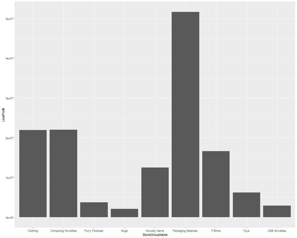
You may argue that the above graph looks a lot better than our colorful graph at the top of this blog. But arguments aside, let’s put on some formatting.
You may notice that the Y-Axis (Line Profit) is not in Dollar ($) format. The Packaging Material group is more than $50,000,000.00.
Well, you can argue about the aesthetic of the graph, but you may agree that the exponential format of the Line Profit is not quite intuitive.
If we divide the LineProfit by the exponential value of 1e6 (1 times 10 to the power 6, which is 1,000,000), then we get a readable metrics:
aes(x=StockGroupName, y=LineProfit/1e6)
To format that value in Dollars ($), we need to add another library to the script – library(scales).
Then we can do:
scale_y_continuous(labels = dollar)
Rename Labels
You may notice that the Y-Axis Label says “LineProfit/1e+06”. That can easily be renamed by using the lab() function:
labs(x="Product Groups", y="Line Profit (Millions)")
To format the data frame labels, use the theme() function:
theme(text = element_text(size=20, color="blue"), axis.text.y = element_text(size=18, face="bold"), axis.text.x = element_text(size=18, face="bold", angle=80, vjust = 0.5))
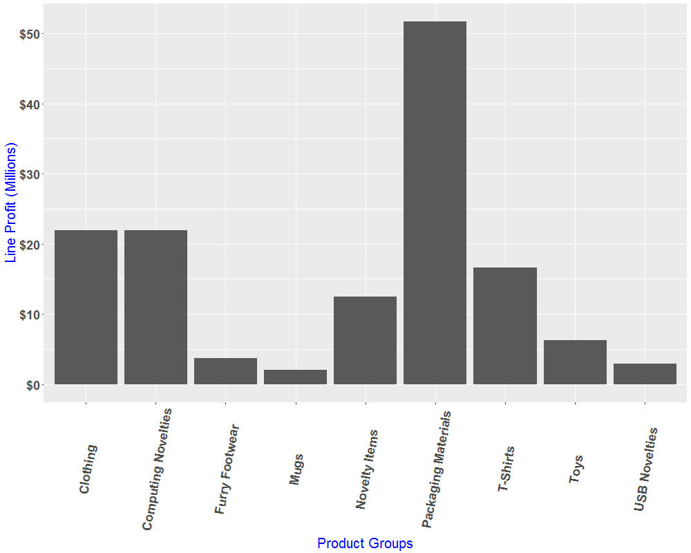
Then, we should have something like this:
Reorder Bar Graph
Just to have the graph easy to read, let’s reorder the bar in descending order.
Plus, we don’t really like to look at bars that seem to resemble that of a dirty finger gesture (you’ll see it).
aes(x=reorder(StockGroupName,-LineProfit / 1e6), y=LineProfit / 1e6))
Rainbow Magic
To have that rainbow effect on the bars, modify the geom_bar() like this:
geom_bar(stat="identity",fill = rainbow(n=length(StockGroupProfit$LineProfit)))
Putting it all together
Here’s the complete R code:
EXEC sp_execute_external_script
@language = N'R',
@script = N'
# Use ggplot2/scales
library(ggplot2);
library(scales)
# Create chart file (folder must be existing)
chartStockGroupProfit <- "C:\\Marlon_test\\StockGroupProfit.png"
png(filename=chartStockGroupProfit, width=1000, height=800)
# Define data frame
StockGroupProfit <- InputDataSet
# Build chart
StockGroupProfitChart <- ggplot(data=StockGroupProfit, aes(x=reorder(StockGroupName,-LineProfit / 1e6), y=LineProfit / 1e6)) +
geom_bar(stat="identity",fill = rainbow(n=length(StockGroupProfit$LineProfit))) +
theme(text = element_text(size=20, color="blue"), axis.text.y = element_text(size=18, face="bold"), axis.text.x = element_text(size=18, face="bold", angle=80, vjust = 0.5)) +
labs(x="Product Groups", y="Line Profit (Millions)") +
scale_y_continuous(labels = dollar)
print(StockGroupProfitChart)',
@input_data_1 = N'
SELECT sg.StockGroupName,
SUM(il.LineProfit) AS LineProfit
FROM Sales.InvoiceLines il
JOIN Warehouse.StockItems si
ON il.StockItemID = si.StockItemID
JOIN Warehouse.StockItemStockGroups sis
ON si.StockItemID = sis.StockItemID
JOIN Warehouse.StockGroups sg
ON sis.StockGroupID = sg.StockGroupID
GROUP BY sg.StockGroupName;'
There you go. Happy plotting!
The post Creating Bar Graph In SQL Server 2017 Using R appeared first on SQL, Code, Coffee, Etc..


