I recently wrote a post on the BlueGranite blog called Improving Screen Reader Accessibility in Power BI Reports. It contains some good reasons why accessibility should be considered when it comes to usability features of any web property or data viz. And it shares several tips to make your report more accessible to screen readers and those who navigate via keyboard only. This all came about because I got the chance to work with my friend Dave Bahr, an accessibility specialist who is also blind and an advanced user of screen readers. He helped me test various features and do the screen capture you see in the video embedded in the BlueGranite blog post. It was a very interesting and enlightening experience that provided enough content for multiple blog posts. So here’s my second blog post (the first on my Data Savvy blog) with more of what I learned from this experience.
Power BI is off to a good start with screen reader accessibility and keyboard navigation, but there are some gaps. They have added keyboard shortcuts to navigate between pages, examine the visuals on a page, and show the data in an accessible format. These features are consistent across Power BI Desktop and PowerBI.com. 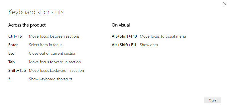
It’s also pretty cool that when the screen reader encounters a visual on the report page it announces the visual title, the chart type, and the alt text. Why does this matter? When we talk about charts on a report we tend to say something like “That sales by region bar chart is…[interesting/not showing correct data/etc.].” Now someone using a screen reader can also follow that reference. Props to the Power BI team for making that work. Based upon my testing so far, it also works on custom visuals (for the most part).
Keyboard (and screen reader) users can also access the menu options to drill down a level and expand down a level. When they do this, the accessible Show Data table changes to what is currently shown in the visual.
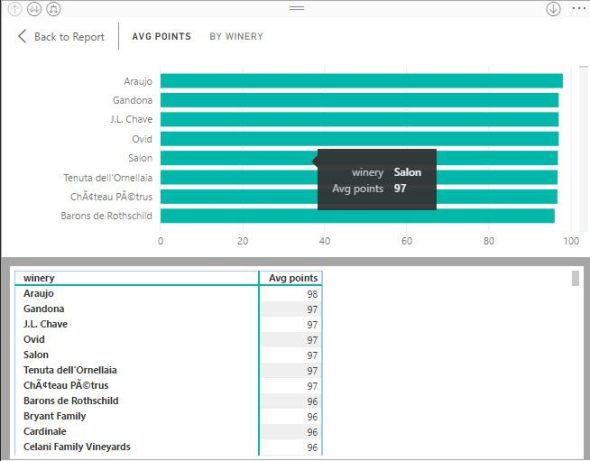
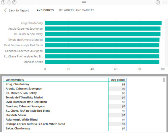
The data in the accessible Show Data table will render in the order it is shown in the visual, so you can control that in your design. One exception to this is when the data is rendered in a matrix rather than a table: the total in the accessible Show Data table is positioned at the top rather than the bottom where we see it visually. This is a purposeful design decision to help the user understand the total and then the breakdown of subtotals. Another good thing about the accessible Show Data tables is that tooltips are included, just like when we use the See Data feature.
Another nice feature (not sure if this is built in to JAWS or something the Power BI team added) is that if you have a report page that takes a while to load JAWS will say “Alert: Visual are loading” so it’s obvious to a blind/low vision user that they need to wait to get the full report page.
There is still a bit of work to be done to make Power BI truly accessible to screen readers. Currently, keyboard users cannot interact with visuals on the page. This means that users who do not use a mouse cannot:
- Click a bar in a bar chart and see other charts on the page cross-filter/cross-highlight
- Drill down on a single value within a chart
- Select a value in a slicer
- Click on a hyperlink in a table or text box
- Click on an image that is linked to a bookmark or external hyperlink
- Play or stop audio or video that requires user interaction
This seems like a tall order from a development standpoint. But there are other features that require less effort that could make a big difference in the user experience of a screen reader/keyboard user. I have logged ideas for each of these features, and I hope you will add your vote to my ideas.
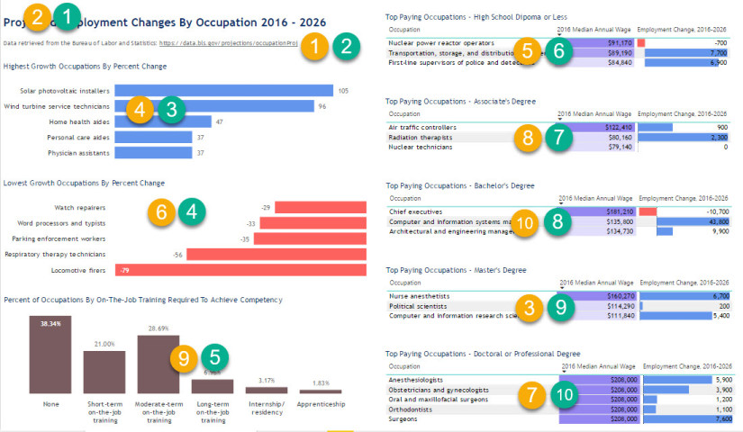
- Currently, a keyboard user presses the Tab key to move between visuals on a page. The order in which they arrive at visuals is arbitrary. In Power BI Desktop, it seems to be the order in which the report designer placed the visual on the page. The behavior in PowerBI.com was the same until this month. Now I’m not sure what the order is there. Most of us design reports that guide our users through a path, with information placed in a specific order that follows their line of thinking/questioning. Keyboard users can’t easily follow the visual order we have imposed because the tab order is basically random (from their point of view). I thought I had a workaround by creating a new report page and copying the visuals over to the new report page in the desired navigation order, but that now only works in Power BI Desktop and not the web service. It would be fairly easy to expose a property in the formatting pane that allows the report designer to set the tab order. Then they could tab in the order we want a user to consume the content. In the image below, the yellow numbers are the current tab order created by Power BI and the green numbers are desired tab order. I would like the user to consume the left side of the report from top to bottom and then consume the right side of the report from top to bottom. But currently, screen reader users get sent all over the page in an unhelpful order.
 Please vote here for adding Expose tab order as a property of visuals for keyboard navigation.
 - When we add hyperlinks in tables, users can click on them to navigate to the target of the link. Users who navigate via keyboard currently cannot do this. There is no way to click on the link. The URL does show up in the accessible Show Data table, but the user has to use the keyboard to find the URL, select it, copy it, and then open a web browser and paste the URL into the address bar. It should be possible to render the URL as a link rather than just text, so a user with a screen reader could just select the link and use it to navigate to the target destination. Please vote here for Make columns containing urls have embedded hyperlink in accessible show data table.
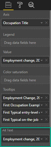
- While there is an option to add alt text to each visual, that text is static. So there is no way to use alt text to provide a summary of trends in the chart without manually updating the alt text each time the data is updated. It would be great if the alt text could be populated by fields in the data model. Just like we now have a Tooltips section, we could have an Alt Text section to drag fields into. Where fields in tooltips apply to a specific data point, fields in alt text would be an aggregation over the total data used in the visual, e.g., in a chart that shows sales by month, the alt text would show total sales or last sales amount (depending on what measure was dragged in). But that would be a great start.

Mockup of requested Alt Text section in the Fields Pane of Power BI The ideal feature for this would be to do something like the Englighten Data Story custom visual where you can add text and then placeholders for fields, then add the fields in the order you want them to fill the placeholders. That would be a bit more complicated, so I would gladly settle for just being able to drag fields into an Alt Text section and have it show summary numbers. Please vote here for Allow use of field value to populate alt text.
- Make textboxes accessible to screen readers. Currently, the contents of a textbox can’t be read via screen reader so you must resort to copying the content to the alt text property. When a user uses the Show Data keyboard command, nothing is available for the textbox – it’s just blank. At the least, the contents of the textbox should be available in a single column/single row table via the Show Data command. Even better would be to auto-populate the alt text with the textbox contents by default. Even better than that would be to reserve the alt text for other comments and add a different property that would allow a screen reader to read out the contents of that property right after the alt text. Please vote here for Make textbox contents accessible to screen readers.
Some other interesting things I learned:
- Many blind users have their browsers settings such that they don’t load images. It saves time in loading the page without detracting from their user experience. When browsing a Power BI report with the browser set to not load images, the screen reader still knows an image is there and announces it (“image”), even if it doesn’t appear on the screen.
- If you use the Play Axis custom visual and allow it to interact with a another visual and then look at the accessible Show Data table for the other visual, the contents will continue to change based upon the changing of values in the Play Axis. While this is rather amusing, I’m sure it makes it difficult for screen reader users to figure out what’s going on and actually obtain information.
Power BI has an opportunity to be a leader in accessibility (of all areas, not just for screen readers). In our increasingly data-driven work cultures, people of all abilities need data. Please help the Power BI team know that accessibility should get some of their limited attention and resources by voting for my ideas or logging your own. If you log an accessibility related idea, feel free to link to it in the comments of this post or tag me on Twitter and I’ll help publicize it.


