Data visualization should be iterative. You should get a good initial draft put together and then check to make sure it meets your success criteria. Then check the design to ensure it it effectively conveys information in a manner that is easy for your audience to consume. You can then make some changes and check things again. One design check you’ll want to perform is the Squint Test.
The Squint Test helps you check the effectiveness of the layout and design of the elements in your report. You can perform the Squint Test using one of two methods:
- Lean/step back from your screen and partially close your eyes.
- Use an application that blurs the details of a web page containing your report or an image of your report, creating an effect similar to squinting.
This allows your design to become blurry, removing visual detail so only the largest, most rudimentary shapes are seen.
When you squint at your report/dashboard, you’ll notice the overall layout and the elements that stand out most. In other words, the Squint Test gives you a high-level view of the visual hierarchy of your work. This is a great way to check that you are making good use of preattentive attributes and Gestalt principles!
Here are some questions to ask yourself while performing the squint test:
- Are any foreground elements not standing out enough against their background?
- Are there any background or border elements that unintentionally draw more attention than more important data elements?
- Is the most eye-catching element on your report page an important element?
- Are your charts in an appropriate order on the report page?
- Are elements spaced appropriately so that objects that are closer to each other have some type of relationship?
- Is the report page balanced so one side is not heavier than another? Is the amount of white space on each side of the report fairly even?
- Are there colors that “pop” more than other colors? Are the items that pop intentionally highlighted or accidentally overly prominent?
Performing the Squint Test in Power BI
While you can definitely perform the Squint Test on your report within Power BI Desktop, I recommend also testing in a browser once the report is deployed to PowerBI.com or to the Power BI Report Server portal since colors and objects may be slightly different there.
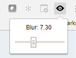
The Squint Test is also used in web page design, so web developers have made tools to aid them in this check. While just squinting at the page is perfectly sufficient, using a browser extension or another tool allows you to easily share your findings with others. In the Chrome Browser, there is a free extension called The Squint Test. This extension places an eye icon near the top right of the browser window. Clicking the icon provides a slider that allows you to increase or decrease the amount of blur applied to the page.

I usually turn the blur to about 6 to perform my Squint Test.
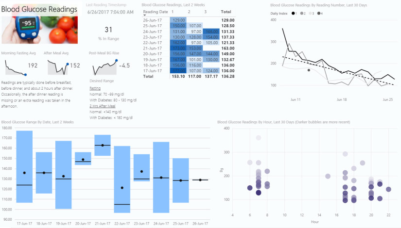
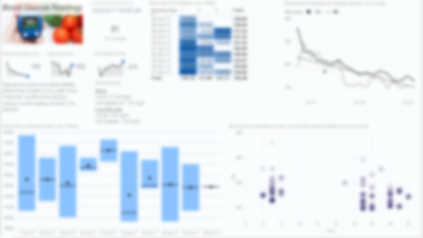
As an example, below is a draft of a report page I made earlier this year. The first image is the original report, and the second image is the blurred version to be used for my test.
My thoughts from my squint test:
- I don’t use a lot of chart backgrounds, and my report page background is a very light gray. So they aren’t overshadowing any objects in the foreground.
- I also don’t use chart borders, so things look good there.
- The items that stand out the most are the image in the top left with the glucometer and tomatoes, the matrix with conditional formatting that shades the cells blue, and the box and whisker plot in the lower left quadrant. I’m ok with these items being the most prominent. Although the image could be considered decorative, the image is helpful in explaining the information contained in the report (glucose readings).This is more meaningful when viewing the full report with multiple report pages. The other two prominent elements are displays of data. The matrix is most prominent where readings are high and needing attention. The box and whisker plot is a good summary of glucose levels throughout the day.
- Charts seem to be in a logical order. Flowing left to right, I get some quick summary numbers and trends, individuals readings that explain those trends, the readings shown based upon time of day, the range of readings throughout the day, and then a longer term view of readings throughout the day over time.
- When I look at spacing, I think the matrix needs to be moved to the right to make the space between it and neighboring graphs more even. The matrix is not more related to the sparklines and KPIs to the left than it is to the line chart to the right.
- One could argue that the page is a bit unbalanced, since the scatter plot and the line chart are a bit less prominent than the other graphs on the left side of the page. I think moving the matrix to the right a bit plus the use of the dark purple colors, evens it out somewhat.
After reviewing my findings, I could make the necessary changes and then check it again, iterating until I am satisfied.
Now you can use the Squint Test to check your visual hierarchy of information and improve the efficacy of your Power BI reports. Happy squinting!
This post is part of a series. Go here to see the list of posts in the series.


