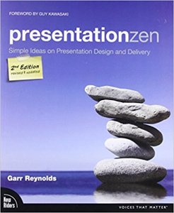
In Part 1, I gave some advice from Toastmasters. We’ll return to the Toastmasters advice in Part 3. In Part 2 we’re going to look at recommendations from Garr Reynolds. You can find this advice and more in Presentation Zen, which I found to be a helpful and informative resource.
Less Is More
When I first started presenting, I tried to put every bit of information of my talk into my slides. This is a bad idea. Here are some reasons why:
- It turns the slide into an eye chart, which is often hard to read from the back of the room.
- Initially, the audience will read your slides. While they’re reading, they’re not listening.
- Most of the content is better delivered in a document or checklist you can link to or give out hard copies of.
- Slide after slide of text causes folks to tune out and pay attention to other things, like their smartphones.
Therefore, it’s better to put highlights in your slides. Write down key points. Ensure your font sizes are large. If you find yourself having to shrink down the font size constantly to get content on the slide, you’ve got too much. Also, if you have lots of nested bullet slides, you have too much. After all, you are the one giving the talk, not the slides.
Of course, when you’re presenting a webinar or giving a class, we tend to err on the side of putting more on the slides. Again, consider if the content is better served in a different format. I admittedly struggle with this one when I give webinars because I realize that sometimes audio problems do crop in for listeners and they may only get the visual during a key point.
Yes, there are some presenters who have the busiest slides but still give a great talk. Realize, though, they are the exception to the rule. There’s a reason folks like Brent Ozar, who continually scores well on attendee reviews, spend significant time reducing and simplifying their slides and other visuals.
Pictures Are Awesome
A good example of this is in the link to Presentation Zen in the first paragraph compared to the picture of the cover. The link may not draw your eye. The picture most likely did. When you can provide pictures, especially clear screenshots of what you’re talking about, that’s helpful. Color and variety keep interest up, as long as such selection isn’t garish to the viewer. If in doubt, ask a few folks you trust to give you honest feedback to look over your slides.
Demos Are Valuable Too
This goes along with pictures and is my add. However, demos are a double-edged sword. I’ve been in plenty of presentations where the presenter went to demo something and it was obvious he or she wasn’t comfortable giving the demo. They didn’t know where particular selections were in the GUI, they were typing in the demo and didn’t remember objects or keywords, or they hadn’t started with a “clean” demo environment. Or the presenter ran out of time because he or she didn’t realize how long a demo would take.
Practice your demos repeatedly before you give them. Also, build setup and cleanup scripts for your demos. Test those as you practice. Your demos should flow smoothly. If they don’t, you will lose the audience. Also, you should know how much time your demos will take the show the data. That’s part of your overall presentation and you need to know that you have enough time to get everything done. You only can know this with solid practice.
The Star Is You
Basically, your slides and demos are there to enhance your talk. You should be the primary source for information. Likely there are several others who present on the same technology feature you’re concentrating on. You’re the difference between their talks and your own. Often, I will pick a talk based on the reputation of a speaker, even if I know the technology. For instance, is Andy Leonard presenting? Then I’m likely there. Aunt Kathi? Sorry, Andy, you’re bumped. You get the idea.
I know with both of those folks that even if I know the subject matter well, I’m still going to come away learning something new. Also, I’m going to enjoy the time I spend in their talks. They have different presentation styles. Andy wins you over with a lot of humor and wit. Kathi has a way of making you feel comfortable and the center of her attention even in a crowd of a hundred or more. Also, both convey their information solidly and help make difficult concepts understandable. Your visual aids should enhance you, not the other way around. That’s the way it works for these two and every successful presenter in our community.


