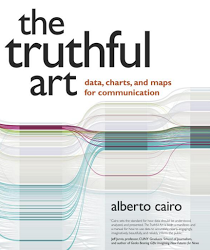
I’m participating in the #vizBookClub, a great idea by the data visualization community. In short, we read a book about data visualization and we post our thoughts online. A blog post with more detail: Introducing our Data Viz Book Club. The first selected book is The Truthful Art by Alberto Cairo (blog | twitter). I’ve always wanted to read his books, so this book club was the ideal reason to get me started. The Truthful Art is actually Alberto’s second book, the first one being The Functional Art (which I haven’t read yet unfortunately). A third book should be on it’s way: The Insightful Art.
Disclaimer: I bought the book myself, so I didn’t get it for free (which happens from time to time if you write book reviews). This means I can give an unbiased review of the book.
TL;DR version: this is an amazing book. It’s very well written (I didn’t notice any mistakes, so that’s a big plus) and the pace of the book is just right. The book is full with beautiful examples of data visualizations and Alberto does a great job in explaining how you should create visualizations that portray data accurately and how you can avoid creating deceiving graphs. Absolutely recommended for everyone with a healthy interest in data visualization.
Now the long version:
As I said before, the book is well written and it’s really a beauty. The book starts with a general introduction into visualizations (why you should create them and how they can help you gain more insights and expand your knowledge) and their fundamentals. Alberto also explains the truth continuum (hence the title of course) and the different models you can create with your stories and visualizations. Each model may be closer or further away from the absolute truth.
There’s a part about the principles of visualizations, the different types of charts and how you can use graphs to explore your data. From time to time a bit of statistics are thrown in (distributions, error margins, deviation etc). Luckily Alberto is not like my college professor in statistics: he really pulls it off to explain everything in terms I can even understand. Some chapters go deeper in how you can visualize certain aspects of statistics: distributions, percentiles, change and relationships in the data (regression, correlation, uncertainty, significance etc). The book also has a nice part about maps, again with beautiful examples. Alberto explains why some projections work and why some don’t (I’m talking about you Mercator!). At the end of every chapter you have a nice list with reference material if you want to dive deeper into a certain topic (noooo, even more reading to do).
I’m really happy I read this book. However, if you are looking for a book that tells you how to create graphs, which colors to choose, which graph type to choose et cetera I think Stephen Fews book are more practical. In my opinion, The Truthful Art is more geared towards journalists, infographic designer and researchers (which is normal due to Alberto’s background as a journalist and editor of graphics at newspapers). Business Intelligence / Data Analysists like myself will still get something out of this book, especially the statistics part and data exploration is useful. Lots in the examples in this book though are “one-shot” visualizations: meaning they look very nice because they only had to be made once (to be published in a newspaper for example). If you create visualizations daily for reports or dashboards, you can’t put that much effort into a graph (Alberto said he created most charts in this book by just a few clicks or lines of code, but there are lots of – stunning – examples made by other people). However, the basic principles still remain they same (don’t truncate your axis on a bar chart) and this book will certainly offer you something if you’re more interested in data visualization.
Conclusion: a must-read for people who daily create visualizations, such as journalists or researchers. If you’re on the business side of things (working with Power BI, Tableau, SSRS, Cognos, BO, …) you are probably better off with Stephen Fews books if you are just starting with data visualization. Those books really explain in detail how to create graphs, tables and dashboards. However, if you have more interest, I still recommend this book. I certainly will read the other books written by Alberto.


