Introduction
This time we will provide some tips to improve the Power BI report appeal. Let’s face it. Software engineers are not usually good to create nice reports. We can deal with complex code, AI, but usually (there are always some exceptions to the rule) we cannot create a decent report with good colors and a better look and feel.
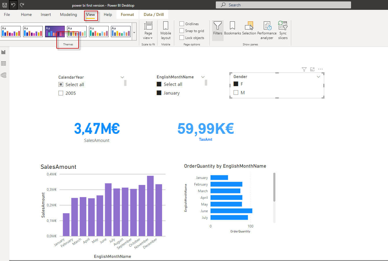
In this article, we will modify the following Power BI report.
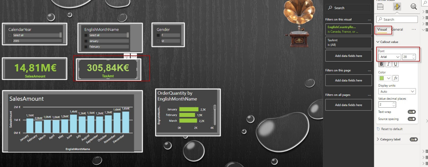
We will convert the previous report into something like this:
Requirements to improve Power BI report appealing
First, we need an ugly report already created.
Secondly, we will use PowerPoint. I am using PowerPoint 2019, but older versions may work as well.
Tips to improve Power BI report appeal - Change the theme
First, you need to change the theme. Go to View and select Theme gallery.
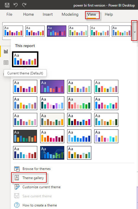
Secondly, select your favorite Theme. In this example, we will select the first one.
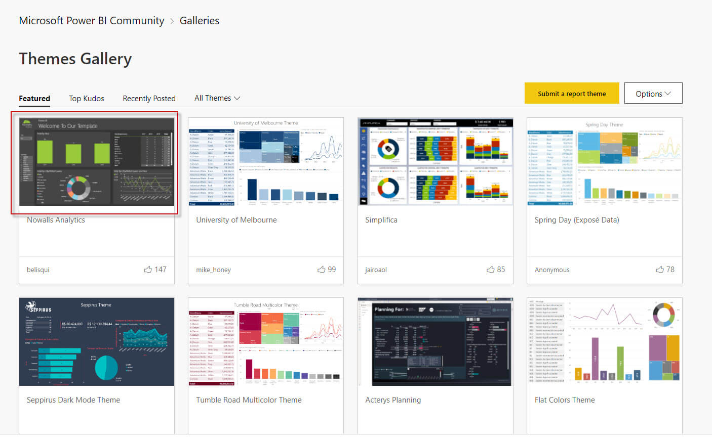
Thirdly, download the JSON file related.
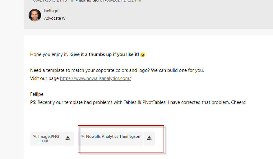
Also, open your JSON file. You will notice that the JSON file includes the colors for the background, foreground, data, etc. The colors use hexadecimal values. You can manually change the colors in the JSON file directly.

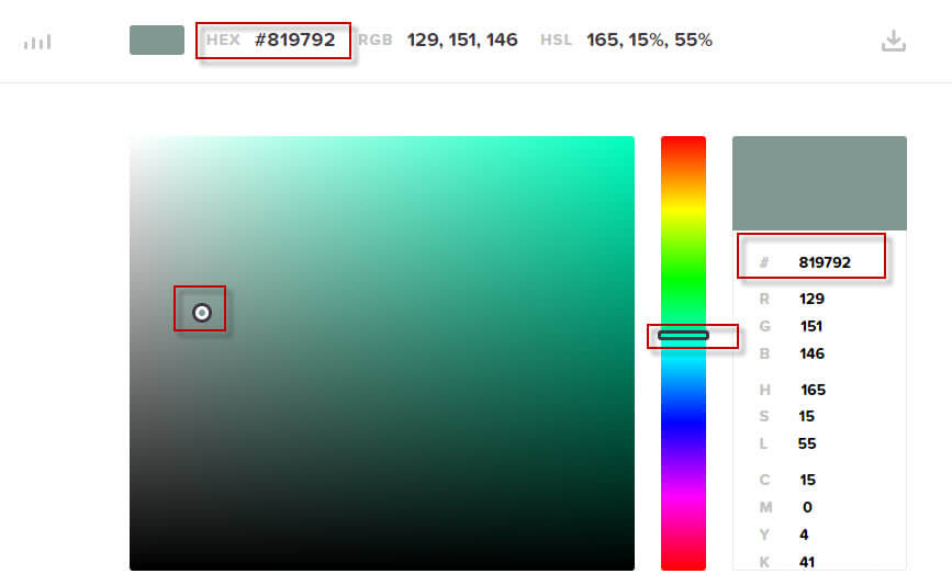
In addition, if you do not know anything about hexadecimal color codes, you can use this link:
You can select a color and check the hexadecimal codes for the colors selected and use those numbers in the JSON file.
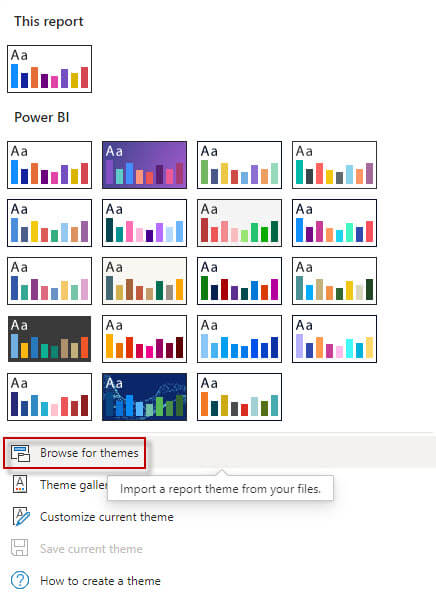
Also, once the JSON file is saved, select the Browse for theme option and select your JSON file downloaded from the gallery.
Once applied, you should have something like this:
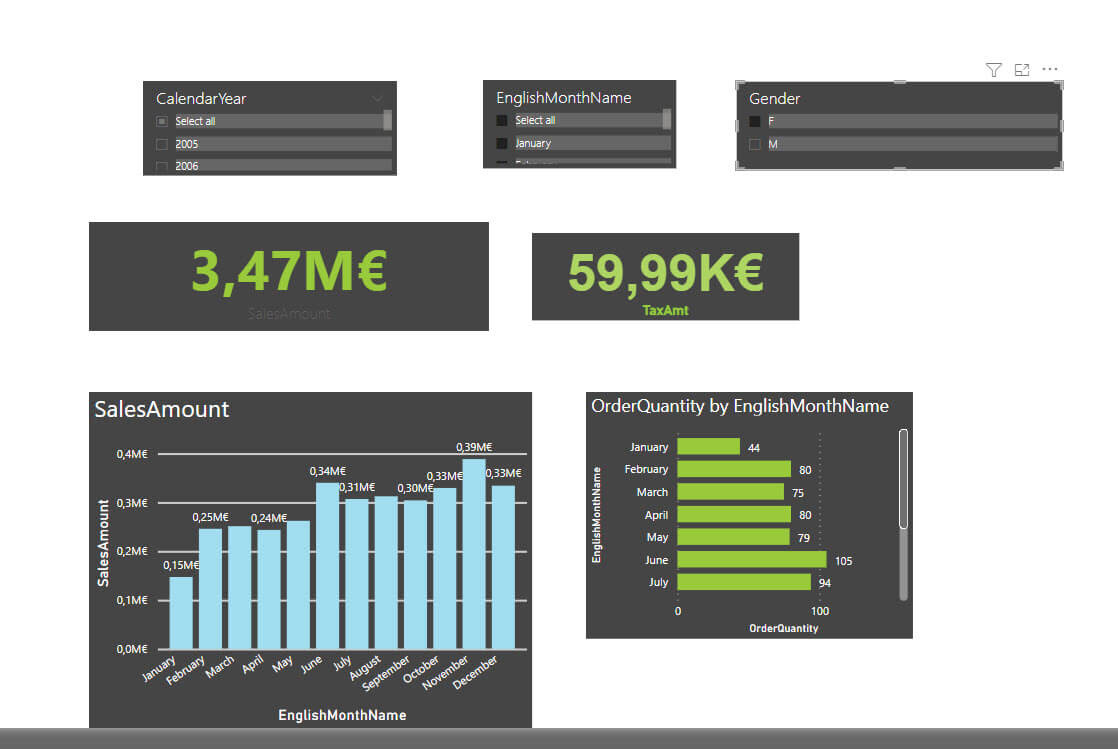
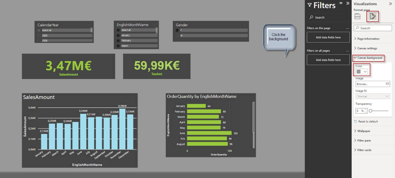
Finally, you can modify the background color using Visualization, Canvas Background, and selecting a color.
Tips to improve Power BI report appeal – Using a background created in PowerPoint
Basically, you could create a background image with Photoshop or another image editor. Why should you use PowerPoint?
Well, if you have a good knowledge of image editors, it is not a bad idea to use them. Snagit editor, Photoshop, Krita, or any other tool can help you to create images for the background. However, if you do not feel comfortable with image editors, PowerPoint can easily export the slide presentation into an image png (Portable Graphic Format) file.
First, open PowerPoint and you will see several Themes, and presentations. You can use all of them as backgrounds.
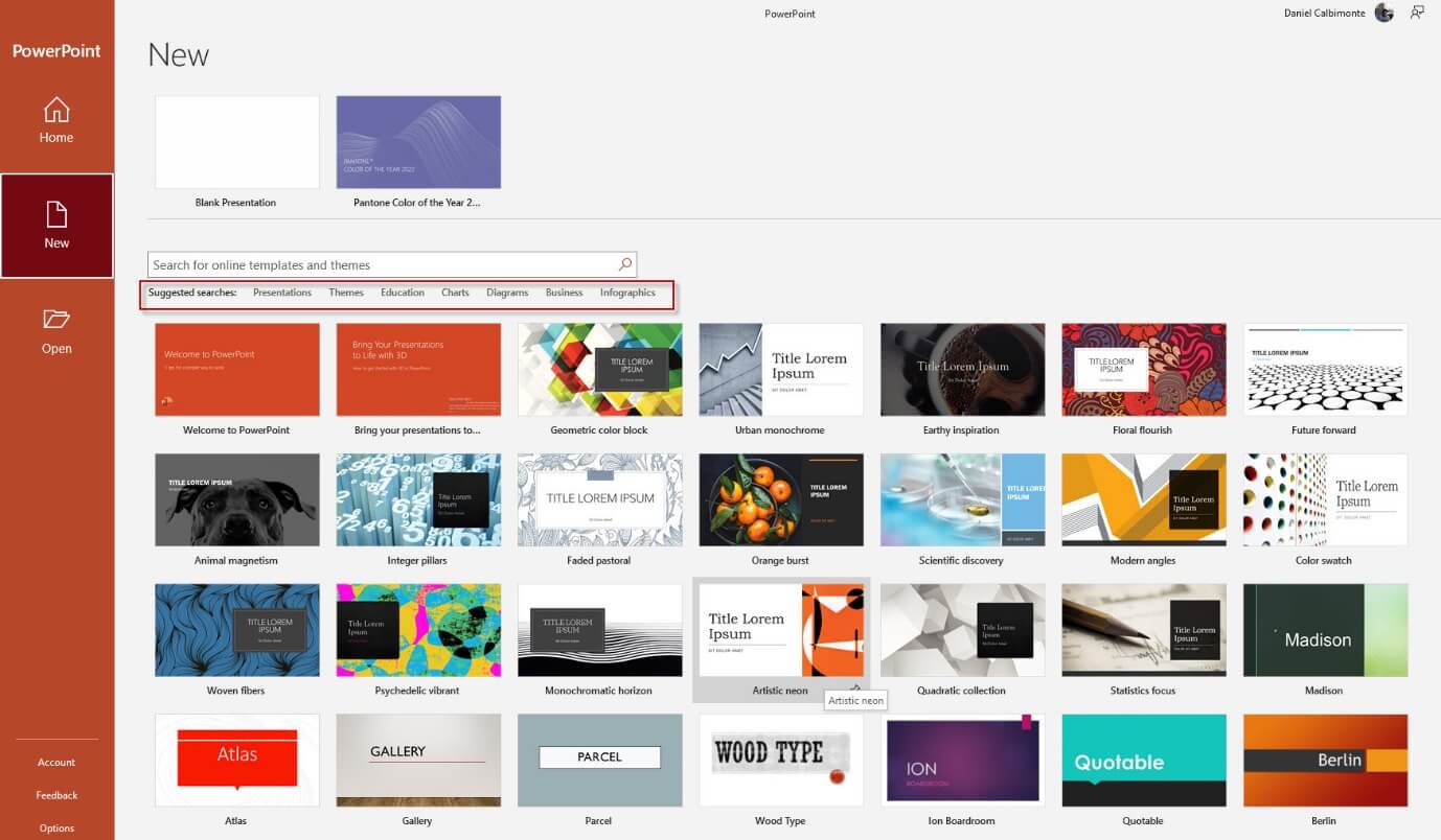
Secondly, I will use the droplet design presentation.
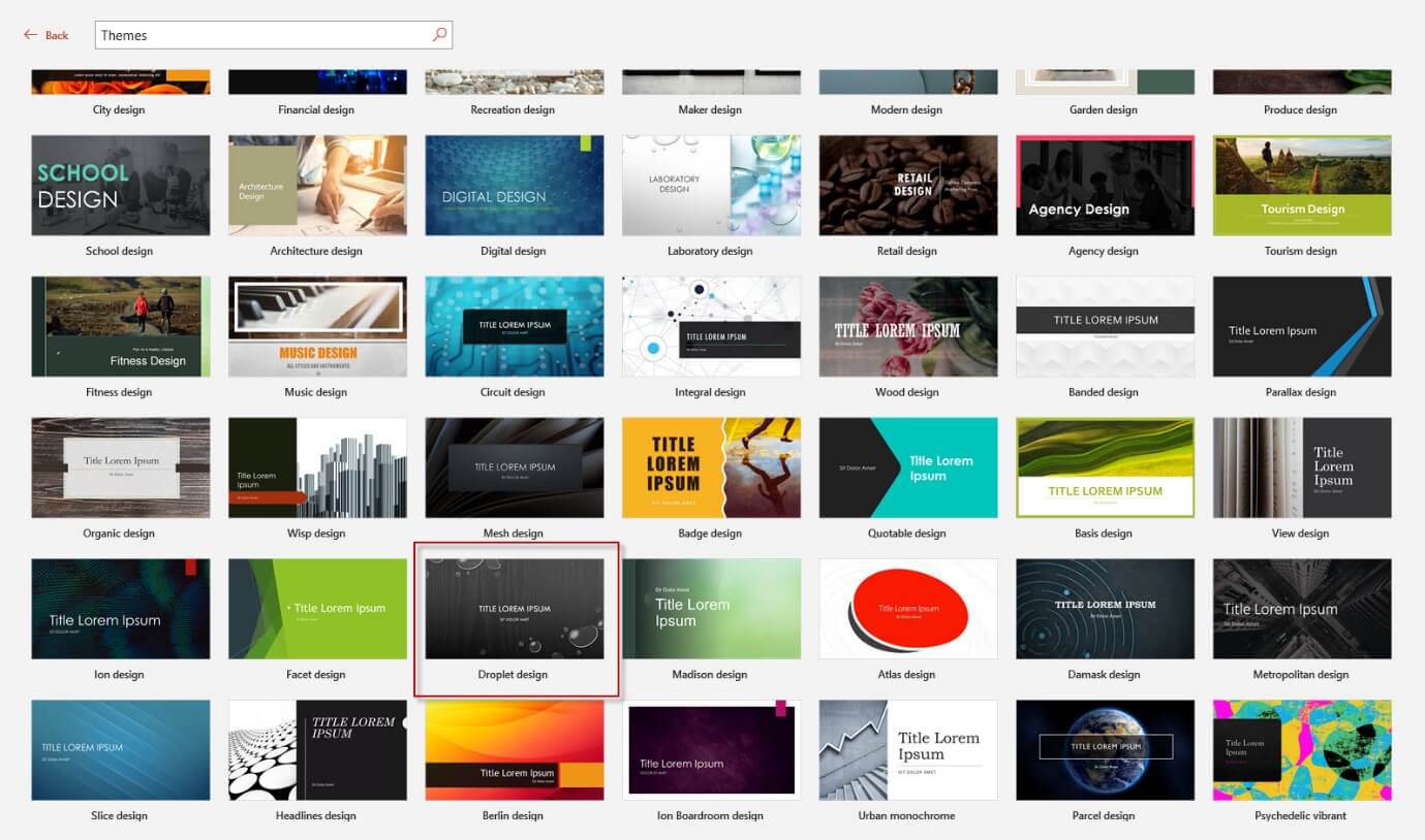
Thirdly, delete the text boxes from the presentation because we do not need them.

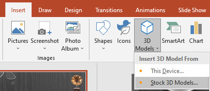
Also, you can add images to the background. In this example, you can add for example the 3D models using the Insert, 3D models option, and Stock 3D Models option.
Tips to improve Power BI report appeal – Using rectangles in PowerPoint
Drawing some rectangles helps to draw some borders for the Power BI visuals.
First, go to Insert, Shapes, and select a rectangle.
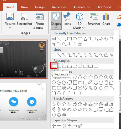
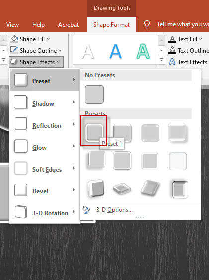
Secondly, in Drawing options when you select the rectangle, select Shape format and provide a shape to the rectangle.
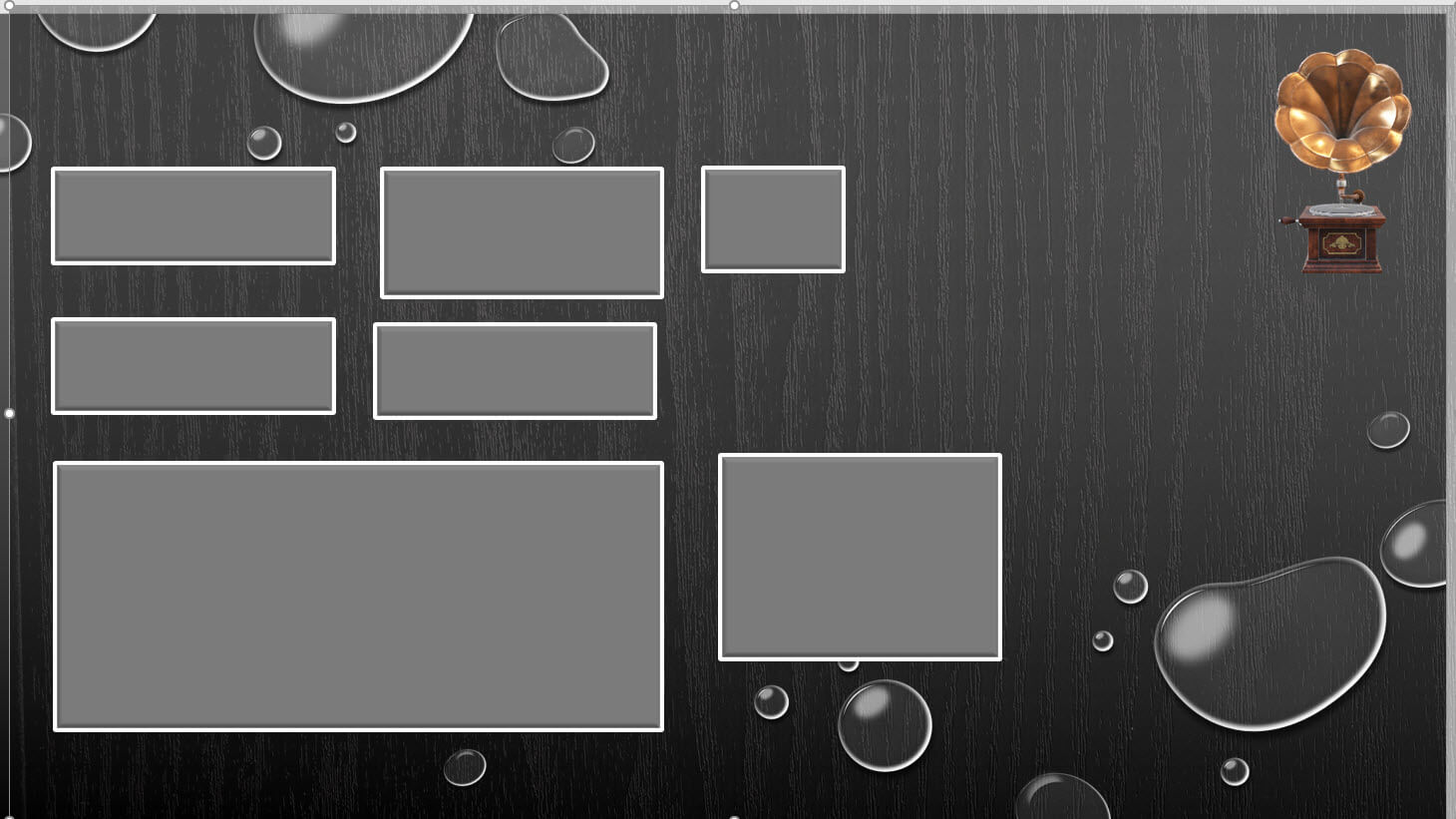
Thirdly, we will create 7 rectangles for the slicers, cards, and charts as well. Check the size for the visuals in Power BI to have rectangles of similar size.
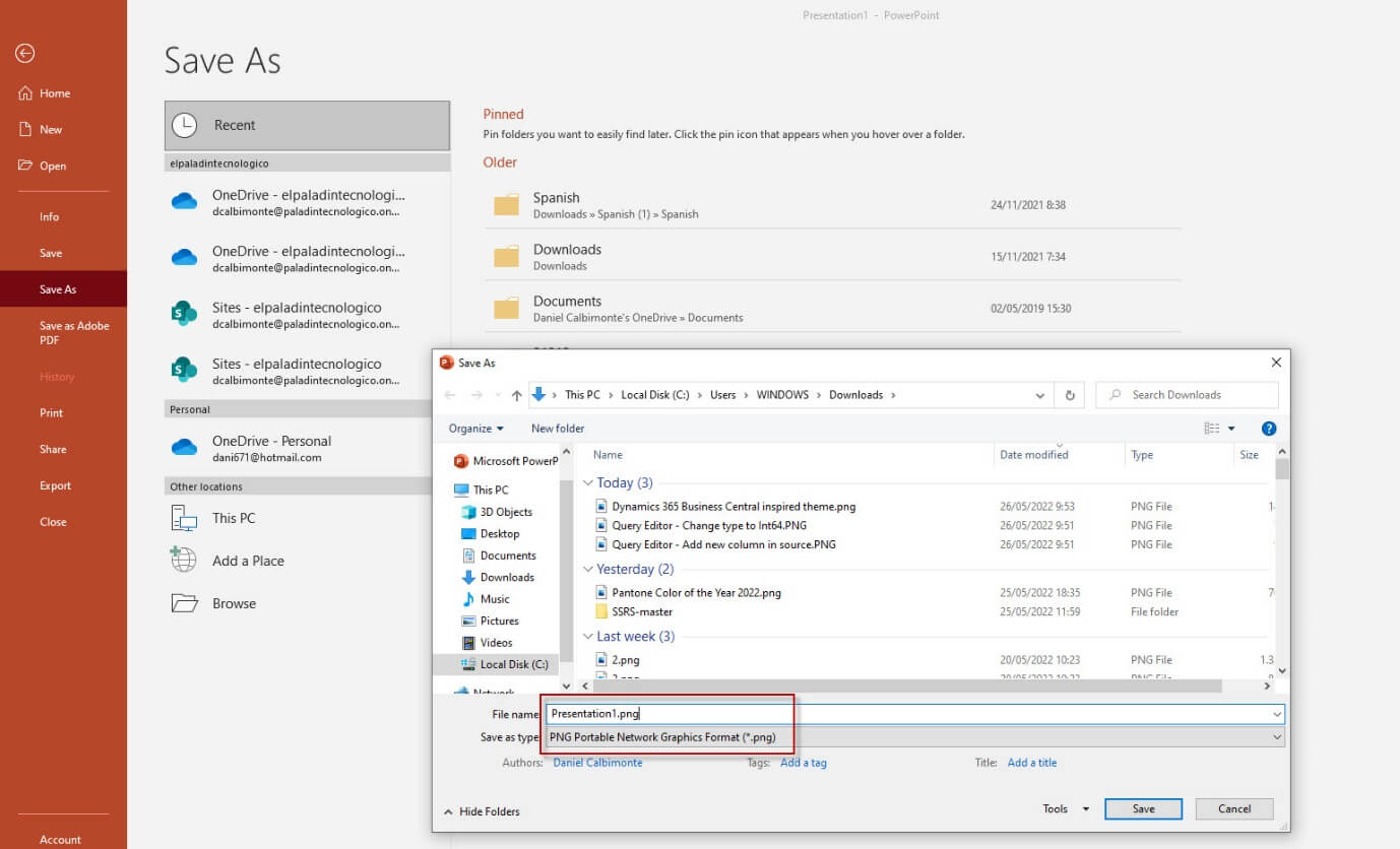
Also, save the PowerPoint as type png.
In addition, a message asking which slides to export will be displayed. Select Just this One.

Using Rectangles in PowerPoint
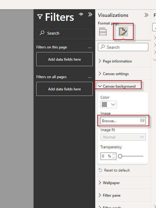
Once the image is created, we can apply it in Power BI. First, go to Power BI and select the background. Secondly, go to visualization and select the Format your report page icon. Also, go to Canvas Background and press the browse button, and select the png file previously created.
The picture may look like this.
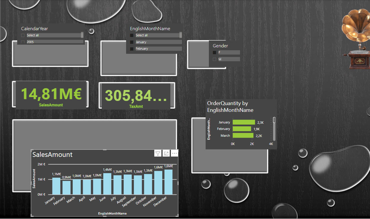
Also, modify and move the controls to fit in the image. Modify the font size and position of the visuals.

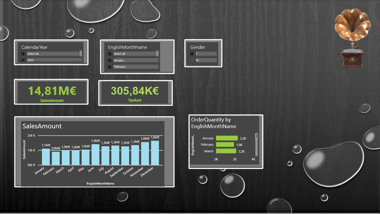
Finally, your control will look like this.
Conclusion
To conclude, we can say that it is a great idea to apply themes from the gallery and have a theme in the company to standardize the reports.
Also, you could hire a graphic designer to help you with a nice background, but it is a great idea to have a flat background and modify it with PowerPoint to add some rectangles for the Power BI visuals.

