Update: The ability to change the color of a KPI was delivered in August 2016!
Color blindness, or color vision deficiency (CVD) affects 1 in 12 men and 1 in 200 women in the world. The chances are good that you have met someone who is colorblind, but you may not have realized it. I know at least two people in the #sqlfamily who are colorblind. There are many types of CVD, but the most common is Deuteranomaly (red/green color blindness). Those with deuteranomoly have trouble distinguishing shades of red and green as well as some shades of gray, purple, and blueish green.
And which colors do we love to use with KPIs? Red and green, of course! Color is a very powerful tool in data viz. We use it to indicate meaning and to draw attention to something important. KPI boxes are used to display key metrics in an efficient manner. These key metrics are usually rather important, and our users need to be able to see their status at a glance.
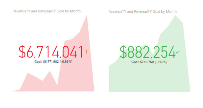
I quite like the design of the KPI boxes in Power BI, but for some reason they were created without the ability to adjust the color associated with the state (good/bad). Shown below, they use the common red/green color scheme.

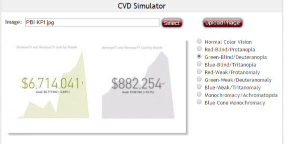
This may look fine to you, but if you are a deuteranope (green-blind), it looks like this:

That makes it much more difficult to tell how things are going. I would have a hard time getting the same quick information from the KPI boxes as a deuteranope. There are some visual clues in the KPI box to help those with CVD: there is an indicator (! for bad and ? for good) as well as the percent above or below the goal shown under the value. But both of those elements are rather small, and I have found no way to increase their size within the KPI box. For those without CVD, the color shown immediately communicates the state without me having to concentrate on the text within the KPI box. Color is a preattentive attribute. I notice it without conscious effort. But I need to be conscious of my audience’s ability to do the same with my color choices.
The video below shows what Power BI KPIs look like through various types of CVD.
If you work at a small company where you know no one is colorblind, or if you use Power BI for personal projects only, you may not care. But if you are an organization that makes data viz for the general public, I encourage you to be aware of what your audience sees and adjust your color choices so you are effectively communicating to your entire audience.
Blue and orange is a recommended palette to avoid common CVD issues. Unfortunately, I can’t change the Power BI KPIs to blue and orange, nor can I change the intensity of the hues to make them more easily distinguishable. If you agree that this functionality should be available in Power BI KPI boxes and would like to make your voice heard, please vote for my suggestion at:
Microsoft watches the suggestions on that site and has already implemented several of them once they were shown to be popular. Please help me out and spare a vote or two for the color vision deficient among us.
Update (25 Apr 2016): Microsoft saw my request and has already committed to getting this functionality into an upcoming release! You can see Miljan Braticevic’s comment below, and the idea is already marked as planned at the link above. That was a quick response!


