The March 2020 release of Azure Data Studio (ADS) includes a charting feature for SQL queries. This is a quick look at the feature, which I think will have some value for users.
SQL Queries
This has been available with SQL queries, but now it’s in notebooks as well. If I run a basic query in ADS, I see something like this:
I have a query and some results. These are numerical results that are easily graphed. However, in the results area, to the right, there are a few icons. I’ve added and arrow and oval in the image below to help you see them.
We have lots of options here for exporting results or visuals., The 5th one down is a chart icon. If I click that, I see this:
By default, a bar chart, but as you see on the right, there are lots of options. I’ll write more as I play with them a bit and get another ADS article at SQLServerCentral.
Notebooks
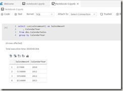
The charting experience comes to notebooks in a similar way. I can create a notebook and add a SQL cell. In there I have code and run it.
You can see the same icons here above the results. If I click the far right one (the chart), it changes to a chart.
If I save the notebook like this and reopen it, the chart is gone. The results are still there, as these are saved with the notebook, but the visual display is gone. I think this is fine, because the chart icon is there, but I wish the state was saved as I’d saved it.
One note, once the chart appears, notice the right icon is now a table icon. Clicking it returns to the original view.
This is a quick look at charting in ADS. I’ll do something more extensive at SSC soon.


