Power BI Desktop has been out for GA for over a week now and some of the pro’s out there have come up with some pretty cool tricks. For instance:
- You’ve got Jason Thomas and his custom Power BI indicators.
- Adolfo Socorro came up with a neat way to view map data at a high level and low level simultaneously.
- And then there’s Sam Vanga who is doing some cool things with Power BI and real life.
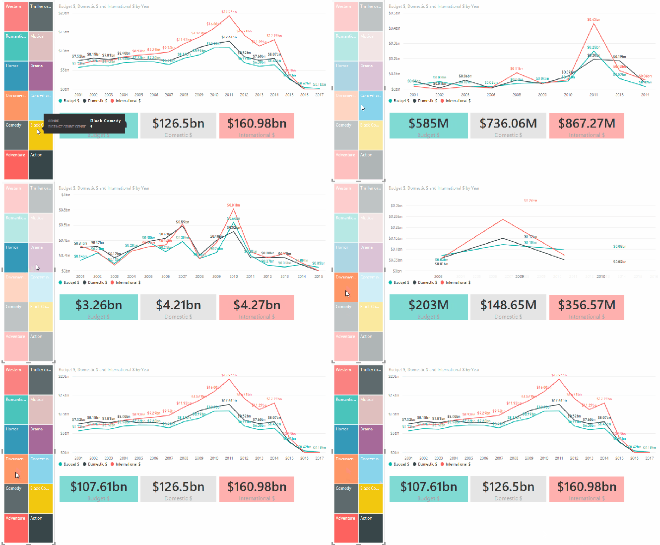
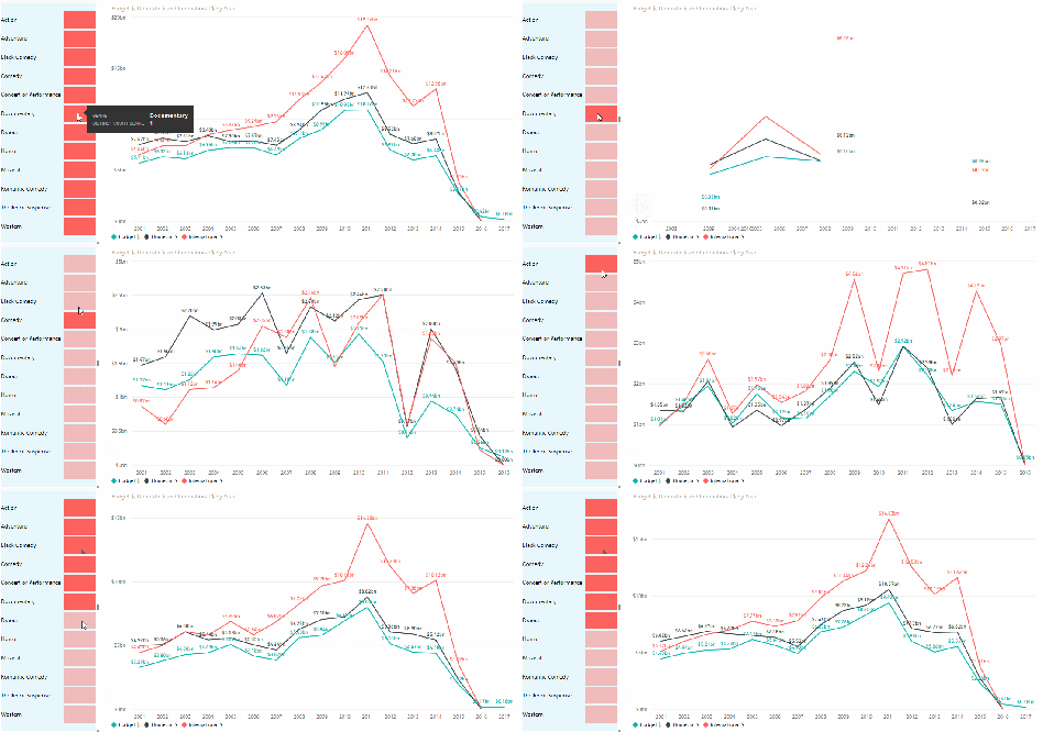
But if you’re looking for a way to spice up you report filtering with a little color, try using the Treemap, Column or Funnel chart as a Slicer for those fields that only contain a few unique values. At this point with Power BI, you don’t have any customization options for the Slicer visualization (although I’m sure that is coming down the pipe in a future release). This option won’t work terribly well if the field you would like to use as a slicer has more than a dozen or so unique members, but you can experiment with it and see what you can come up with. Here’s my custom slicers in action.

To multi-select tiles in the custom slicer, just hold Cntrl as you click.
This little trick relies on the natural cross filtering between data regions in the Power BI dashboards. First I created a measure that calculates the distinct count of the field that I wish to use as my slicer. In this case the field is Genre.
Then I added a Treemap/Funnel chart to the report using the field Genre as the Group value and the measure Distinct Count Genre as the Values.
Then just resize the visualization so that the squares are about evenly sized. There’s a few ways you can arrange it, but just play around with it and see what you can come up with.
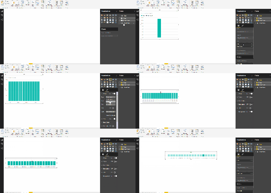
If you are wondering how I made the column chart slicer, here’s a gif image that shows the steps I used. Enjoy!
Feedback?
What do you think? Leave me a comment below and let me know. Or if you’ve got a neat Power BI trick you’d like to share, let me know, as well. I love to hear new ideas! Thanks for reading!


