[read this post on Mr. Fox SQL blog]
Its time to take a well deserved 1/2 time break in my 8 part post series on SQL Partitioning and so I have decided to take a slight “light-hearted” tangent and talk about visualisations, or more specifically Pie Chart visualisations.
In all seriousness, this actually came up as I overheard a conversation at a client site debating the usage of this very visualisation.
Now – If you believe everything you read on the Internet about Pie Charts you may begin to think they are the proverbial trouble-maker of the BI World, but I believe that they deserve a chance to prove themselves!
So to prop up my rickety case, this post will explore Pie Chart Visualization Best Practices and then compare the default Pie Chart visualization from 10x industry leading BI/Reporting Tools to see how they stack up against this Best Practice list.
And so, lets get into the nitty gritty of creating and eating pie charts!
So What are the Pie Chart Best Practices? (seriously)
The whole point of charting (of any form) is to assist in the process of making a business decision. So often I see business people forget this and are blinded by what I call the “Visual Bling” that some BI vendors peddle.
So having said that its pretty easy to make a “bad visualisation” using any chart, however yes OK it just happens that its easier to do it badly with a Pie Chart!
So — after extensive research filtering numerous articles, I have formulated these Pie Chart Best Practices…
- Do not show more than 5 categories (Generally works best with 2-3) (ie Part to Whole)
- Only use a single pie chart, do not use multiple for comparing figures
- Do not use 3D visualizations or accentuation’s
- Keep charts simple and use soft colors
- Do not “explode” the pie (or any one piece for that matter)
- If showing % values, ensure all data points actually add up to 100%
- Use clear labels to show the % value of slices for clear comparison (if required)
- Use a clear legend for the categories for clear comparison (if required)
Given we’re talking “visualisation” then some BI tools build Pie Charts which are completely interactive and offer default hover text and drill though which may negate some of these best practices (specifically 7. labels and 8. legends) and thus have been taken into account in my extensive analysis.
Also some of these aren’t really Pie Chart specific, but are broadly related to all visualisations, such as 3. limit 3d charting and accentuation’s and 4. Use soft colours and simple images. This is one of my all time favorite posts on these critical “best practices” – https://darkhorseanalytics.com/blog/data-looks-better-naked/
Gathering Visualisation Testing Data
Before we can actually plot and compare anything, we first need data to plot. So I took a representative sample of the community (including 2 helpful fellow bloggers Matt and Nick) and asked them all to rank their inner-most feelings about Pie Charts on a scale of 1 to 5 (1=Hate, 2=Dislike, 3=Indifferent, 4=Admire, 5=Love).
| Person | Rating |
| Senior SQL DBA (Ctrl-Alt-Geek) | 2 (from 3 after balanced colleague input) |
| Data Scientist (:: Nick Burns) | 3 (+ fascinating list of scientific caveats) |
| Pro-Clarity Reporting Analyst | 4 |
| Gartner handsomely-paid Magic-Quadrant Global Visualisation Consulting Executive | 1 |
| IMS DBA | NULL |
| Uber guy driving me home after pub | 2 |
| French Pastry Chef (Pie Specialty) | 5 |
| Pie Throwing Activist | 4 |
| Australian Rules Football Player | 2 (but, But, BUT… its NOT round!) |
| My 4yo Son | 5 (he then wanted that pie I talked about?) |
| Random Oracle DBA | 6 (asked again – still got the same answer?) |
| Teen Titans (TV Show) | 4 |
| Barry Rigby (Pie Eating Champ) | 4 |
So after trimming the rather obvious outliers we’re left with our final data set below.
| RATING_CATEGORY | RATING_COUNT |
| 1_HATE | 1 |
| 2_DISLIKE | 3 |
| 3_INDIFFERENT | 1 |
| 4_ADMIRE | 4 |
| 5_LOVE | 2 |
Comparing the Product Visualisations
So what BI/Reporting Tools are we going to throw this data at to compare their “out of the box” Pie Chart visualisation? Here’s my top 10 comparison list.
- Excel 2013 Pivot Table Chart
- SQL 2014 Reporting Services
- Excel 2013 Power View
- Power BI Designer Preview 2.2
- MS Access 2013
- Qlik Sense 1.0
- Qlik View 11.0
- SAP Lumira 1.13
- Tableau 9.0
- R Studio 0.98
Why did I choose these specific BI tools? Well, mainly because I just happened to have these on my laptop at the time I was writing this post (and that’s about as scientific or balanced as it gets people!)
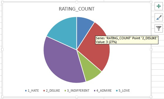
Excel 2013 Pivot Table Chart
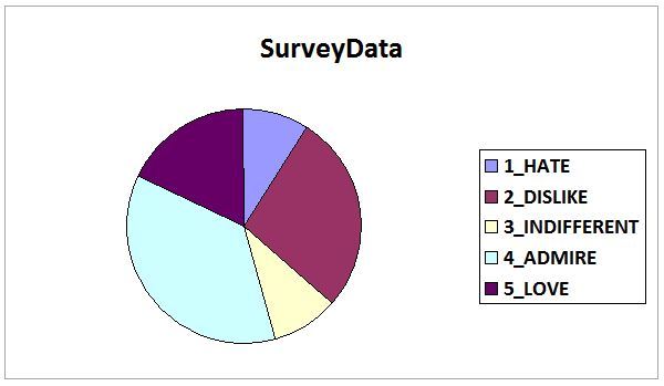
Overall a great and simple visualisation, meeting most criteria
However – loses 10 points as the sum of slices adds to 99% and not 100%! (Oh, Excel, but we still love you because you’re you!)
SQL 2014 Reporting Services
Great visualisation however scored lower for not using more blended and softer colours.
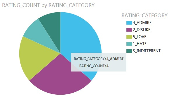
Excel 2013 Power View
Great visualisation however scored lower for not using more blended and softer colours.
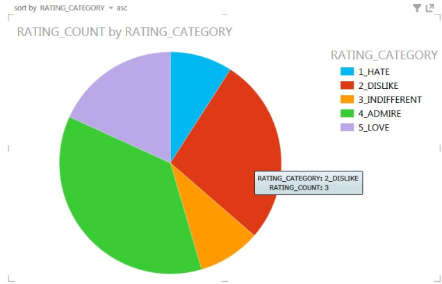
Power BI Designer 2.2
Great visualisation meeting almost all best practice requirements. Probably should have lost points as the category name isn’t sorted (by default it seems sorted by the category value), but hey that wasn’t on the best practice list!
MS Access 2013
Mmmm, just where do I even start. Less than acceptable visualisation, poor usage of colour, no % labels or hover, and even a chunky low quality graphic… enough said.
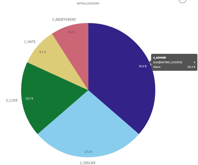
Qlik Sense 1.0
Overall a really great looking and simple visualisation, meeting most criteria
However – loses 10 points as the sum of slices adds to 100.1% and not 100%! (Oh no Qlik, this could really hurt your ranking!)
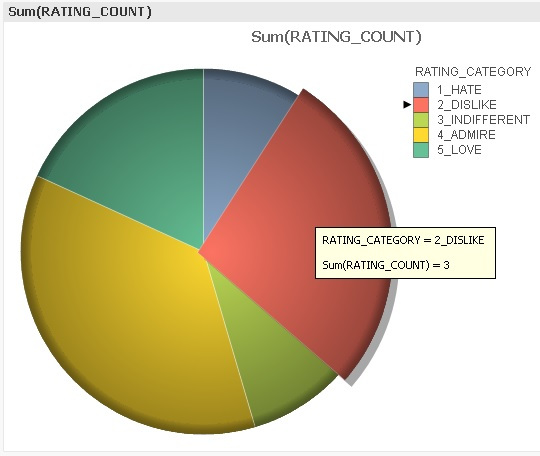
Qlik View 11.0
Quite a good visualisation, however scored lower as did not use flat image and was attempting to explode components on the pie on hover.
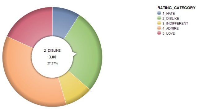
SAP Lumira 1.13
Quite a good visualisation, with a funky interactive hover, however scored lower as did not use flat image
Also – loses 10 points as the sum of slices adds to 99.99% and not 100%!
Tableau 9.0
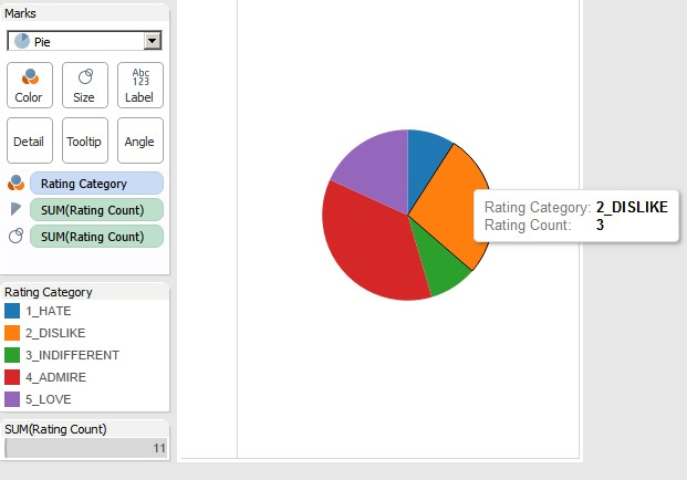
Reasonable and (honestly) very basic looking visualisation, however its simplicity leaves it with fewer areas where it can go wrong! Only really scored lower for not using more blended and softer colours.
R Studio 0.98 (Revolution R Open 3.2.0)
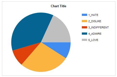
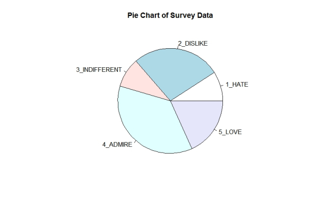
In defence of R there is no “default” visualisation per se for anything you do with R plots! This chart was as simple as I could get it using very few R commands.
As an aside – R documentation leaves just so much to be desired – however documentation is not a best practice for charting so R gets away with it (this time anyway).
Overall, a basic visualisation however scored lower for not meeting many of the requirements for a best practice pie chart.
slices <- c(1, 3, 1, 4, 2)
lbls <- c("1_HATE", "2_DISLIKE", "3_INDIFFERENT", "4_ADMIRE", "5_LOVE")
pie(slices, labels = lbls, edges = 100, main="Pie Chart of Survey Data")
And the (Non-Scientific) Final Results are In!
All scores are out of a total of 7o points, loosely matching the best practice requirements for Pie Charting as outlined above.
Overall it was close, damn close. There were only 6 points in it between 4 and dead last! And as some vendors lost points for cumulative slice % not adding to 100% then this has thrown the field wide open! (Would have been a different conversation if this didn’t happen!)
Power BI Designer leads the pack, closely followed by Power View then Tableau which make up the top 3. Following closely and (not surprisingly) matched on the same score was team Qlik. In mid pack but oh so just behind was Excel Pivot Charts (we still love you!) and SQL SSRS with only a point difference. And finally pulling up the rear was R Studio, SAP Lumira and dead last some 17 points behind the leader is poor old MS Access.
| Product Name | TOTAL / 70 | RANK |
| Power BI Designer | 59 | 1 |
| Power View | 56 | 2 |
| Tableau | 50 | 3 |
| Qlik View * | 48 | 4 |
| Qlik Sense | 48 | 4 |
| Excel Pivot Table Chart * | 46 | 6 |
| SQL Reporting Services | 45 | 7 |
| R Studio | 44 | 8 |
| SAP Lumira * | 43 | 9 |
| MS Access | 42 | 10 |
(*) Lost 10 points as by default showed a slice % which didn’t add up to 100%
Note to Self: What might be interesting here is revisiting the ladder with a pricing overlay and see how this shakes down the rankings! For another day…
And So in Summary…
I hope that this post has given some food for thought on visualisation best practices, and perhaps even changed your mind on how best to tackle that troublesome Pie Chart for your next BI project.
And remember, just because someone writes terrible things about Pie Charts on the internet, it doesn’t necessarily mean that they are true… I will leave you with this passing quote…
"The trouble with quotes on the internet, is that you can never know which ones are genuine."
- Abraham Lincon (1866)
AND of course, as I always say, please test this yourself as your results may vary!
Disclaimer: all content on Mr. Fox SQL blog is subject to the disclaimer found here


