By Steve Bolton
…………When the goal is to illustrate how just how outlying an outlier may be, the efficiency with which scatter plots represent distances really can’t be beaten. It doesn’t take any training in mathematics to look at one and notice that a few data points are further away from the others, in proportion to how different they are from the normal values by some particular measure. Any five-year-old can grasp that idea. It isn’t necessarily easy to calculate the measures that populate many of the more advance species of scatter plots, but you still don’t need to be a rocket scientist to interpret them. That makes them an ideal choice when our uses cases call for easily interpretable visualizations. There are still some drawbacks to scatter plots and their variants – including their simplicity, which can be a weakness when our user requirements call for greater sophistication. Like every other visual method outlined in this series of amateur mistutorials on identifying outliers with SQL Server, it amounts to a brute force, unconscious assessment that “if something looks out of place, we’ll look at it more closely.” That tells us nothing about why a data point is an outlier, or whether or not the domain knowledge and underlying data distribution predict how many values we ought to find at that particular point. Sooner or later, every scatter plot can be saturated with so many data points that they obscure the information we’re looking for. Every outlier detection method we’ve surveyed in this series has suffered from some similar limitation imposed by the sheer scale of the tables commonly seen in SQL Server, which can number in the thousands, millions or even billions of rows. Nevertheless, scatter plots take a lot longer than some other methods to reach the breaking point where strategies like binning and banding have to be applied; that is mainly because they can show outliers at any point in a graph of two or more dimensions, whereas other display techniques like box plots limit them to very confined spaces. Even the relatively efficient histogram/run chart hybrids discussed in a previous post retain a lot of the white space above their bars, where no outliers can be depicted; this is even before we take into consideration the binning that they are more susceptible to, which tends to hide outliers. Given how flexible and efficient they are, it is not surprising that there are so many variations on the theme. In this installment of the series, however, I’ll concentrate on just three subtypes that are frequently mentioned in connection with outlier detection in the data mining literature.
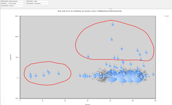
…………The logic of scatter plots is so simple, in fact, that it requires less T-SQL to populate one through a stored procedure than in any other code sample I’ve posted in this series. Readers of this series have probably grown accustomed to the familiar list of parameters, which allows users to select a count for all the distinct combinations of two columns in any single table in any database they have access to. The rest is just the usual dynamic SQL and the debugging string on the next-to-last line. The chart in Figure 1 is fairly self-explanatory: on the horizontal row we find the value for the Hemopexin protein in the 209-row dataset on the Duchennes form of muscular dystrophy we’ve been using for sample purposes throughout this series (which I downloaded from the Vanderbilt University’s Department of Biostatistics and converted to a SQL Server table). On the vertical axis we find the value of the Creatine Kinase enzyme; wherever there’s a scatter plot point, we have a combination of the values of both columns. The only thing that might require explanation here is the size of the bubbles in the 3D Bubble Chart included with Report Builder, which I tied to the count of the records for each combination. As anyone can see, the bulk of the values are centered on the bottom right, but there are two separate groups of outliers, which I’ve drawn red circles around.
Figure 1: Code for the Simple Scatter Plot Procedure
CREATE PROCEDURE [Calculations].[SimpleScatterPlotSP]
@DatabaseName as nvarchar(128) = NULL, @SchemaName as nvarchar(128), @TableName as nvarchar(128),@ColumnName1 AS nvarchar(128), @ColumnName2 AS nvarchar(128)
AS
DECLARE @SchemaAndTableName nvarchar(400), @SQLString nvarchar(max)
SET @SchemaAndTableName = ISNull(@DatabaseName, ”) + + ‘.’ + @SchemaName + ‘.’ + @TableName
SET @SQLString = ‘SELECT ‘ + @ColumnName1 + ‘ AS Column1, ‘ + @ColumnName2 + ‘ AS Column2,
Count(*) OVER (PARTITION BY ‘ + @ColumnName1 + ‘, ‘ + @ColumnName2 + ‘ ORDER BY ‘ + @ColumnName1 + ‘, ‘ + @ColumnName2 + ‘ ) AS CombinationCount
FROM ‘ + @SchemaAndTableName + ‘
WHERE ‘ + @ColumnName1 + ‘ IS NOT NULL AND ‘ + @ColumnName2 + ‘ IS NOT NULL’
–SELECT @SQLString — uncomment this to debug string errors
EXEC (@SQLString)
Figure 2: Simple 3D Scatter Plot Example with Outliers
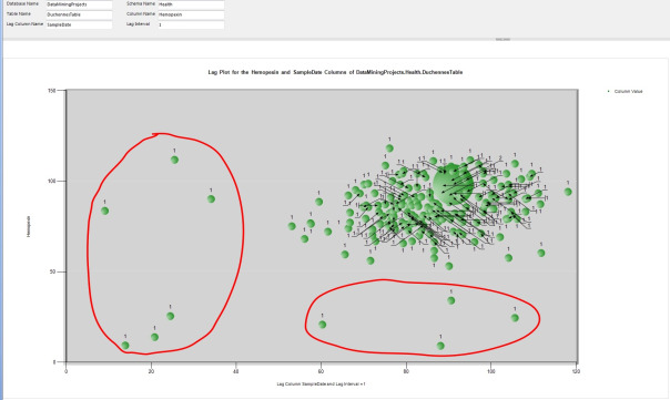
…………As Stan Lee might say, ‘Nuff Said. We might be able to add more useful information through such tricks as setting the bubbles for the normal values semi-transparent or the color of the outliers to an eye-catching red, or setting the ToolTip to display the value associated with each outlier (as I did here, although my screen capture utility failed to pick it up). Yet the primary means of adding sophistication is by changing the measures used on both axes. It is quite common to compare multiple columns using bubble of different colors, but this is unsuitable for our purposes because it would quickly conceal the outliers for all columns in a mass of clutter. Adding columns to the mix might be unwise, but using more complex statistical means to calculate the data points would not cause clutter by saturating it with data points. There might be a performance cost in the calculations and the ease of interpretation would decline as the meaning of the measures grows more intricate, but in many use cases such drawbacks aren’t problematic. Our imagination is really the only limit on the kinds of measures we can put on the axes of scatter plots, but two in particular are singled out as outlier detection methods in statistical literature like the National Institute for Standards and Technology’s Engineering Statistics Handbook. One of these is the lag plot[1], which takes very little code to implement thanks to the Lag windowing function added in to T-SQL in SQL Server 2012. The basic idea is to compare the value of a column on the vertical axis against a prior data point in the column, by some fixed amount that is often measured in time slices. I’ve had some issues converting the SampleDate in the DuchennesTable accurately to a SQL Server data type, but regardless of whether the results are accurate, Figure 4 still illustrates how unusual values can be exposed through such a technique. Lag plots are a less appropriate means of outlier detection than a regular scatter plot because their primary purpose is measuring the randomness of a dataset, which is tangentially rather than directly related to finding outliers, i.e. seemingly random points within a non-random pattern. A lag value of one time slice is the most common value input into a lag plot, although this procedure allows it to be set to any arbitrary bigint value through the @LagInterval parameter. There are apparently many nuances to the interpretation of lag plots that amount to pattern recognition, such as the identification of sinusoidal patterns with cyclical activity[2], but that is really beyond our purview. In the absence of some rigorous logical or mathematical definition of what a “pattern” is, we basically have to use the old rule of thumb: if it looks out of place, it might be an outlier.
Figure 3: Code for the Lag Plot Procedure
CREATE PROCEDURE [Calculations].[LagPlotSP]
@DatabaseName as nvarchar(128) = NULL, @SchemaName as nvarchar(128), @TableName as nvarchar(128),@ColumnName AS nvarchar(128), @LagColumnName AS nvarchar(128), @LagInterval bigint
AS
DECLARE @SchemaAndTableName nvarchar(400), @SQLString nvarchar(max)
SET @SchemaAndTableName = ISNull(@DatabaseName, ”) + ‘.’ + @SchemaName + ‘.’ + @TableName
SELECT @SQLString = ‘SELECT DISTINCT ‘ + @ColumnName + ‘ AS ColumnValue, LagResult, Count(*) OVER (PARTITION BY ‘ + @ColumnName + ‘, LagResult
ORDER BY LagResult) AS CombinationCount
FROM (SELECT TOP 99999999999 ‘ + @ColumnName + ‘, ‘ + @LagColumnName + ‘ AS LagColumn,
Lag(‘ + @ColumnName + ‘, ‘ + CAST(@LagInterval AS nvarchar(50)) + ‘) OVER (ORDER BY ‘ + @LagColumnName + ‘) AS LagResult
FROM ‘ + @SchemaAndTableName + ‘
WHERE ‘ + @ColumnName + ‘ IS NOT NULL) AS T1
WHERE LagResult IS NOT NULL
ORDER BY ColumnValue, LagResult ASC’
–SELECT @SQLString
EXEC (@SQLString)
Figure 4: Lag Plot Example with Outliers
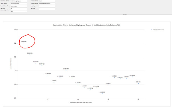
…………As can be gathered from the length of the code for the two procedures in Figure 5, computing an autocorrelation plot is somewhat trickier.[3] The basic idea is that instead of partitioning a range of values for a single column on the horizontal axis by a single lag value, we instead make a comparison against a range of lag values. The second procedure merely creates a list of lag values within the limits specified by the user through the @LagBegin, @LagEnd and @LagStep parameters, then calls the first procedure iteratively to return an autocorrelation value for each row. The calculations for this stat are a little more involved than for a simple lag, but not nearly as difficult and dry as some of those introduced in previous posts – let alone the monster procedures required for the next two tutorials on Cook’s Distance and Mahalanobis Distance.[4] On occasion I have received values greater than one for these autocorrelations, which is abnormal but apparently allowable when the values have been normalized (i.e. recalibrated to a different scale, rather than being “normalized” like a database schema in DBA lingo).[5] Alas, the point is moot anyways because autocorrelation plots are not as useful as lag plots for identifying outliers on the kind of scale DBAs operate at, just as lag plots are in turn less well-suited in many cases than ordinary scatter plots. The basic concept is that the further the values are from the baseline of zero – like the first data point in Figure 6 – the less random the process is. The more values that are closer to zero, the more random the dataset is.[6] This really amounts to shifting back to a bar chart-style type of visualization, which can’t display as many outliers as an ordinary scatter plot. It also requires more computation and more interpretation, since the meaning is not readily apparent to the untrained eye. To make matters worse, autocorrelation is designed to depict the degree of randomness exhibited by a dataset, which requires us to identify a pattern before looking for an exception to it; with ordinary scatter plots, any pattern and its exceptions are evident in a single step. Another difficulty with this approach is that you have to take the automatic rescaling into account; I also tried this on the Hemopexin, CreatineKinase and PyruvateKinase columns and there were a couple of points that were further away from the others, but the autocorrelation values ranged between roughly 0 and 0.25, which isn’t that big of a gap; yet with the LactateDehydrogenase column in Figure 6, they’re between -0.335196 and 0.405092, which is about a third of the scale from -1 to 1.
Figure 5: Code for the Two Autocorrelation Plot Procedures
CREATE PROCEDURE [Calculations].[AutocorrelationSP]
@DatabaseName as nvarchar(128) = NULL, @SchemaName as nvarchar(128), @TableName as nvarchar(128),@ColumnName AS nvarchar(128), @LagColumnName AS nvarchar(128), @LagInterval AS bigint, @DecimalPrecision AS nvarchar(50)
AS
DECLARE @SchemaAndTableName nvarchar(400), @SQLString nvarchar(max)
SET @SchemaAndTableName = ISNull(@DatabaseName, ”) + ‘.’ + @SchemaName + ‘.’ + @TableName
SELECT @SQLString = ‘DECLARE @Mean as decimal(‘ + @DecimalPrecision + ‘), @NCount as bigint
SELECT @Mean = Avg(‘ + @ColumnName + ‘), @NCount = Count(‘ + @ColumnName + ‘)
FROM ‘ + @SchemaAndTableName + ‘
SELECT TOP 1 SUM(TopOperand) OVER (ORDER BY RN ) / BottomOperand AS AutoCorrelationCoefficient
FROM (SELECT RN, TopOperand, SUM(BottomOperand) OVER (ORDER BY RN) AS BottomOperand — this is the n – k on the top operand summation; the Bottom Operand is to RN, not RN – @LagInterval
FROM (SELECT RN, ‘ + @ColumnName + ‘, (‘ + @ColumnName + ‘ – @Mean) * (Lag(‘ + @ColumnName + ‘, ‘ + CAST(@LagInterval AS nvarchar(50)) + ‘) OVER (ORDER BY RN)) AS TopOperand,
Power((‘ + @ColumnName + ‘ – @Mean), 2) as BottomOperand –this middle query is necessary because we need to add RN to the LagInterval for one calculation
FROM (SELECT ROW_NUMBER() OVER (PARTITION BY 1 ORDER BY ‘ + @LagColumnName + ‘ DESC) AS RN, ‘ + @ColumnName + ‘
FROM ‘ + @SchemaAndTableName + ‘) AS T1
GROUP BY RN, ‘ + @ColumnName + ‘) AS T2) AS T3
WHERE RN <= @NCount – ‘ + CAST(@LagInterval AS nvarchar(50)) + ‘
ORDER BY RN DESC’
–SELECT @SQLString — uncomment this to debug the dynamic SQL
EXEC (@SQLString)
CREATE PROCEDURE [Calculations].[AutocorrelationPlotSP]
@DatabaseName as nvarchar(128) = NULL, @SchemaName as nvarchar(128), @TableName as nvarchar(128),@ColumnName AS nvarchar(128), @LagColumnName AS nvarchar(128), @LagBegin decimal (38,21), @LagEnd decimal(38,21), @LagStep decimal (38,21), @DecimalPrecision AS nvarchar(50)
AS
DECLARE @InputTable table
(ID bigint IDENTITY (1,1),
LagAmount decimal(38,21)
);
DECLARE @ResultTable table
(ID bigint IDENTITY (1,1),
AutoCorrelationValue decimal (38,21)
);
— use the standard CTE method of generating sequences to populate the lag amounts for the table
WITH RangeCTE(RangeNumber) AS
( SELECT @LagBegin as RangeNumber
UNION ALL
SELECT RangeNumber + @LagStep
FROM RangeCTE
WHERE RangeNumber < @LagEnd)
INSERT INTO @InputTable
(LagAmount)
SELECT RangeNumber
FROM RangeCTE
ORDER BY RangeNumber ASC
DECLARE @SQLString nvarchar(max),
@CurrentTableVarID bigint = 0,
@MaxTableVarID bigint = 0,
@CounterCheck bigint = 0,
@LagInterval decimal(38,21)
SELECT @MaxTableVarID = Max(ID) FROM @InputTable GROUP BY ID ORDER BY ID ASC
SELECT @CurrentTableVarID =Max(ID) FROM @InputTable GROUP BY ID ORDER BY ID DESC
WHILE @CurrentTableVarID <= @MaxTableVarID
BEGIN
SELECT @LagInterval = LagAmount
FROM @InputTable
WHERE ID = @CurrentTableVarID
SET @SQLString = ‘EXEC Calculations.AutocorrelationSP
@DatabaseName = ‘+ CAST(@DatabaseName as nvarchar(50)) + ‘,
@SchemaName = ‘+ CAST(@SchemaName as nvarchar(50)) + ‘,
@TableName = ‘+ CAST(@TableName as nvarchar(50)) + ‘,
@ColumnName = ‘+ CAST(@ColumnName as nvarchar(50)) + ‘,
@LagColumnName = ‘+ CAST(@LagColumnName as nvarchar(50)) + ‘,
@LagInterval = ‘+ CAST(@LagInterval as nvarchar(50))+ ‘,
@DecimalPrecision = ”’+ CAST(@DecimalPrecision as nvarchar(50)) + ””
–SELECT @SQLString — uncomment this to debug the dynamic SQL
INSERT INTO @ResultTable
EXEC(@SQLString)
SET @CounterCheck = @CounterCheck + 1
SET @CurrentTableVarID = @CurrentTableVarID + 1 — increment the loop
END
SELECT LagAmount, AutoCorrelationValue
FROM @InputTable AS T1
INNER JOIN @ResultTable AS T2
ON T1.ID = T2.ID
Figure 6: Autocorrelation Plot Example with Outliers
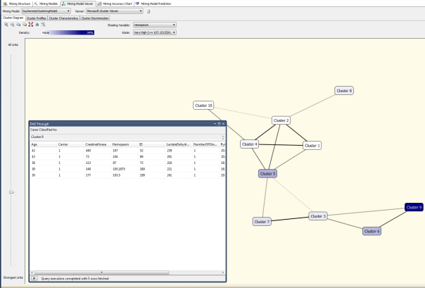
…………When all is said and done, one of the more effective visual means of identifying outliers available to us out-of-the-box is also one of its least publicized: the Microsoft Cluster Viewer, which depicts the results calculated by the two SQL Server Data Mining (SSDM, to coin an abbreviation) Clustering algorithms. The calculations are fast and don’t require any custom code of the kind I’ve posted here. Best of all, it can do what Reporting Services cannot: efficiently depict both summary stats and individual data points together, by clicking on a cluster and viewing the Drill Through window (by selecting Model Columns Only or Model and Structure Columns in the submenu) as seen in Figure 7. As discussed in the last post, SSRS is crippled by its simultaneous inabilities to consume more than one result set from a stored procedure in a single dataset, to consume more than one dataset in a single chart, or calculate statistics as efficiently as T-SQL or .Net languages like Visual Basic. Perhaps it is possible to add this functionality through custom .Net code, but if so, the workaround hasn’t been well-publicized, judging from the frequency with which the complaint is raised in coding forums. As we have seen in this segment of the series, it can still be used as an effective outlier detection tool, but much of its potential has not be realized. The potential of SSDM, in contrast, has been realized but not recognized by the SQL Server community at large. As discussed in my last tutorial series, SSDM as a whole is perhaps the most unsung and long-neglected component of SQL Server. One of its many overlooked benefits is the Cluster Viewer, which acts much like a scatter plot, except that the points represents a set of summary stats and the associated data points, rather one or the other as would be the case in any SSRS chart. By using a combination of the Density shading color, the Shading Variable dropdown and various values of the State dropdown (like Very Low, Low, Average, High and Very High), outliers easily become apparent. The All Links slider can also be used to show or hide links between clusters, which isn’t possible between data point in an ordinary scatter plot. As I pointed out in the last two posts, I’m trying to avoid tutorial clutter by omitting descriptions of basic tasks in Reporting Services, like adding a diagram to a report; in the same vein, I’m not going to get into an in-depth description of the Clustering algorithm, which I’ve already introduced in A Rickety Stairway to SQL Server Data Mining, Algorithm 7: Clustering. As discussed there, the Cluster Viewer can be used to display two types of results, one of which is derived from the Expectation Maximization (EM) version of the Clustering algorithm. It also displays the results of the K-Means Clustering algorithm, which is closely related to the popular K-Nearest Neighbors formulas that apparently used quite frequently in outlier detection.[7] All of the methods in this family are based on the idea of calculating a relative distance between data points, which is a somewhat more sophisticated measure than the crude distances implied in scatter plots or the difference between each data point and the mean or median, as seen in Z-Scores and many other outlier detection methods we’ve already discussed. This particular flavor of SSDM Clustering is really the first of three outlier detection methods that are based on such distance calculations. In the next two posts I’ll close out the series by discussing the two most sophisticated distance-based outlier identification methods I could find in the data mining literature, Cook’s Distance and Mahalanobis Distance. There are some costs in terms of interpretability, performance and the legibility of the lengthy code, but they address some unique use needs in the field of outlier identification.
Figure 7: SSDM Clustering Example with a Cluster of Outliers
[1] National Institute for Standards and Technology, 2014, “1.3.3.15 Lag Plot,” published in the online edition of the Engineering Statistics Handbook. Available online at http://www.itl.nist.gov/div898/handbook/eda/section3/lagplot.htm
[2] IBID.
[3] I tried to use the windowing functions ROW ROWS BETWEEN UNBOUNDED PRECEDING AND 1 PRECEDING in this code but couldn’t get them to perform the way I wanted. I may take another shot at it though if I ever need to rewrite this procedure for some practical application.
[4] I derived this code from the formulas given at two sources: National Institute for Standards and Technology, 2014, “1.3.5.12 Autocorrelation,” published in the online edition of the Engineering Statistics Handbook. Available online at http://www.itl.nist.gov/div898/handbook/eda/section3/eda35c.htm and Also see the course notes published by McInally, Cameron, 2008, “WCSLU2850.Lo1 Web Project 11,” published April 23, 2008 at the Coparoom.com web address http://www.coparoom.com/archive/Fordham/courses/Spring2008/CS2850/web_project/project11.html
[5] See the reply by the user named thrillhouse86 to the thread “Can Autocorrelation Be Geater Than One?” published April 27, 2010 at the Physics Forums web address http://www.physicsforums.com/showthread.php?t=392277
[6] National Institute for Standards and Technology, 2014, “1.3.3.1.Autocorrelation Plot,” published in the online edition of the Engineering Statistics Handbook. Available online at http://www.itl.nist.gov/div898/handbook/eda/section3/autocopl.htm
[7] See the Wikipedia page “Outlier” at http://en.wikipedia.org/wiki/Outlier


