By Steve Bolton
…………Throughout this series of amateur mistutorials in using SQL Server to identify outliers, we have repeatedly seen that the existing tried-and-true methods of detection long used for such purposes as hypothesis testing are actually poorly suited for finding aberrant values in large databases. The same problem of scale also affects the simple visual inspection methods we’re surveying in this segment of the series; for example, we reached a point in last week’s tutorial where histograms and run charts had to be binned to accommodate large record counts. The problem with such strategies for our purposes is that they blur outliers by concealing them in a mass of other values, rather than highlighting how much they contrast with normal values. That difficulty is even more pronounced with the box plots, which are a well-established form of outlier detection that unfortunately doesn’t seem to scale well. Because all of the outliers are represented on a single axis, they easily blur into a single undifferentiated line after the accumulation of a handful of records. This is a problem with all visual inspection methods, but it is more pronounced with box plots and their relatives because they’re limited to representing them in a single dimension. The histograms we introduced last week and the variants of scatter plots we’ll discuss in the next installment can have the advantageous capability of displaying values in two dimensions, which conveys information in the available space in a much more efficient way. Because of this insurmountable, built-in limitation, I’ll only spend a short time discussing how to implement this family of plots in Reporting Services. I’m omitting discussion of probability plots from this series altogether for basically the same reason: they certainly have their uses, as we shall discover in a future series on goodness-of-fit testing, but outlier detection only amounts to an afterthought in comparison to them.
…………Don’t get me wrong: box plots are entirely appropriate for certain use cases, including detecting a handful of outliers. Their most common use, however, is in comparing the variability of multiple columns against each other, or a single column against itself after partitioning it by some flag; this is especially useful when comparing trials of scientific experiments against each other. The technique was popularized by 20th Century statistician John Tukey, who is recognized as one of the Founding Fathers of the field of data mining[1] and was also instrumental in the development of a number of important statistical tools, particularly the Fast Fourier Transform (FFT).[2] He was also apparently quite sane, in contrast to the many famous mathematicians and physicists who have completely lost their minds and morals, as I pointed out a few times in my last tutorial series, A Rickety Stairway to SQL Server Data Mining; he had the common sense to correct the uncommon nonsense found in the infamously flawed Kinsey Report on human sex habits.[3] Edward Tufte, whose name is synonymous with data visualization, has nothing but praise for Tukey.[4] They may be ugly, but the box plots he invented are very effective in conveying some of the stats associated with Interquartile Range, if you know how to read them. Unfortunately, most of the emphasis is on comparing the variability of data over a set of columns or trials, not finding outliers, so the outlier information we’re looking for is obscured.
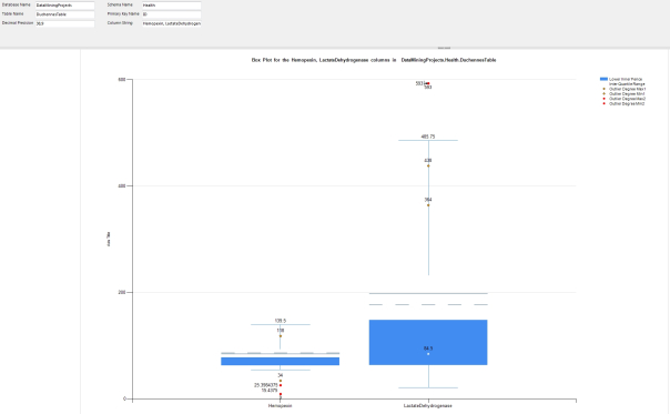
…………When interpreting plots of the kind depicted in Figure 1, just remember this simple rule mentioned by Kaiser Fung in an old post on data visualization: “the box contains the middle 50% of the data…the line inside the box is the median score; the dots above (or below, though nonexistent here) the vertical lines are outliers.”[5] The edges of the box represent the first and third quartiles, which we discussed earlier in this series in the post on Interquartile Range. The whiskers are the tricky part, since they can represent all kinds of different measures, like standard deviations and various percentiles of values.[6] Sometimes the min and max values of the dataset are used for the whiskers, but this is unsuited to our purposes because it would further obscure any outliers. My implementation is equivalent to a Tukey box plot, in which the whiskers represent the inner fence values of the Interquartile Range and another line is added to represent the median. The yellow points represent the maximum and minimum values where the Interquartile Range procedure returned an OutlierDegree equal to 1 and the red ones correspond to the same for OutlierDegree = 2. This isn’t standard practice, so I had to add code to the SSRS report to implement it.
…………Keep in mind when interpreting Figure 1 that only there may be many more outliers than the four dots depicted here, which take up a minuscule amount of the available space and thus convey the information we need very inefficiently. As I will discuss in more depth momentarily, SSRS simply doesn’t provide an out-of-the-box way to drill down to the records that ought to accompany the kind of summary statistics that the mean, median, Interquartile Range and the like represent. We’re therefore limited to displaying just a few data points based on the minimum and maximum values associated with the class of OutlierDegree they belong to. And even if we could access all of the individual data points alongside the summary statistics, as is normally the case with other implementations of box plots, we still wouldn’t be able to display them all because of the scaling issue. Adding more than a handful of values above or below the boxes quickly blurs them into an undifferentiated line, thereby concealing the information we’re after. If our purpose is looking for aberrant values, then it is much more efficient to simply display all the data points at once in a table ordered by the OutlierDegree flag column, with the summary statistics neatly available in a single view above it. For an example, see the tables returned in Outlier Detection with SQL Server, part 5: Interquartile Range. Figure 1 doesn’t present any new facts or unearth any buried information that isn’t already freely available to us in the table format, nor does it execute any faster. The data below comes from the same 209-row dataset on the Duchennes form of muscular dystrophy I have been using throughout this series for examples.[7] Since I’m not familiar with Duchennes[8] or biochemistry, I might be unwittingly making an apples-and-oranges comparison between the values for the protein Hemopexin and the enzyme Lactate Dehydrogenase. The purpose here was merely to demonstrate how difficult it is spot outliers with this technique, not to expose any relationship between the columns, so it’s beside the point anyways. It is worth noting though that adding the columns for the Creatine Kinase and Pyruvate Kinase enzymes to the box plot quickly rendered it unreadable, due to a few extreme outliers stretching out the vertical scale too far – which gives you an idea of how fragile box plots can be when applied to our purposes.
Figure 1: A Sample Box Plot Report with Outliers (click to enlarge)
…………To feed data to these reports, I had to rejig the stored procedure used in the aforementioned article on Interquartile Range and write the T-SQL code in Figure 2 to call it multiple times for each comma-separated column included in the @ColumnString parameter. The length of the code may seem intimidating, but it’s actually quite simple; the SplitColumnNameStringCTE merely separates the @ColumnString into a table variable, which is joined to a table variable that holds the results for each column. The rest of the code merely loops over each column in the list and feeds it to the Interquartile Range procedure; the number of parameters we need to feed to that procedure and the large number of return fields accounts for much of the length of this code. The first three parameters also enable users to select columns in any single table in any database for which they have the requisite access. It is certainly possible to extend this procedure to compare columns from multiple tables, but this is just for illustration purposes, so I kept it as simple as I could. I’ve included the @DecimalPrecision parameter in most of the procedures I’ve posted in this series so that users can adjust the precision and scale of the calculations to avoid overflows, but it may be necessary to ratchet it down further to keep Reporting Services from returning blank reports, as SSRS was doing with the run sequence plots in last week’s tutorial for some unfathomable reason.
Figure 2: Code for the Multiple IQR Stored Procedure
CREATE PROCEDURE [Calculations].[MultipleIQRSP]
@DatabaseName as nvarchar(128) = NULL, @SchemaName as nvarchar(128), @TableName as nvarchar(128),@ColumnString AS nvarchar(128), @PrimaryKeyName as nvarchar(400), @DecimalPrecision AS nvarchar(50)
AS
DECLARE @SchemaAndTableName nvarchar(400)
SET @SchemaAndTableName = ISNull(@DatabaseName, ”) + @SchemaName + ‘.’ + @TableName
DECLARE @ColumnTable table
(ID bigint IDENTITY (1,1),
ColumnName nvarchar(128)
);
DECLARE @ResultTable table
(ID bigint IDENTITY (1,1),
Mean decimal(38,9),
Median decimal(38,9),
LowerQuartile decimal(38,9),
UpperQuartile decimal(38,9),
InterquartileRange decimal(38,9),
LowerInnerFence decimal(38,9),
UpperInnerFence decimal(38,9),
LowerOuterFence decimal(38,9),
UpperOuterFence decimal(38,9),
OutlierDegreeMax1 decimal(38,9),
OutlierDegreeMin1 decimal(38,9),
OutlierDegreeCount1 bigint,
OutlierDegreeMax2 decimal(38,9),
OutlierDegreeMin2 decimal(38,9),
OutlierDegreeCount2 bigint
);
; WITH SplitColumnNameStringCTE
(TempPatIndex,LeftString, RemainingString, StringOrder)
AS (SELECT TempPatIndex, LEFT(@ColumnString, TempPatIndex) AS LeftString, RIGHT(@ColumnString, LEN(@ColumnString) – TempPatIndex) AS RemainingString, 1 AS StringOrder
FROM (SELECT PATINDEX(‘%,%’, @ColumnString) AS TempPatIndex) AS T1
UNION ALL /* after splitting the string, send the remainder back to the PATINDEX and LEFT/RIGHT functions in the part below */
SELECT NewPatIndex, LeftString = CASE WHEN LEFT(LastString , NewPatIndex) = ” THEN RIGHT(LastString, LEN(LastString) – NewPatIndex)
WHEN LEFT(LastString , NewPatIndex) IS NULL THEN RIGHT(LastString, LEN(LastString) – NewPatIndex)
ELSE LEFT(LastString , NewPatIndex) END,
RIGHT(LastString, LEN(LastString) – NewPatIndex) AS RemainingString, StringOrder + 1
FROM ( SELECT PATINDEX(‘%,%’, RemainingString) AS NewPatIndex, RemainingString AS LastString, StringOrder
FROM SplitColumnNameStringCTE
WHERE LeftString IS NOT NULL AND LeftString != ” AND LeftString LIKE ‘%,%’ ) AS T1
)
INSERT INTO @ColumnTable
(ColumnName)
SELECT T1.SplitString AS ColumnA
FROM (SELECT TOP 99999999999 REPLACE(REPLACE(LeftString, ‘,’, ”), ‘ ‘, ”) AS SplitString, StringOrder
FROM SplitColumnNameStringCTE
ORDER BY StringOrder) AS T1
DECLARE @CurrentID bigint = 0, @MaxID bigint = 0, @CurrentColumnName nvarchar(128)
SELECT @MaxID = Max(ID) FROM @ColumnTable GROUP BY ID ORDER BY ID ASC
WHILE @CurrentID < @MaxID
BEGIN
SET @CurrentID = @CurrentID + 1 — increment the loop
SELECT @CurrentColumnName = ColumnName
FROM @ColumnTable
WHERE ID = @CurrentID
INSERT @ResultTable
(Mean, Median, LowerQuartile, UpperQuartile, InterquartileRange, LowerInnerFence, UpperInnerFence, LowerOuterFence, UpperOuterFence, OutlierDegreeMax1,
OutlierDegreeMin1, OutlierDegreeCount1, OutlierDegreeMax2, OutlierDegreeMin2, OutlierDegreeCount2)
EXEC Calculations.InterquartileRangeSP3 @DatabaseName, @SchemaName, @TableName, @CurrentColumnName, @PrimaryKeyName, @DecimalPrecision
END
SELECT ColumnName, Mean, Median, LowerQuartile, UpperQuartile, InterquartileRange, LowerInnerFence, UpperInnerFence, LowerOuterFence, UpperOuterFence, OutlierDegreeMax1,
OutlierDegreeMin1, OutlierDegreeCount1, OutlierDegreeMax2, OutlierDegreeMin2, OutlierDegreeCount2
FROM @ColumnTable AS T1
INNER JOIN @ResultTable AS T2
ON T1.ID = T2.ID
ORDER BY T1.ID
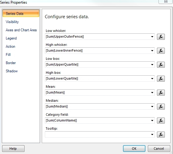
…………As discussed in last week’s tutorial, describing how to do basic SSRS tasks like adding data sources is not part of the scope of this series; there are plenty of other tutorials available on the Web which explain them better than I can. I will mention a few critical details needed for my implementations though, like the technique discussed in the last tutorial for retrieving data from stored procedures and using it in an SSRS report. One potential “gotcha” I ought to highlight is the fact the Mean and Median are sometimes left blank in the Series Properties window in Figure 3, even when they are correctly assigned in the Chart Data setup in Figure 4, so you may have to add the values again manually.
Figures 3 and 4: The Series Properties Window in Report Builder and the Chart Data Setup

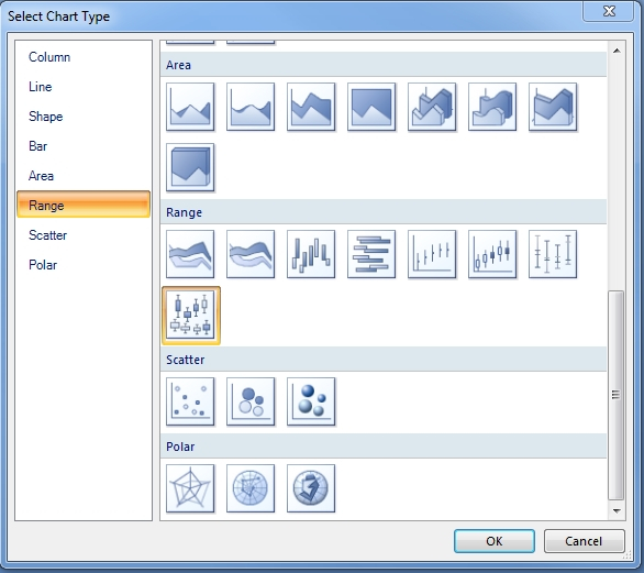
Figure 5: Types of Range Charts Available in Report Builder
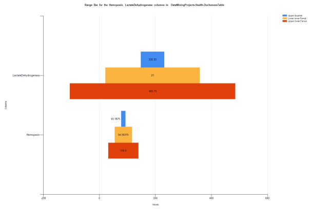
…………It may be worth noting here that box plots are grouped together in Report Builder under the Range heading with Smooth Range and Range Column, which we discussed last week, as well as the Stock, Candlestick and Error Bar charts, as seen in Figure 5. The latter three are just stripped-down variants of a box plot, so there’s no sense in discussing them further unless someone can point out a read need for more detail. I’m not aware of any means of implementing violin plots, another popular variant on the box plot, through Reporting Services out-of-the-box, although it might be possible to write custom code that achieves this end. That leaves the Range Bar, which as shown in Figure 6, can be used to conveniently compare the various fence values and quartiles returned with the Interquartile Range.
Figure 6: Range Bar Example (click to enlarge)
…………Please note that Report Builder quits altogether whenever I try to combine a range bar with any variant of a scatter plot, so it is apparently difficult to enhance them further for the purposes of outlier detection. That means I can’t even apply the technique for combining box plots with scatter plots, as presented by Mike Davis in his excellent tutorial, “How to Make a Box Plot Chart in SQL Reporting Services 2008 SSRS.”[9] That is how I managed to get the four measly dots into Figure 1, which might be sufficient if we were only doing exploratory data mining or hypothesis testing, but is woefully inadequate if our primary goal is finding outliers. Furthermore, as Davis points out, we’re better off calculating the quartiles and other stats associated with Interquartile Range ourselves anyways, since “Reporting services does not do a good job of calculating these numbers. The best thing to do is have analysis services calculate these for you or use a stored procedure to produce them.”[10] So the optimal way to go about it is to design a stored procedure of the kind I used here, but that presents another problem which really amounts to an unnecessary complication: Reporting Services will only recognize the first result set a stored procedure feeds to it, so you can’t return summary statistics and the records they’re calculated from in the same dataset.[11] And since you can’t include them in the same dataset, they can’t be combined in the same chart. One unworkable workaround is to simply return the summary stats together with the data in a single denormalized table, but this is grossly inefficient at best and quickly becomes impractical as the number of rows increases. Another poor solution is to just send the data and then add code to recalculate the detail rows in the SSRS reports, but this forfeits all of the power and performance advantages of computing through set-based methods. I haven’t had a chance yet to investigate other potential workarounds like writing Custom Data Extensions, using LINQ through a web service or operating on a local report in a WPF report control, but they all seem to be so awkward as to nullify the real the selling point of using Reporting Services charts to identify outliers, which is their simplicity. At present I’m leaning towards trying to implement multiple resultsets through VB.Net code embedded in SSRS reports, but I have no idea if it’s feasible. One of the most useful things Microsoft could do to improve the performance of Reporting Services in future editions of SQL Server might be to allow SSRS reports to consume multiple result sets of this kind, since it might drastically cut down the number of round-trips to the database and recalculations performed within it. Microsoft has been in the habit of artificially limiting the usefulness of its software through such oversights and arbitrary limitations for so long that it almost seems to be part of the corporate culture; as one programmer whose name escapes me once puts it, the company commonly adds great features to its software and then renders them useless, which he likened to saying, “Here’s a glass of milk – with a hole in the bottom.” This particular empty glass already forced me to truncate the histogram creation procedure in the last tutorial by stripping out useful code that tested the normality of the columns using the 3-Sigma Rule [12], by checking whether or not the first standard deviation comprised 68 percent of the values and the second and third comprised 95 and 99.7 percent respectively. It was trivial to calculate these tests on a pass-fail basis, but impossible to return the results efficiently because of this senseless limitation against multiple result sets in Reporting Services. It may be worthwhile to start a Connect request for this upgrade to SSRS, if one doesn’t already exist. Yet even if the next version of SQL Server allowed us to consume multiple result sets in SSRS reports, that still wouldn’t make box plots much more useful when the primary goal is exposing numerous outliers. For that objective, we would probably be much better off using the full two-dimensional space available to us in scatter plots, as we’ll delve into in the next installment.
[1] Indiana University of Pennsylvania IT Prof. James A. Rodger says that the roots of modern data mining can be found in Tukey’s exploratory analysis in the70s. p. 178, Rodger, James A., 2003, “Utilization of Data Mining Techniques To Detect and Predict Accounting Fraud,” pp. 174-187 in Pendharkar, Parag C. ed. Managing Data Mining Technologies in Organizations: Techniques and Applications. Idea Group Publications: Hershey, Pennsylvania.
[2] See the Wikipedia page “John Tukey” at http://en.wikipedia.org/wiki/John_Tukey
[3] IBID.
[4]
…………“John Tukey on data analysis and behavioral science, with a fierce attack on statistical practices for sanctification, formalism, and hiding the messiness inherent in real data.”
…………“I first saw this as an unpublished manuscript as a graduate student in statistics at Stanford. It set the way for me in data analysis. When I interviewed at Princeton University for my first teaching job, John and I discussed badmandments. After circulating underground for years, John’s essay was finally published in volume III of his collected papers…”
See Tufte, Edward, undated post titled “John Tukey ‘Badmandments’ in Statistical Work, Mainly in the Behavioral Sciences “ at the EdwardTufte.com website. Available online at http://www.edwardtufte.com/bboard/q-and-a-fetch-msg?msg_id=0003xA
[5] Fung , Kaiser, 2010, “Eye Heart This,” published Aug 12, 2010 at the Junk Charts website. Available online at http://junkcharts.typepad.com/junk_charts/boxplot/
[6] See the Wikipedia page “Box Plot” at http://en.wikipedia.org/wiki/Box_plot
[7] I originally downloaded it from Vanderbilt University’s Department of Biostatistics.
[8] I am acquainted with two people who have it though, which is why I selected this particular biostats dataset.
[9] Davis, Mike, 2009, “How to Make a Box Plot Chart in SQL Reporting Services 2008 SSRS,” published Nov. 12, 2009 at the BIDN.com web address http://www.bidn.com/blogs/MikeDavis/ssis/163/how-to-make-a-box-plot-chart-in-sql-reporting-services-2008-ssrs Another post of interest is user3557796’s thread “SSRS Box Plot with Scatter Outliers,” published April 21, 2014 at the StackOverflow web address http://stackoverflow.com/questions/23204901/ssrs-box-plot-with-scatter-outliers
[10] IBID.
[11] The Internet is awash with threads about this topic. Some examples include Jes Borland’s post titled “T-SQL Tuesday #024: Reporting Services, Stored Procedures, and Multiple Result Sets” on Nov. 8, 2011 at LessThanDot, which can be accessed at http://blogs.lessthandot.com/index.php/DataMgmt/ssrs/t-sql-tuesday-024-reporting/ ; the post by the user named mou_inn in Microsoft’s ASP.Net Forum titled “Multiple Datasets from Stored Procedure in SSRS,” on Feb. 16, 2012, which is available at http://forums.asp.net/t/1770328.aspx?Multiple+Datasets+from+Stored+Procedure+in+SSRS ; and Matt Gibson’s reply on March 11, 2011 to the StackOverflow thread titled “Query That Returns Multiple Result Sets,” which is available at the web address http://stackoverflow.com/questions/5270843/query-that-returns-multiple-result-sets
[12] See the Wikipedia pages “68–95–99.7 Rule” and “Standard Deviation” at http://en.wikipedia.org/wiki/68%E2%80%9395%E2%80%9399.7_rule “68–95–99.7 Rule” and http://en.wikipedia.org/wiki/Standard_deviation “Standard Deviation” respectively.


