SSRS Chart Custom Colors by Category Group
-
October 13, 2017 at 10:46 am
I have a graph with two related Categories. One is Production, the other Estimating. Within each category there are up to six departments. It is a stacked column chart. Values are in hours. Category groups are by Year-Week and P or E for Production and Estimating. The Series is by Department. I'm using the Bright pastel palette so each department has its own color. For each week of the year there are two stacked columns, P and E. What I would like to do is define a custom palette so that for each department the P column is the standard Bright palette color. For the E column I would like to apply the same color but has (1) 25% opacity or (2) a gradient or (3) a pattern. I have determined both the RGB and HTML (#) values for all 15 colors in the Bright Pastel palette as well as for 25% and 33% Opacity for each. This will make it easier to pick out the P from the E columns when you are looking at a large number of weeks, say 52
 .
.
Is there a way to do this? I've been beating on it for two or three days now and haven't found anything that works.John
SQL Rebel without a Where Clause
SQL/Epicor/Prophet21/VISUAL/e.i.e.i.o. -
October 14, 2017 at 3:43 am
In all honesty, I'm not sure you can for your current set up. I notice that some of the bars are the same colour in the P and E columns, which means that they are part of the same sub-group. SSRS labels and colours sections on graphs by their name. If you have something called "Sales" in your P and E group, then it's going to have the same colour in both.
Without seeing the data, this is a little harder to express, but you should be able to achieve this IF you split the groups into separate ones across the board (annoying I know). This, likely, however, would be good anyway if you are showing a key, as you can show the two different colours on it.
On the subject of creating your own custom colours, that isn't too hard, but comes with some quirks. Firstly, I'll explain how to do it.
- Go to your graph in your report and click an area of white space
- Hit F4 to view the Properties Pane (or just go to it). This is NOT the Properties window.
- Scroll down to the Chart Section and find the Palette Option. Change this to Custom
- Find the CustomPaletteColor Option and click the ellipsis.
- Add your custom colours using the dialogue window. This may require a bit of trial and error, however, they are displayed on the screen in the Ordering of your labels.
- Click Ok.
- Run the report and check colours are in the order you want. If not, go to step 4, and use the up and down arrow buttons in the window to change the ordering.
One thing to note. You can't link a colour to a label, they are just an order of colours. This means that if a label is missing, for whatever reason, the colouring will skew.
Have a go, and see what results you get. If you get stuck, post back. 🙂
Thom~
Excuse my typos and sometimes awful grammar. My fingers work faster than my brain does.
Larnu.uk -
October 16, 2017 at 7:10 am
I got it to work! Here is how.
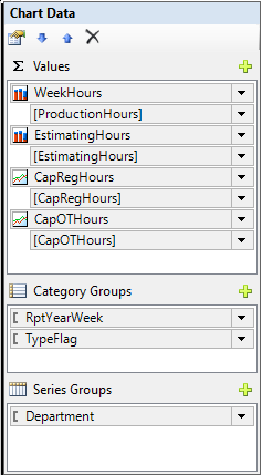
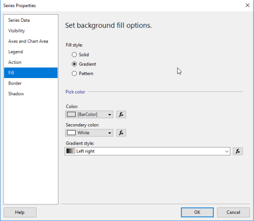
I did a UNION of Production and Estimating Hours setting Estimating Hours to zero in the Production Query and Production Hours to zero in the Estimating Query. I defined a BarColor field for the Department table and assigned a different color for each department. So Veneer is '#418cf0', Machine is '#fcb441', etc. (I used a color picker to get the values for all 15 colors in the Bright Pastel palette). I then added both ProductionHours and EstimatingHours as Values for the Chart.
BTW, I don't need to sum these values because my stored procedure does all the that.
Then for each value I set the Fill color property to BarColor. For Production I left the Fill style set to Solid and for Estimating set the Fill style to Gradient.
The TypeFlag field is set to either 'P' for Production or 'E' for Estimating. I also created a sort field so the Production Bar would show before the Estimating Bar.
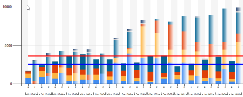
The end result...

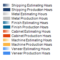
with a legend that looks like this.

I hope some of you find this useful.John
SQL Rebel without a Where Clause
SQL/Epicor/Prophet21/VISUAL/e.i.e.i.o.
Viewing 3 posts - 1 through 3 (of 3 total)
You must be logged in to reply to this topic. Login to reply
 .
. 


