Charts present summary data in a visually appealing format. Following is a chart for sales over month:

Before
I frequently use a few options along with charts to get most out of them.
Show data labels:
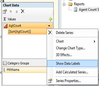
It’ll be easier for the users to quickly read, if the chart shows the actual numbers along with bars. Steps: From the chart data pane, click data value, and choose Show Data Labels.
Display all categories on horizontal axis:
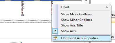
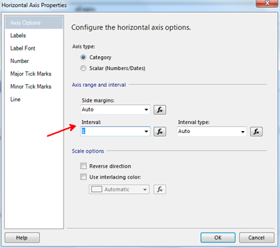
Notice in the above chart, all the categories (Months in our example) are not displayed. By default, auto fit property determines the interval of horizontal axis labels. Changing the interval to 1 will force the axis to display all categories. Steps are depicted in the below screen prints.
Rotate Labels:
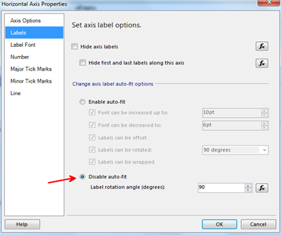
Sometimes you may notice the labels are rotated automatically to better fit them, other times labels overlap with each other. Labels can be forced to rotate by disabling auto-fit and changing the label rotation angle to 90 degrees.
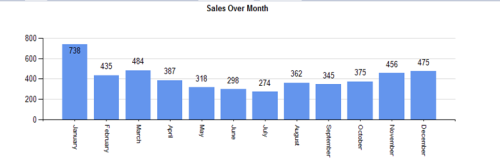
After
Summary:
In this post, I’ve looked at simple properties that can extend chart’s functionality: Showing data labels, configuring axis interval, and rotating axis labels.
~Sam.


