Report Recipes
This is the second in a series of three articles highlighting the Report Solution
Patterns and Recipes from Chapter 7 of Professional
SQL Server 2005 Reporting Services.
As we have endeavored to solve various business problems, we've learned to do some
interesting things with Reporting Services. On consulting engagements, I often find
myself in front of a client who is asking questions like "Can you do this or that?"
Almost inevitably, the answer is "yes," but the question becomes what the best method
would be to meet the requirement. With a little outside-the-box thinking, a lot of
interesting things are possible. This may involve some custom programming, embedding
report items or using customer application components in concert with Reporting Services.
In the following article, I've compiled a description of reporting challenges and
solutions we've encountered when developing reports for our clients. For each "solution
recipe," I provide a brief list of skills, techniques, and resources needed to apply
the report feature. This should give you a good idea about how prepared you may be
to use the techniques based on your skill set and the level of complexity. Some of
these are easy to duplicate and others require more advanced skills, which may include
Transact-SQL and Visual Basic programming. These are not intended to be exercises
or step-by-step instructions. I have made a point to provide enough information to
demonstrate the concepts and techniques.
Creating a Business Scorecard
Microsoft Office Business Scorecard Manager is a Back Office product that integrates
with SharePoint Portal Server and may be used to bridge the features of several Microsoft
products, such as SQL Server Analysis Services, Excel, Visio, and Office Web Components.
BSM is primarily designed for the nonprogrammer, power-user and requires little technical
expertise to create dashboard-style reports. Using Reporting Services and a little
programming savvy, it's possible to duplicate some of the BSM features without the
product.
This type of reporting scenario has quickly become a mainstay in enterprise business
applications. Also known as executive dashboards, business scorecards provide summary
level progress and success status information for business leaders.
You'll need the following:
- A query expression with data-based or calculated target, budget, variance and actual
values
- A multigroup table with drill-down features
- Small images for use as progress indicators
- An expression used to translate KPI and target values to indicator images
Executive Dashboards
To understand and appreciate the value of this type of reporting interface, you need
to walk in the shoes of corporate business leaders. A typical corporate officer deals
with a lot of people and a variety of information in a day, and often needs to make
immediate decisions based on this information. Moving from meeting to meeting, transaction-level
details are too granular for most decisions. Business leaders need to know how the
business is performing overall and whether there are areas of concern or notable success.
I've sat in a lot of meetings with a General Manager or Director sitting on one side
of the table and subject experts on another. The officer begins by saying, "So, how
are we doing?" The subject expert gives a lengthy presentation, stepping through PowerPoint
slides, charts, graphs, and diagrams that depict trends and variances based on mountains
of data. After the presentation, the officer concludes with the question: "So, how
are we doing?" Scorecards and dashboards answer this all important question using
succinct summary values and simple graphical, symbolic progress indicators.
Although simplification is a key concept, scorecards go beyond just keeping reports
simple. Trends and success indicators should be clear and easy to understand but should
provide an avenue to discover more detail and to view related trends and summaries.
These objectives are easily achieved using drill-down and drill-through report features.
Targets and KPIs
These are the fundamental concepts behind business scorecards. For any given measurement,
a target is simply an objective value. Targets are often data-driven values like a
Budget, Quota, Baseline, or Goal. A KPI, or Key Progress Indicator, is a set of thresholds
used to measure actual values with the target. KPIs may define banding indicators
that to signify a range of variances like poor, acceptable and exceptional performance.
KPI thresholds may be a single point, corresponding to the target, percentage, or
fixed increment offsets with any number of indicator bands.
When considering longer-term trends, you may want to recognize the difference between
a positive trend using a KPI and whether or not a value represents a successful outcome,
as a KSI (Key Success Indicator.) For example, sales for a particular product may
have been unprofitable since it went on the market. If sales are rising, a KPI would
show positive sales growth while a KSI would indicate that the company is still in
the red. We might simply define two targets, one to measure short-term progress and
the other to measure overall profitability.
Indicators
Indicators are graphical icons, representing the state of an actual value with respect
to a KPI band. On the scorecard, corresponding indicator icons might be red, yellow,
and green symbols. Indicators are typically common symbolic metaphors like traffic
lights, colored shapes, progress bars, gauges, and directional arrows. Figure 1 shows
some common indicator graphics embedded in a sample report.
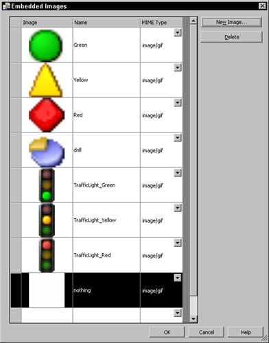
Figure 1
Calculating Variance
Variance is the difference between an actual and target value. If time variances will
be used extensively, the queries used to make these calculations can be very intensive.
Aggregating and calculating sales totals, for example, for a given month over last
month, quarter, or year can require some heavy-duty query processing (even with a
modest number of detail rows.) Ideally this type of data should be stored in a data
mart or data warehouse with precalculated variance values stored in the database.
The AdventureWorksDW database contains some preaggregated summary values, but as you
can see, even for this simple report with only year-over-year variances, the query
is fairly complex.
SELECT
    ThisYearSales.SalesTerritoryRegion
  , ThisYearSales.SalesTerritoryKey
  , ThisYearSales.CalendarYear
  , ThisYearSales.LastName
  , ThisYearSales.FirstName
  , ThisYearSales.EmployeeName
  , SUM(ThisYearSales.ExtendedAmount) AS ExtendedAmountSum
  , SUM(ThisYearSales.SalesAmountQuota) AS SalesAmountQuotaSum
  , SUM(LastYearSales.ExtendedAmountSum) AS ExtendedAmountSumLastYear
  FROM (
     SELECT
         DimSalesTerritory.SalesTerritoryRegion
       , DimSalesTerritory.SalesTerritoryKey
       , DimTime.CalendarYear
       , DimEmployee.LastName
       , DimEmployee.FirstName
       , DimEmployee.EmployeeKey
       , DimEmployee.FirstName + ' ' + DimEmployee.LastName AS EmployeeName
       , FactResellerSales.ExtendedAmount
       , FactSalesQuota.SalesAmountQuota
     FROM DimEmployee INNER JOIN FactSalesQuota
         ON DimEmployee.EmployeeKey = FactSalesQuota.EmployeeKey
         INNER JOIN DimTime ON FactSalesQuota.TimeKey = DimTime.TimeKey
         INNER JOIN FactResellerSales
         ON DimEmployee.EmployeeKey = FactResellerSales.EmployeeKey
            AND DimTime.TimeKey = FactResellerSales.OrderDateKey
         INNER JOIN DimSalesTerritory
         ON DimSalesTerritory.SalesTerritoryKey =
            FactResellerSales.SalesTerritoryKey) AS ThisYearSales
         INNER JOIN
           ( SELECT
                 FactResellerSales.EmployeeKey
               , DimTime.CalendarYear
               , DimSalesTerritory.SalesTerritoryKey
               , DimSalesTerritory.SalesTerritoryRegion
               , FactResellerSales.ExtendedAmount AS ExtendedAmountSum
             FROM FactResellerSales
                 INNER JOIN DimTime
                 ON FactResellerSales.OrderDateKey = DimTime.TimeKey
                 INNER JOIN DimSalesTerritory
                 ON DimSalesTerritory.SalesTerritoryKey =
                    FactResellerSales.SalesTerritoryKey
            ) AS LastYearSales
     ON LastYearSales.CalendarYear = ThisYearSales.CalendarYear - 1
        AND ThisYearSales.EmployeeKey = LastYearSales.EmployeeKey
        AND ThisYearSales.SalesTerritoryKey = LastYearSales.SalesTerritoryKey
GROUP BY ThisYearSales.SalesTerritoryRegion, ThisYearSales.SalesTerritoryKey
  , ThisYearSales.CalendarYear, ThisYearSales.LastName, ThisYearSales.FirstName
  , ThisYearSales.EmployeeName
ORDER BY ThisYearSales.SalesTerritoryRegion, ThisYearSales.CalendarYear
  , ThisYearSales.LastName, ThisYearSales.FirstName
When running complex queries like this one, you may need to increase the default connection
timeout setting on the data source. The default setting is 15 seconds, which may not
be sufficient for this query on all hardware. In a production application with data
volumes greater than the sample database, I would recommend testing query performance
and possibly using an Analysis Services database with cubes and precalculated aggregates.
To populate the data warehouse, you will use queries similar to this one and store
the results for later retrieval.
Figure 2 shows a simple table with two groups: on the SalesTerritory and CalendarYear fields.
This table is much like several previous examples. The detail row is hidden by default
allowing for drill-down using the SalesTerritoryRegion textbox. Two more
images will serve as indicators. These are based on expressions used to change the
indicator image.

Figure 2
You will notice that the images have a white background even though I've used background
colors to separate the rows. I've only done this to simplify this example. I have
simply added the images to the cells in the table header. If you want to use transparent
images over a colored or shaded background, you will need to add rectangles to the
header cells and then place images in the rectangles. This way, you can set the BackgroundColor
property for each rectangle and take advantage of the image transparency. The final
example, shown in Figure 6 (on the final page of the article), uses this technique
to fill the background color behind the scorecard indicator images.
Looking at the columns with text headers, the first column contains the SalesTerritoryRegion field
in the first group header and the CalendarYear field in the detail row.
The second column contains the EmployeeName in the detail row.
The third text column is for the SalesAmountQuota field. The header uses
the SUM() function to aggregate the details for the sales territory.
The fourth text column contains total sales values, using the ExtendedAmount field.
The last column of textboxes, labeled Yr. Variance, calculates the total
sales amount annual variance. In the header row, the expression uses the SUM() function.
In the detail row, the SUM() function is omitted.
=1-(Sum(Fields!ExtendedAmountSumLastYear.Value)/Sum(Fields!ExtendedAmountSum.Value))
The expression for the sales first set of indicators (the images column after total
sales column) calls a Visual Basic function to apply the KPI threshold banding. Figure
3 shows this custom code.
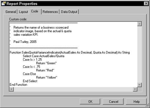
Figure 3
Since the image names for the green, yellow, and red indicators are Green, Yellow,
and Red, these values are simply returned in the Value property of the
image item using the following expression:
=Code.SalesQuotaVarianceIndicator(Sum(Fields!ExtendedAmountSum.Value),
Sum(Fields!SalesAmountQuotaSum.Value))
For variety, I've resolved the second indicator column images using only an in-line
expression, rather than using a custom function. This is the expression for the header
row. The detail row expression is the same but excluding the SUM() function. As a
rule, after I've decided to use custom code, I'll typically continue to use custom
functions for all but the simplest expressions so I can keep business logic in one
place.
The following is intended as all one line but will not display that way with this
page width online.
=IIF(Sum(Fields!ExtendedAmountSum.Value) /
Sum(Fields!ExtendedAmountSumLastYear.Value)
This expression returns the name of an exclamation mark icon image when this year's
sales amount is less than 80 percent of last year's. I created an image file called
"nothing," which is a blank icon with a white background. Using this image effectively
displays nothing in the image cell.
Synchronizing Charts and Related Report Items
One of the great advantages to the scorecard approach is that all the information
is presented in a concise page. In order to make the best use of screen space, I can
use a separate report item to show content related to the item selected in the scorecard.
Figure 4 shows the table and chart items. When I select a sales territory, by clicking
on the small pie chart icon in the first column, I want to see sales trend information
in a column chart. I've placed a chart to the right of the scorecard and have configured
it as a column chart. I've also simplified the chart by removing the legend.
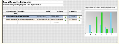
Figure 4
The chart content is synchronized using a report parameter. The SalesTerritoryKey parameter
is used to filter the dataset providing data to the chart. The SalesTerritoryregion parameter
is used to provide a title value for the textbox above the chart. Figure 5 shows the
Navigation properties for the pie icon used to synchronize the chart. Note that the
Jump to report property is set to navigate back to this report, re-rendering the same
report with the new parameter values.
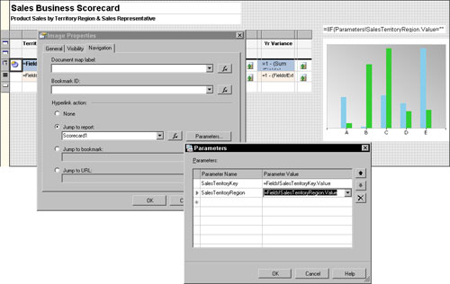
Figure 5
Figure 6 shows the rendered report with some region sections drilled open. I've clicked
the pie icon next to the Southwest region to synchronize the chart and view sales
trend details for the southwest region. Again, note the background color fill behind
the scorecard indicator images using the technique I mentioned earlier.
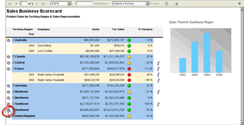
Figure 6
One of the first things you'll probably notice is that the quota and total sales values
are not very close at all. These values have actually changed in different editions
of the AdventureWorksDW sample database as it progressed through beta testing cycles.
For this report example to be more realistic, you can manually change some of the
SalesAmountQuota values in the FactSalesQuota table. The completed sample
code on the book's support site, at P2P.WROX.COM, contains a script to update
all of the quota values.
This article is the second in a series of three articles from Paul Turley excerpted
from the 90-page chapter, "Report Solution Patterns and Recipes" from the book Professional
SQL Server 2005 Reporting Services, written by Paul Turley, Dave DuVarney, James
Counihan, and Todd Bryant (Wrox, 2006, ISBN: 0-7645-8497-9). The full chapter contains
a deep analysis of successful report projects, including project profiles, success
factors, user discussions, and scope management. Templates are provided to assist
requirement gathering and management. The Report Recipes section of this chapter includes
19 specific examples of advanced report designs that implement custom coding and other
techniques taught in previous chapters. This series of articles demonstrates three
of these examples. The first article was Greenbar
Reports and the final installment will be Creating Sparklines. Hitachi Consulting
has business and IT consulting offices throughout the world. Paul works for Hitachi's
Pacific Northwest Business Intelligence practice in Seattle and may be contacted at pturley@hitachiconsulting.com.
Weblog by Paul Turley and SQL Server BI Blog.


