If you google for “anomaly detection” or “outlier detection”, you will get a flurry of results including commercial hoopla, academic research papers and the ubiquitous StackOverflow answers. It's a problem that is increasingly popular and applicable across nearly all business areas. It's also an area where the ideal of 'automated' detection systems seems like it should be achievable and yet, a truly generic solution doesn't exist so far.
So, why are there so many different approaches and how do we get started? In this post, we will explore three aspects of anomaly detection:
- the right questions,
- a quick overview of applicable methods
- and finally, an exploration of the most basic concept of "what is normal vs. abnormal"?
The Right Questions
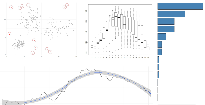
There are so many options because the terms “anomaly” and “outlier” mean different things depending on your context and your data. The image below shows a whole variety of different data sources, each with potential outliers:

These types of plots are everywhere. It's not uncommon to see business intelligence dashboards saturated with scatterplots, bar charts, pie charts and line charts, providing a visual window over the raw data from every conceivable angle.
Stop for a moment and think about the kinds of stories that people tell alongside these plots. If we pretend that the bar chart represents sales figures for this year, by region then we might hear narratives like:
“Total sales for this year was $X. Our top 3 regions where (A, B & C). And, we have some serious work to do in the bottom 5 regions.”
Similarly, if we pretend that the boxplots represent the number of shoppers in all of our stores, by hour; then we might hear something like:
“The average number of shoppers ranges between 100 and 160 shoppers per hour.This peaks just after lunchtime and into the early afternoon, before dropping off through the evening.
There are a couple of stores that attract an abnormally high number of shoppers throughout the morning (the dots, or “outliers”, above the boxes) – what are they doing right?”
Underpinning these narratives there are another set of equally interesting questions which cannot be answered directly from the plots above:
- how many customers do we expect to get during lunchtime?
- are there regions which demonstrated exceptional sales performance this year?
Underneath these narratives lie two fundamental questions: what is normal? and what is exceptional?.
Methods for Anomaly Detection
Broadly, anomaly detection methods fall into four areas:
Extreme value analysis: the use of statistical tests to determine "normal" and identify values that are "unlikely to occur, given historical observations". Statistical methods assume that there is a single underlying process from which the data was generated and that this process is both known and relatively stable.
Clustering: Clustering methods allow there to be different "types of normal" (for example, different customer segments). Normal events will form part of a cluster with other normal events, and abnormal events will remain somewhat isolated away from the rest of the pack. For example k-means, k-nearest neighbours or density-based clustering.
Machine learning methods: machine learning methods assume that the majority of your data is generated by "normal processes". You train your models to recognise "normal" and then use these models to make a prediction (usually returning a probability) about whether new data points appear normal or not.
Time-series methods: Time series is a different kettle of fish. The biggest challenge in time series analysis is the fact the observations over time are strongly correlated and often exhibit seasonal trends. Most time series methods rely heavily on first decorrelating the time series and removing trends.
What is Normal?
For me, this is the most important question: what is normal? Obviously, I can't speak for everyone else but in my company, many of our alerting thresholds are based on a default threshold. Sometimes these thresholds are based on "best practice" recommendations, but often they are entirely arbitrary. Having recognised this, we are on a mission to set more appropriate thresholds that are tailored to our client's environments. Unfortunately, we haven't always been collecting the right data to be able to do this either. Often, we don't collect data until some alert has been triggered. At this point, the horse has already bolted and we've lost the ability to understand what lead up to this moment. But let's assume that we have got the right data & let's start to analyse "normal" using R.
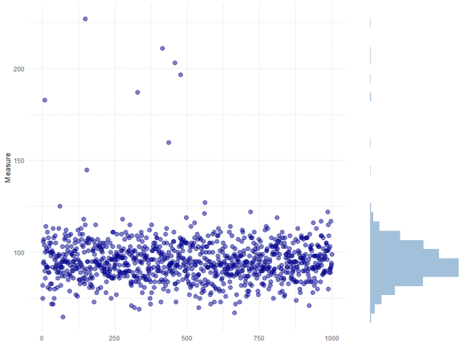
Let's quickly look at the data. Below, we've plotted our data set which is a count of active users over time:

We can see from the histogram on the side of the plot, that the data is strongly skewed, but the vast majority falls between 75 and 125, with a mean value of approximately 100. There are also some obvious outliers.
I am happy to say that this data can be described by a count distribution (the data has a constant mean and variance, and each data point is independent). Based on this assumption, we can analyse the dataset using the ppois() function in R: ppois(x, lambda)
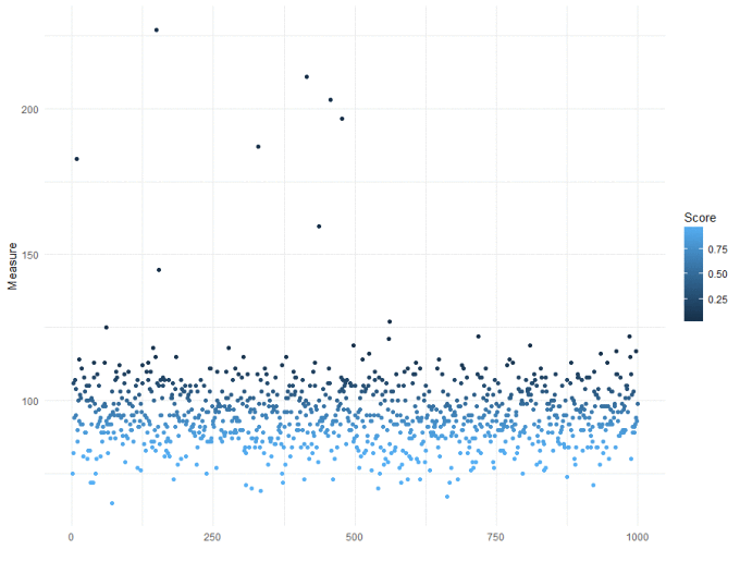
The ppois() function takes a count value (x) and the expected mean (lambda) and calculates the likelihood of observing a value (x) given the mean (lambda). The likelihood can be interpreted as a probability, so a high probability corresponds to 'normal' and a low probability to 'abnormal'. Note that the data is stored in a data.table.
xs[, Score := 1 - ppois(Measure, mean(Measure))]

ggplot(xs, aes(x = 1:1000, y = Measure)) +
  geom_point(aes(colour = Score)) +
  theme_minimal()

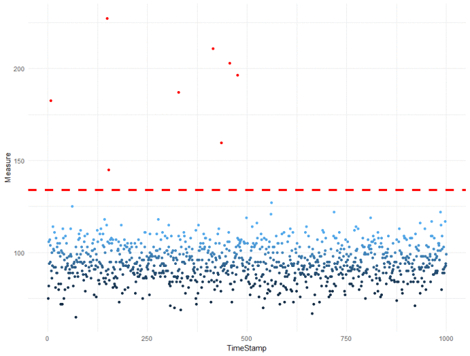
This is a good start, we can see that lower counts are more likely than higher counts. But it hasn't helped us set a threshold. In this example, we are going to define a 5% probability threshold. Specifically, we are assuming that our "normal" process is poisson distributed (counts) with a mean of 100. Under these assumptions, if a point has less than 5% likelihood of coming from this "normal" pattern, we will mark it as an outlier.
xs[, Outlier := Score < 0.05 / 1000]
xs[, Score := -ppois(Measure, mean(Measure), lower.tail = FALSE, log.p = FALSE)]

ggplot(xs, aes(x = TimeStamp, y = Measure)) +
  geom_point(data = xs[Outlier == FALSE], aes(colour = Score)) +
  geom_point(data = xs[Outlier == TRUE], colour = "red") +
  geom_hline(aes(yintercept = qpois(0.0005, 100, lower.tail = FALSE)), colour = "red", linetype = "dashed") +
  theme_minimal()

There is quite a bit going on in the code above - that we won't step through in detail, but will very briefly describe:
- Line 1 identifies Outliers using a Bonferroni-corrected score.
- Line 2: recalculation of the score as a negative log probability (for easier visualisation, no other reason)
- Line 3 onwards: plotting the results. Outliers and normal points have been plotted & coloured separately, with a threshold calculated using the qpois() function.
The end result is a data-driven threshold with 8 outliers identified. We can now confidently say that "normal" is a range anywhere up to ~ 135 active users. This is slightly higher than I would have guessed (~ 125) just by looking at the data, and will reduce the number of false alerts we receive.
Wrap up
I'm excited about the potential for outlier and anomaly detection. Picking the right method, one which complements the data can be a challenge. But as we see more and more real-world examples hopefully, the various use cases and applications of these algorithms will become more obvious. But beyond the algorithms, I hope that the potential applications of anomaly detection will see a shift in the way we talk about our data: what is normal, are we collecting the right data for this and what is interesting? One day very soon hopefully, all of our alerting thresholds will be data-driven, with a clear narrative for the customer about "what normal is for them", and a reduction in the number of charts on our dashboards by focusing on abnormalities - the things that are really interesting.

