Introduction
Microsoft’s integration of R and SQL Server 2016 has been revolutionary. R can give us insights into our data that would be difficult, if not impossible, to implement in SQL alone. One of R’s key capabilities is its powerful graphics system and ability to create plots geared toward exploratory data analysis. These plots can readily be created in SQL Server Reporting Services and PowerBI. However, as a DBA, sometimes you want to quickly inspect the data visually without going through the process of creating a report definition or a PowerBI dashboard - given that these tools are even available. While RStudio is one of the most common tools used for viewing plots in R, to retrieve the data from SQL Server, you need to have the RODBC library installed, and you will need to pull the data into R over ODBC, which is much slower (for large datasets) than the more direct pipe, sp_execute_external_script.
Viewing a Plot in SSMS
I will now demonstrate how it is possible to view an R chart returned from sp_execute_external_script from within SQL Server Management Studio. SQL server has a built-in web browser that can be accessed by navigating to View > Other Windows > Web browser or by pressing Ctrl + Alt + R (ironic?). To view an R plot in SQL Server Management Studio, we will take the following steps:
- Use sp_execute_external_script to render the plot to a VARBINARY(MAX) output variable
- Convert the plot to Base64
- Embed the Base64 representation of the plot in an <img> tag in HTML
- Save the HTML file to a temporary folder (again, leveraging sp_execute_external_script)
- Enter the location of the HTML file in the URL of SSMS’s web browser.
After following these steps, the plot will be visible in the web browser as an HTML element. This may sound like a lot of work, but once proceduralized, it is quick and painless.
CREATE PROCEDURE GetRPlotInHtml (
       @R NVARCHAR(MAX),
       @SQL NVARCHAR(MAX),
       @TempFilePath NVARCHAR(50) = 'C:\Temp\SQL Server'
)
AS

DECLARE
       @Plot VARBINARY(MAX),
       @PlotBase64 NVARCHAR(MAX),
       @Html XML,
       @FileName NVARCHAR(50),
       @HtmlStr NVARCHAR(MAX)

DECLARE
       @SqlJob TABLE(
              Name NVARCHAR(250),
              DurationSec INT
       )

-- Generate plot using "dat" as the input dataset and "Plot" as the output variable
EXEC sp_execute_external_script
       @language = N'R',
       @script = @R,
       @input_data_1 = @SQL,
       @input_data_1_name = N'dat',
       @params = N'@Plot VARBINARY(MAX) OUTPUT',
       @Plot = @Plot OUTPUT

-- Get the plot as a Base-64 string
SET @PlotBase64 = CAST('' AS XML).value('xs:base64Binary(sql:variable("@Plot"))', 'VARCHAR(MAX)')


-- Create HTML
SET @Html = '<html>
<body>
       <img alt="Boxplot of SQL Job Durations" src="data:image/jpeg;base64,' + @PlotBase64 + '" />
</body>
</html>
'

-- Write an HTML file to disk
SET @FileName = CAST(NEWID() AS NVARCHAR(50)) + '.html'
SET @HtmlStr = CONVERT(NVARCHAR(MAX), @Html)

SET @R = 'write.table(HtmlStr, file="' + REPLACE(@TempFilePath, '\', '\\') + '\\' + @FileName + '", quote = FALSE, col.names = FALSE, row.names = FALSE)'

EXEC sys.sp_execute_external_script
       @language = N'R',
       @script = @R,
       @params = N'@HtmlStr NVARCHAR(MAX)',
       @HtmlStr = @HtmlStr

-- Return URL
SELECT @TempFilePath + '\' + @FileName

GO
There are a few prerequisites to using this stored procedure. First, you should have SQL Server 2016 with R Services set up and enabled (https://docs.microsoft.com/en-us/sql/advanced-analytics/r-services/set-up-sql-server-r-services-in-database). Second, you will need to have a directory which your user has full permissions on. I will use C:\Temp\SQL Server. When you execute an external script, your credentials will be delegated to SQL Server Launch Pad and the script will be executed in the context of your user; thus, it is important that your logon user have permission to the directory. The SQL Server service account, however, does not need to have permission to this directory.
The stored procedure takes three input parameters, @R, @SQL, and @TempFilePath. The @TempFilePath parameter should point to the location where your HTML files can be written. I would recommend setting a good default when creating the stored procedure and subsequently omitting it upon execution. The @SQL parameter is the SQL statement that will be executed to populate an R data frame object named “dat”. The @R parameter is the R source code which will create the plot. Your objective is to use “dat” to create a plot, binarize it, and save it to an output variable, “Plot”. We will now cover some specific examples.
Create a Histogram
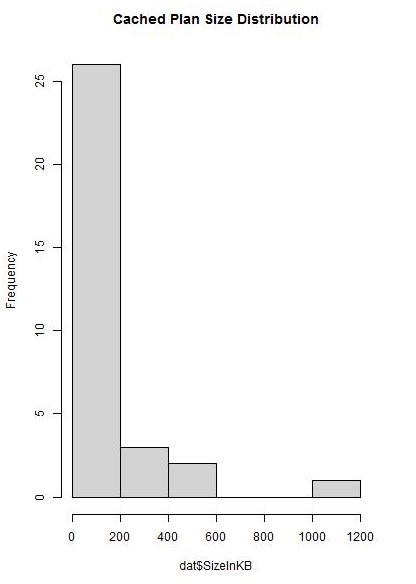
This first example creates a histogram of cached execution plan sizes in kilobytes.
DECLARE
       @R NVARCHAR(MAX) = '
# Initialize a temporary file and set the graphics device to use it
image_file = tempfile()
jpeg(filename = image_file, width=400, height = 600)

# Render plot to the graphics device
hist(dat$SizeInKB, col = c("lightgrey"), main = "Cached Plan Size Distribution")
dev.off()

# Binarize the temporary file and assign it to our output variable
Plot <- readBin(file(image_file, "rb"), what=raw(), n=1e6)
'

EXEC GetRPlotInHtml
    @R = @R,
    @SQL = N'SELECT size_in_bytes / 1024 SizeInKB FROM sys.dm_exec_cached_plans'
The R code initializes a temporary JPEG file and sets the graphics device to write to it. Next, the plot is rendered to the file, and finally, the file is binarized. Executing the above SQL will output a URL which you can copy and paste into SSMS’s web browser to view the plot.
Figure 1.

Figure 2.

Having reviewed the histogram, we can see that most execution plans are under 200 KB in size, although there are a few large plans.
Create a Grouped Bar Chart
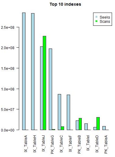
Next, we will create a grouped bar chart to look at seeks vs scans on our most frequently used indexes.
DECLARE
       @R NVARCHAR(MAX) = '
# Initialize a temporary file and set the graphics device to use it
image_file <- tempfile()
jpeg(filename = image_file, width=400, height = 600)

# Convert data frame to matrix so we can create a grouped frequency bar chart
d <- t(cbind(dat$Seeks, dat$Scans))
colnames(d) <- dat$IndexName

# add extra space in the margin for vertical labels
par(mar = c(10.1,4.1,4.1,2.1))

# Render plot to the graphics device
barplot(height = d, beside = T, col = c("lightblue", "green"), las = 2, main = "Top 10 indexes")

legend("topright", c("Seeks", "Scans"), pch = 15, col = c("lightblue", "green"))
dev.off()

# Binarize the temporary file and assign it to our output variable
Plot <- readBin(file(image_file, "rb"), what=raw(), n=1e6)
'

EXEC GetRPlotInHtml
    @R = @R , -- nvarchar(max)
    @SQL = N'SELECT TOP 10
              i.name IndexName,
              user_seeks Seeks,
              user_scans Scans
       FROM
              sys.dm_db_index_usage_stats ius
              INNER JOIN sys.indexes i ON i.index_id = ius.index_id AND i.object_id = ius.object_id
       ORDER BY
              user_seeks + user_scans DESC'
The input SQL query will retrieve the number of seeks and scans for the most frequently read indexes. To create a grouped bar chart, we need to pass a 2 x p matrix to the barplot() function, where p is the number of indexes. To do this, we create a matrix with just the seeks and scans and then transpose it. Finally, we set the column names equal to the index names so they will display along the x-axis of the plot.
Figure 3.

Upon reviewing the chart, it is apparent that TableJ is getting hit with a lot of index scans. Adding an index to TableJ or refactoring queries which access it may lead to performance improvements. TableB and TableD may also warrant closer inspection.
Create Box and Whisker Pots
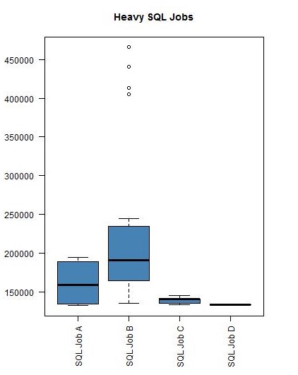
In the last example, we will create box and whisker plots to analyze the performance of our heaviest SQL Agent jobs in the last month. Rather than specify what the threshold is for ‘heavy’, we will use k-means clustering to cluster the SQL jobs into 3 groups {light, medium, heavy} based on their durations.
DECLARE
       @R NVARCHAR(MAX) = '
# Initialize a temporary file and set the graphics device to use it
image_file <- tempfile()
jpeg(filename = image_file, width=400, height = 600)

# Cluster into 3 groups by duration > {light, medium, heavy}
clust <- kmeans(dat$Duration, 3)

# We only wish to plot the SQL jobs which belong to the "heavy" cluster
clustfactor <- as.factor(clust$cluster)
index = which(dat$Duration == max(dat$Duration))
heavyclust = clustfactor[index]
d <- dat[clustfactor == heavyclust,]
d$JobName <- droplevels(d$JobName)

# Add extra space in the margin for vertical labels
par(mar = c(10.1,4.1,4.1,2.1))

# Render plot to the graphics device
boxplot(d$Duration ~ d$JobName, col = c("steelblue"), las = 2, main = "Heavy SQL Jobs")
dev.off()

# Binarize the temporary file and assign it to our output variable
Plot <- readBin(file(image_file, "rb"), what=raw(), n=1e6)
'

EXEC GetRPlotInHtml
    @R = @R,
    @SQL = N'SELECT
                           j.name JobName,
                           jh.run_duration Duration
                     FROM
                           msdb..sysjobhistory jh
                           INNER JOIN msdb..sysjobs j ON j.job_id = jh.job_id
                     WHERE
                           CONVERT(DATE, CONVERT(NVARCHAR(10), run_date)) > DATEADD(Month, -1, Getdate())'
Our input SQL query retrieves SQL jobs and their corresponding durations which ran in the last month. We apply the k-means clustering algorithm to cluster the jobs into three groups based on durations. Then, we subset the data frame to only includes rows which belong to the cluster in which the longest-running SQL Job is a member. Notice that we must drop the unused factor levels after doing this. Now, we are ready to plot the data.
Figure 4.

Looking at this plot, we can see that SQL Job B has a large distribution with many outliers which may need to be investigated.
Wrapping Up
Writing the R code to make the plots can be a lot to type, especially if you’re in a hurry. And with no IntelliSense®, it’s easy to make a syntax error. I’ve found it beneficial to create snippets for the charts I use most often: histogram, scatter plot, bar chart, box plot. When in need of a chart, simply pull down the snippet and edit it to suit the situation.
The last item to briefly address is cleanup. You should set up a job to regularly clean out your temporary folder which is being used for saving the HTML files. I’ve done this by creating a SQL Agent job with one PowerShell step: Get-ChildItem "C:\Temp\SQL Server" | Remove-Item.
This concludes the demonstration. We have only scratched the surface of the many ways R plots can be used with SQL Server R Services. These same principles can be applied to send a plot to an application or embed a plot in an HTML email and send through database mail. It is also possible to render ggplot2 plots using ggsave() if you have installed the package (https://msdn.microsoft.com/en-us/library/mt591989.aspx). I hope you have found this educational and useful. Happy plotting!


